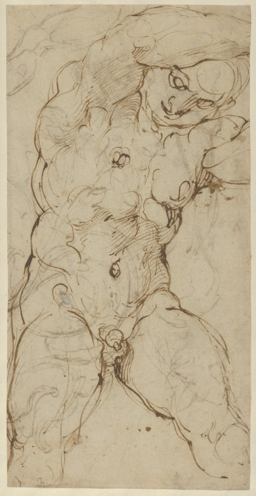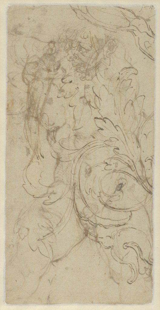
Giovanni Battista Beinaschi (1636–1688): Between Rome and Naples

From Piedmont to Rome

Giovanni Battista Beinaschi was born in Fossano, Piedmont, in 1636. His earliest years are imperfectly documented, although Bernardo de’ Dominici, writing in the eighteenth century, records that he initially studied with the portraitist known as Monsù Esprit Grandjean, who was active in Turin during the 1640s. According to the same biographer, the young painter also benefited from the protection of Christina of France, Duchess of Savoy. By about 1651, Beinaschi had travelled to Rome, where he continued his education under Pietro del Po, a painter and engraver who had himself studied with Domenichino and Giovanni Lanfranco.

Beinaschi arrived in a city whose artistic character had been transformed by the achievements of the Carracci and their successors. Annibale Carracci’s frescoes in the Farnese Gallery were among the works he studied, while Domenichino’s carefully organised compositions provided another important example. Through Pietro del Po, Beinaschi encountered an artistic inheritance in which drawing, the construction of the human figure and the intelligible arrangement of complex narratives remained fundamental.

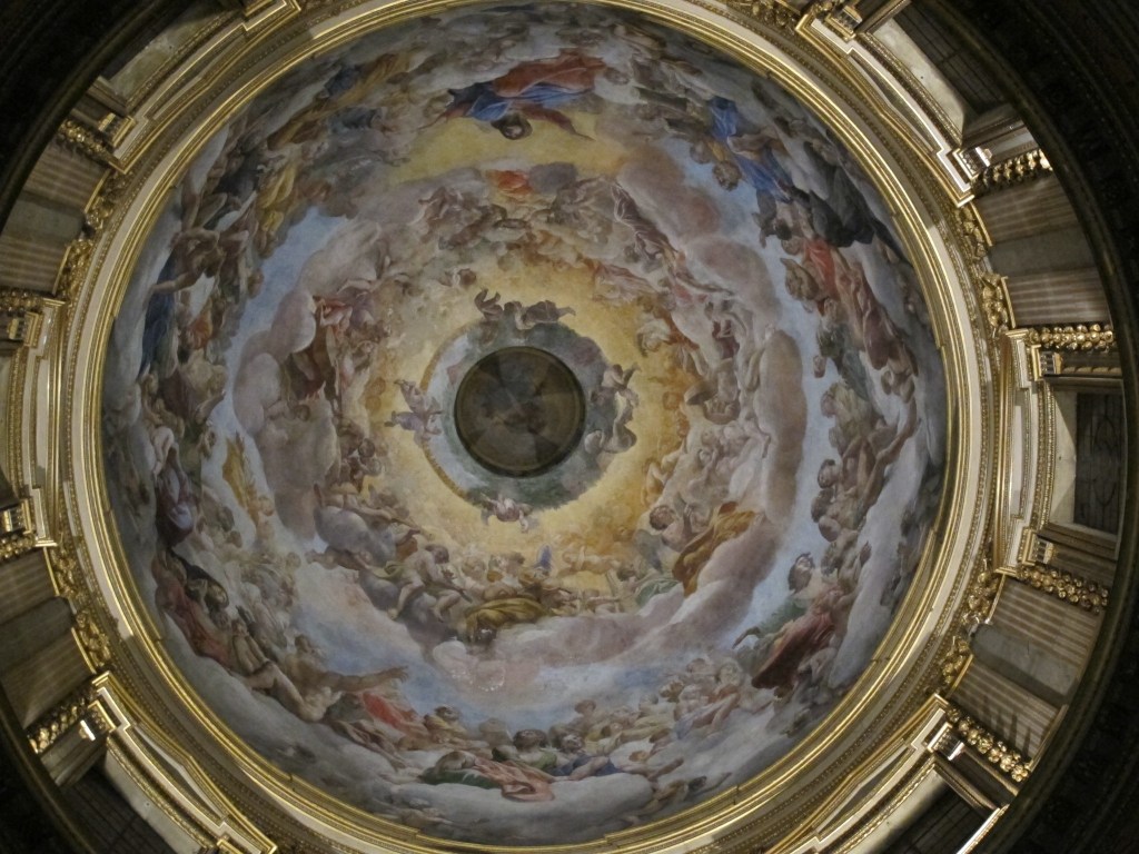
The influence of Lanfranco was still more pronounced. Although Lanfranco had died in 1647, his decorations in Sant’Andrea della Valle and San Carlo ai Catinari remained among the most ambitious achievements of Roman fresco painting. Their expansive compositions, populated by figures seen in daring foreshortening, offered Beinaschi an example of how painting could transform the apparent boundaries of architectural space. De’ Dominici subsequently described him as Lanfranco’s pupil, despite the chronological impossibility of such an apprenticeship. The association was nevertheless understandable, given Beinaschi’s sustained attachment to his predecessor’s manner. De’ Dominici also recounts a journey to Parma to study Correggio’s celebrated cupolas, although independent documentary confirmation of the visit is lacking.
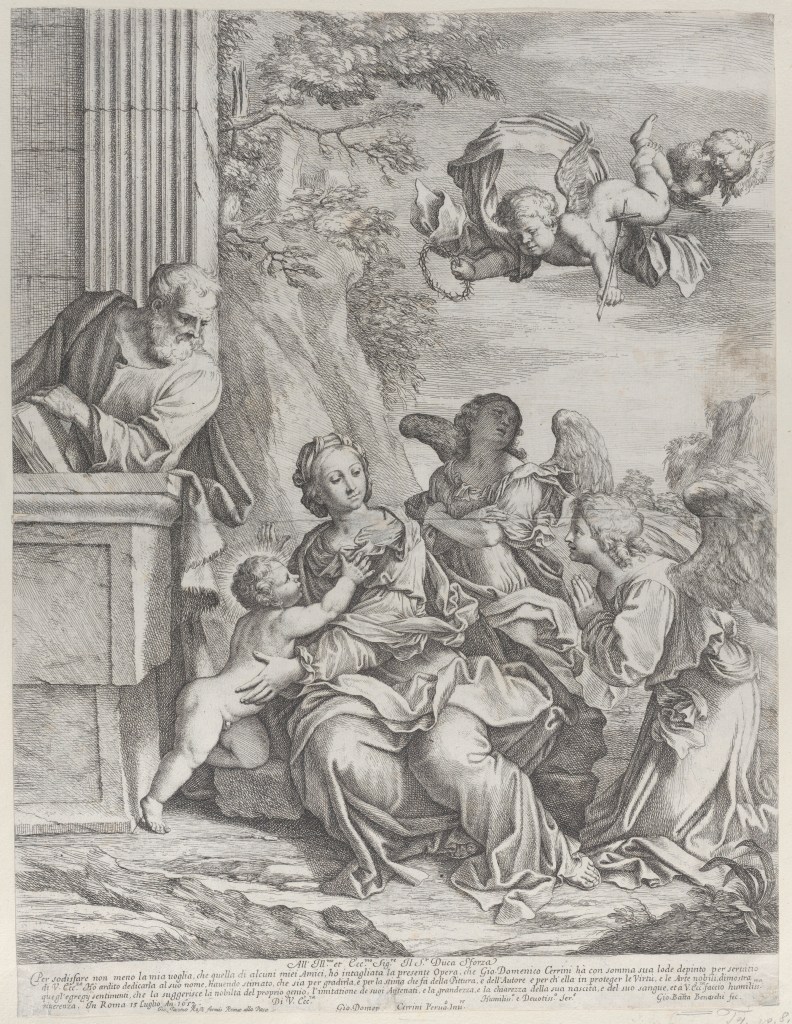
Beinaschi’s early interests were not confined to monumental decoration. An engraving of 1652 after Gian Domenico Cerrini’s Rest on the Flight into Egypt, dedicated to Duke Sforza, provides firm evidence of his engagement with another contemporary Roman painter. Mario Alberto Pavone has emphasised Cerrini’s importance in Beinaschi’s formation, especially the combination of expressive lighting with substantial, clearly articulated figures. Drawing was central to his education, and the numerous studies associated with his subsequent career testify to the continuing importance he attached to graphic invention.
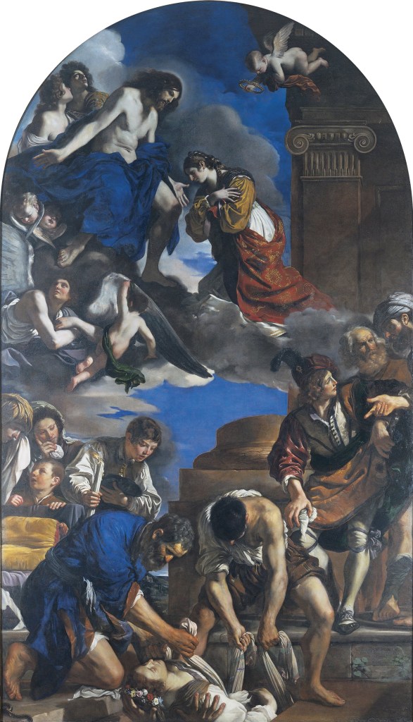
Pavone has also identified Guercino as an important source for Beinaschi’s treatment of the human figure. Guercino’s biblical and religious paintings offered models of powerful characterisation in which carefully modulated light gave substance to bodies and expressive force to gesture. Among the works Pavone considers significant is the Burial of Saint Petronilla, now in the Capitoline Museums, Rome, together with Guercino’s numerous representations of elderly men, saints and biblical protagonists. This inheritance offered Beinaschi possibilities distinct from Lanfranco’s expansive decorative manner, especially in the treatment of individual figures within dramatic narratives.
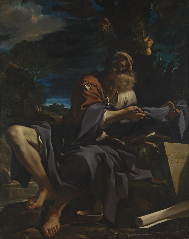
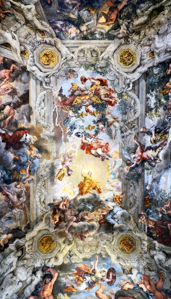
Beinaschi’s early artistic interests were thus shaped principally by the Emilian painters, especially Carracci, Domenichino, Lanfranco and Guercino. Pietro da Cortona’s example became increasingly important in his subsequent work, notably in the treatment of movement and crowded compositions.
Among the relatively few mythological canvases associated with Beinaschi is Venus and Adonis, a large painting generally dated to around 1660–65. Known through earlier scholarship, it reappeared on the art market in 2025 after several decades during which its whereabouts had been uncertain. Drawn from Ovid’s Metamorphoses, the subject offered an opportunity for the treatment of the human figure outside the devotional and ecclesiastical contexts that would dominate much of Beinaschi’s subsequent production. The painting has been related to the example of Lanfranco and Guercino, while its pronounced contrasts of light and shadow also suggest affinities with the naturalistic tendencies of southern Italian painting.

Beinaschi Venus and Adonis – Wannenes Lot 188

Around 1663–64, Beinaschi moved to Naples, where substantial opportunities for fresco decoration coincided with an artistic environment shaped by the legacy of Jusepe de Ribera and the increasingly influential work of Mattia Preti and Luca Giordano.

Naples: Naturalism and Monumental Ambition

Naples had suffered the devastating plague of 1656, but major ecclesiastical commissions continued to attract painters and provide opportunities for ambitious decorative programmes. The naturalism associated with Jusepe de Ribera remained an important presence, while Mattia Preti, who had worked extensively in Naples during the 1650s, had brought a new dramatic intensity to religious painting. Luca Giordano, meanwhile, was developing a remarkably versatile manner that drew upon both Venetian colourism and the Neapolitan tradition. Beinaschi entered this environment with a firm grounding in Roman painting and an established command of drawing.

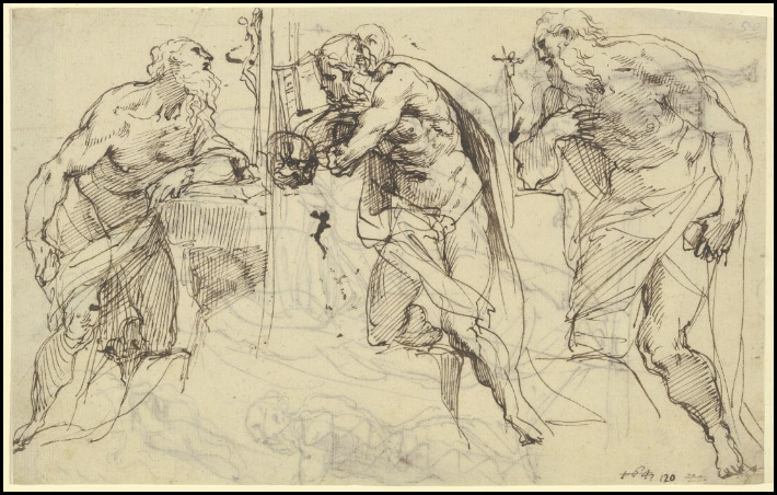
His first documented Neapolitan commission was a cycle illustrating the life of Saint Nicholas in the church of San Nicola alla Dogana, completed in December 1664. Although the frescoes have been destroyed, preparatory drawings associated with the project survive in several collections, including the Louvre, the Albertina in Vienna and Düsseldorf. Fausta Navarro draws attention to their rapid, fluent handling, which gives some indication of Beinaschi’s approach to designing extensive narrative decorations. Further commissions followed in the later 1660s, among them the Cappella Seripando at Santi Apostoli and the Cappella Venata d’Aquino at Santa Maria la Nova.

Saint Nicholas Calming the Waves, a drawing associated with the lost fresco cycle at San Nicola alla Dogana

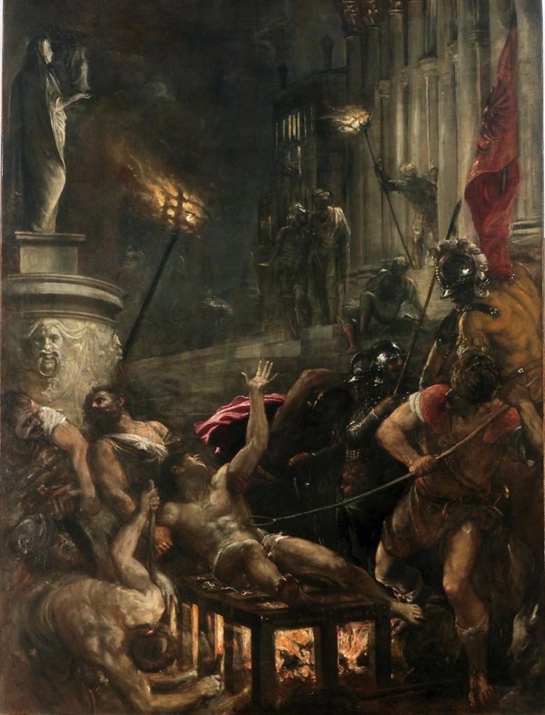
The encounter with Neapolitan painting is especially apparent in the Martyrdom of Saint Erasmus, a large canvas measuring 202 × 280 cm, now in the Museo Diocesano at Salerno. Formerly associated with the collection of the Marchese Ruggi d’Aragona, it was donated to Salerno Cathedral in 1873 and attributed to Beinaschi by Raffaello Causa. Nicola Spinosa dates the work shortly after 1666, identifying connections with Giacinto Brandi’s Crucifixion at Gaeta, which itself recalls Nicolas Poussin’s celebrated Martyrdom of Saint Erasmus in Rome.

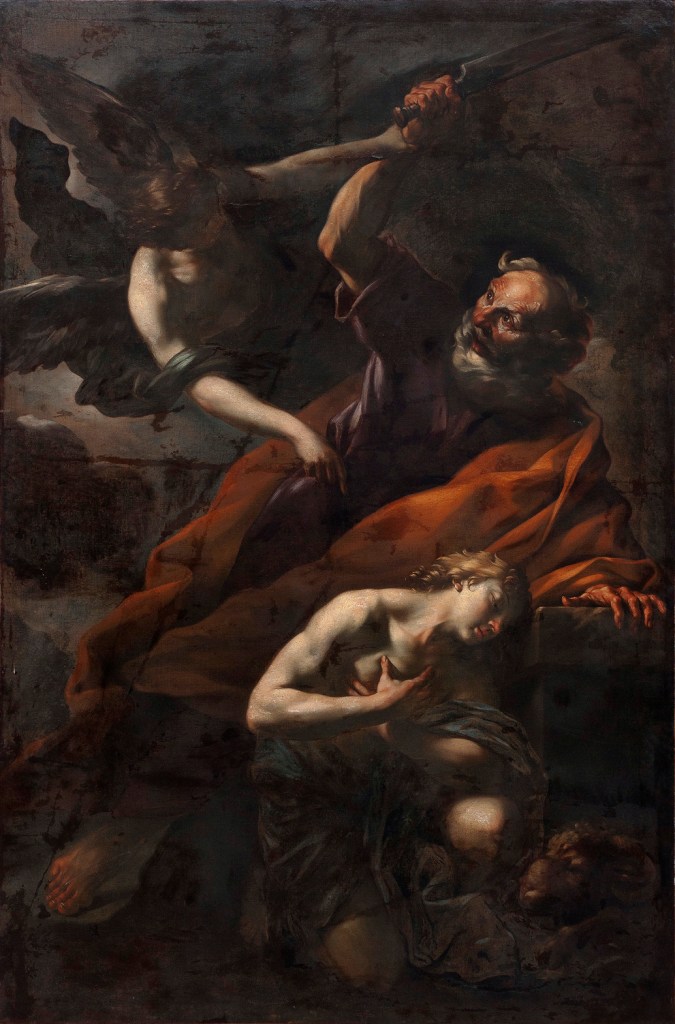
Fausta Navarro places greater emphasis on Mattia Preti’s influence. The painting’s forceful contrasts of illumination, vigorous treatment of the human figure and broad handling of paint recall the dramatic religious compositions Preti had produced in Naples. Navarro describes an execution approaching that of an enlarged oil sketch, in which the immediacy of the handling contributes to the violence of the episode. Spinosa similarly recognises the impact of Neapolitan naturalism, although he also identifies the continued importance of Beinaschi’s Roman models. Another canvas, The Sacrifice of Abraham, now in the Musée des Beaux-Arts at Brest, belongs to the same broad field of expressive biblical painting. Patricia Rubens associates its powerful chiaroscuro and treatment of bodily emotion with the example of Preti.

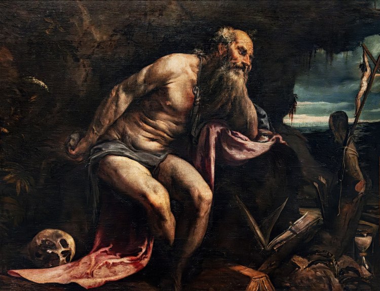
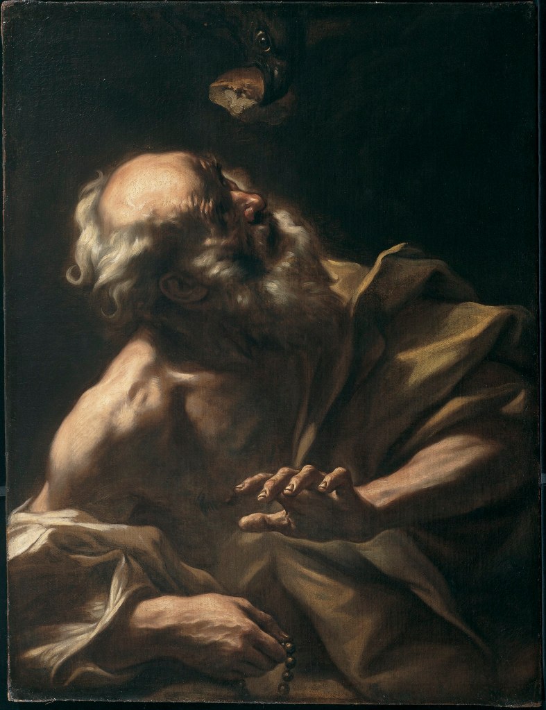
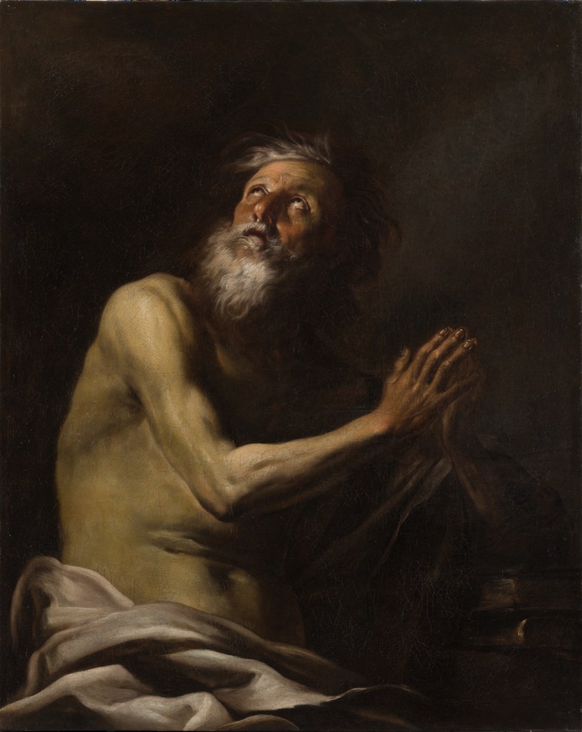
Another painting associated with Beinaschi’s early Neapolitan years is Saint Paul the Hermit, dated to around 1665 and now in the Hood Museum of Art, Dartmouth College.
The demands of monumental decoration occupied an increasing proportion of Beinaschi’s activity. Between 1668 and 1673 he undertook substantial work at Santa Maria degli Angeli a Pizzofalcone, a church whose decorative programme would engage him again in subsequent years. His contributions eventually extended across the vaults, transept walls, counter-façade, tribune, pendentives and cupola. Francesco Petrucci has emphasised the importance of this enterprise in establishing a form of monumental Baroque painting in Naples that could build upon Lanfranco’s achievements while responding to the city’s more recent artistic developments.
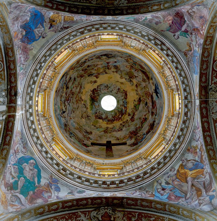
A canvas of Saint John the Baptist Preaching, rediscovered and discussed by Petrucci in 2025, provides an instructive connection with the Pizzofalcone frescoes. Dated approximately 1668–73, it corresponds to a composition on the right transept wall. Petrucci suggests that it may have served either as a preparatory model or as a painted record of the completed fresco. Its precise function has not been established, but the relationship between the two works supplies evidence of the close interaction between Beinaschi’s practice as a painter of canvases and his activity as a monumental decorator.

Saint John the Baptist Preaching, illustrated in the Dorotheum auction catalogue (2024).

Among his most ambitious independent paintings from the period is Joshua Halting the Sun, now in the Musée d’arts de Nantes. The elongated canvas, approximately 132 × 269 cm, illustrates the episode in the Book of Joshua in which the Israelite leader commands the sun and moon to stand still while his forces pursue their enemies. The painting belonged to the collection of François Cacault, which was acquired by the municipality of Nantes in 1810. Formerly attributed to Pietro da Cortona, it was restored to Beinaschi by Roberto Longhi.

Giovanni Battista Beinaschi, Joshua Halting the Sun, oil on canvas, Musée d’arts de Nantes.

Patricia Rubens places Joshua Halting the Sun within the tradition of seventeenth-century Roman battle painting, drawing comparisons with Poussin and Cortona, including the latter’s Battle of Arbela and Victory of Joshua over the Amalekites. She emphasises the extraordinary concentration of figures and the physical violence of the encounter. Joshua’s commanding gesture invokes divine intervention, while the combatants are caught in a succession of forceful movements and contorted poses. Rubens observes that the apparent disorder is controlled by an underlying compositional structure, recalling the arrangement of figures in antique relief sculpture. She is less persuaded by the landscape at the left, which she considers inadequately integrated into the scene.

Spinosa extends the comparisons to the battle paintings of Jacques Courtois, known as Borgognone, and Salvator Rosa. Beinaschi’s familiarity with these painters helps situate the canvas within a wider tradition of military subjects, although Spinosa stresses the individuality of its composition. The combination of crowded action, emphatic diagonals and strongly modelled bodies demonstrates the painter’s ability to translate the movement associated with monumental decoration into the more restricted space of an easel painting.

Rubens also identifies a revealing correspondence between an agonised figure in the Nantes painting and Beinaschi’s Death of Abel, now in the Real Academia de Bellas Artes de San Fernando, Madrid. She relates the expressive treatment of dying bodies to developments in Neapolitan painting after the plague, particularly the works of Preti and Giordano devoted to the city’s suffering and deliverance. In Joshua, the subject’s military violence becomes an opportunity for the heightened physical expression that characterises so much of Beinaschi’s painting. Rubens assigns the canvas to the 1670s, during his first Neapolitan period.

By this time Beinaschi was receiving commissions from several of Naples’s religious institutions. His work at Santa Maria la Nova included the decoration of the Chapel of San Giovanni della Marca, where Navarro identifies further evidence of his engagement with Preti. The activity of the early 1670s was accompanied by continuing exchanges with Roman painting, and in the second half of the decade Beinaschi returned to Rome, where his association with Giacinto Brandi would acquire a more direct professional importance.

The Return to Rome

Beinaschi’s second period of activity in Rome, generally placed between about 1675 and 1680, brought him into renewed contact with Giacinto Brandi, whose painting had already contributed to his artistic development. The two artists shared an interest in emphatic figural expression and strongly contrasted illumination, although Brandi’s work was more closely associated with easel painting and altarpieces than with the extensive decorative programmes in which Beinaschi had distinguished himself.
Their professional relationship is documented in 1678, when Brandi commissioned Beinaschi to execute allegorical frescoes in the church of Santi Ambrogio e Carlo al Corso, usually known as San Carlo al Corso. Representing virtues including Religion, Fortitude, Purity and Chastity, the frescoes formed part of the church’s extensive decorative programme. A final payment was recorded on 15 October of that year.

Another significant undertaking was the decoration of San Bonaventura al Palatino, where Beinaschi supplied paintings including an Annunciation, a Crucifixion and Saint Michael the Archangel. Mario Alberto Pavone dates the principal canvases to shortly after 1677, linking them with the establishment of the Spanish Reformed Franciscans at the convent. He identifies a more concentrated treatment of light and a greater solidity in the construction of figures, qualities he relates to Beinaschi’s renewed encounter with Brandi. The Annunciation is especially important in Pavone’s account of this period, demonstrating the painter’s interest in combining substantial bodily forms with a more controlled distribution of illumination.

The decoration of San Bonaventura also provides an early indication of the activity of Beinaschi’s daughter, Angela Maria, who was born in 1666 and subsequently worked as a painter and draughtswoman. A Deposition in the church bears her signature, and the possibility of her participation in other works associated with her father has attracted scholarly attention. Her contribution to the family workshop would become more significant as Beinaschi’s commissions multiplied.

At Santa Maria del Suffragio, Beinaschi undertook another group of paintings and decorations, including the Resurrection of Lazarus, Daniel in the Lions’ Den and frescoes in the vault of the apse. Pavone assigns these works to the second Roman residence, noting that the church was completed around 1675 and consecrated in 1680. He compares their treatment of the human figure with several canvases attributed to Beinaschi, identifying connections between the representation of Christ in the Resurrection of Lazarus and figures in Christ and the Adulteress.

The latter painting, a substantial canvas measuring approximately 155 × 210 cm and formerly in a private collection at Nocera Inferiore, has occasioned disagreement over its chronology. Pavone places it in the early 1680s, shortly after Beinaschi’s return to Naples from his second Roman residence, whereas Nicola Spinosa favours a date around 1670, during the painter’s first Neapolitan period. Its attribution also has a complicated history. Previously associated with Mattia Preti and Giacomo Farelli, the painting was recognised as Beinaschi’s by Raffaello Causa, an attribution also supported by Ferdinando Bologna.

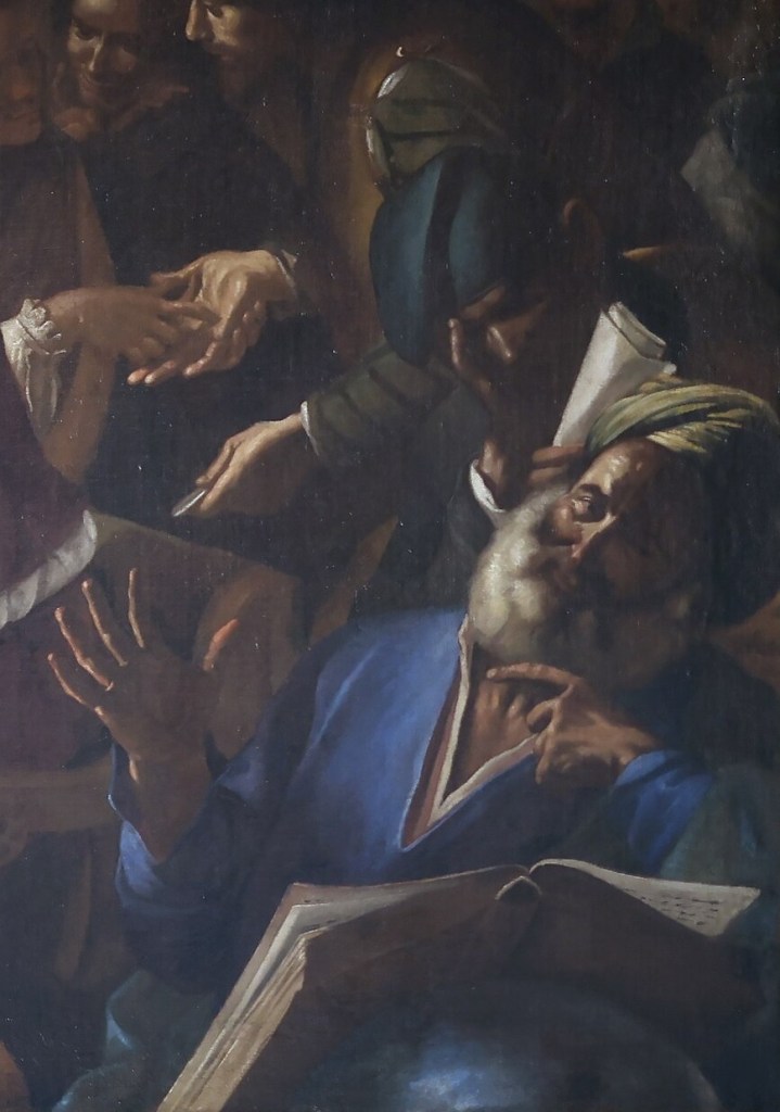
Pavone’s analysis of Christ and the Adulteress is especially extensive. He identifies affinities with Guercino’s treatment of elderly figures, the expressive naturalism of Ribera and the strongly directed illumination associated with Preti. The treatment of the figures also invites comparison with Beinaschi’s Roman paintings, particularly those at Santa Maria del Suffragio. The different dates proposed by Pavone and Spinosa therefore reflect a genuine difficulty in distinguishing successive phases of the painter’s development. Although we need not resolve the disagreement, the painting provides evidence of the continuing relationships between works produced in Rome and Naples.

During these years Beinaschi also encountered the decorative innovations of Giovanni Battista Gaulli, known as Baciccio, whose work was transforming Roman fresco painting. Gaulli’s compositions, with their abundant figures, luminous colouring and dramatic effects of movement, offered possibilities that differed from the more forcefully outlined forms characteristic of Beinaschi’s earlier paintings. Pavone regards the experience of Gaulli’s work as an important element in Beinaschi’s subsequent development, especially in the greater mobility of colour and illumination that emerged in his later Neapolitan decorations.

His Roman activity was not without opposition. According to the account transmitted by Lione Pascoli, Beinaschi encountered hostility from painters associated with the classicising circle of Carlo Maratti. Pavone considers that such opposition may have contributed to his decision to return to Naples, notwithstanding the favourable reception of his paintings at Santa Maria del Suffragio. The episode belongs to the biographical tradition and cannot be treated as a fully documented explanation of his departure. By about 1680, however, Beinaschi had resumed his Neapolitan career, taking up some of the largest decorative commissions of his life.

The Later Neapolitan Commissions

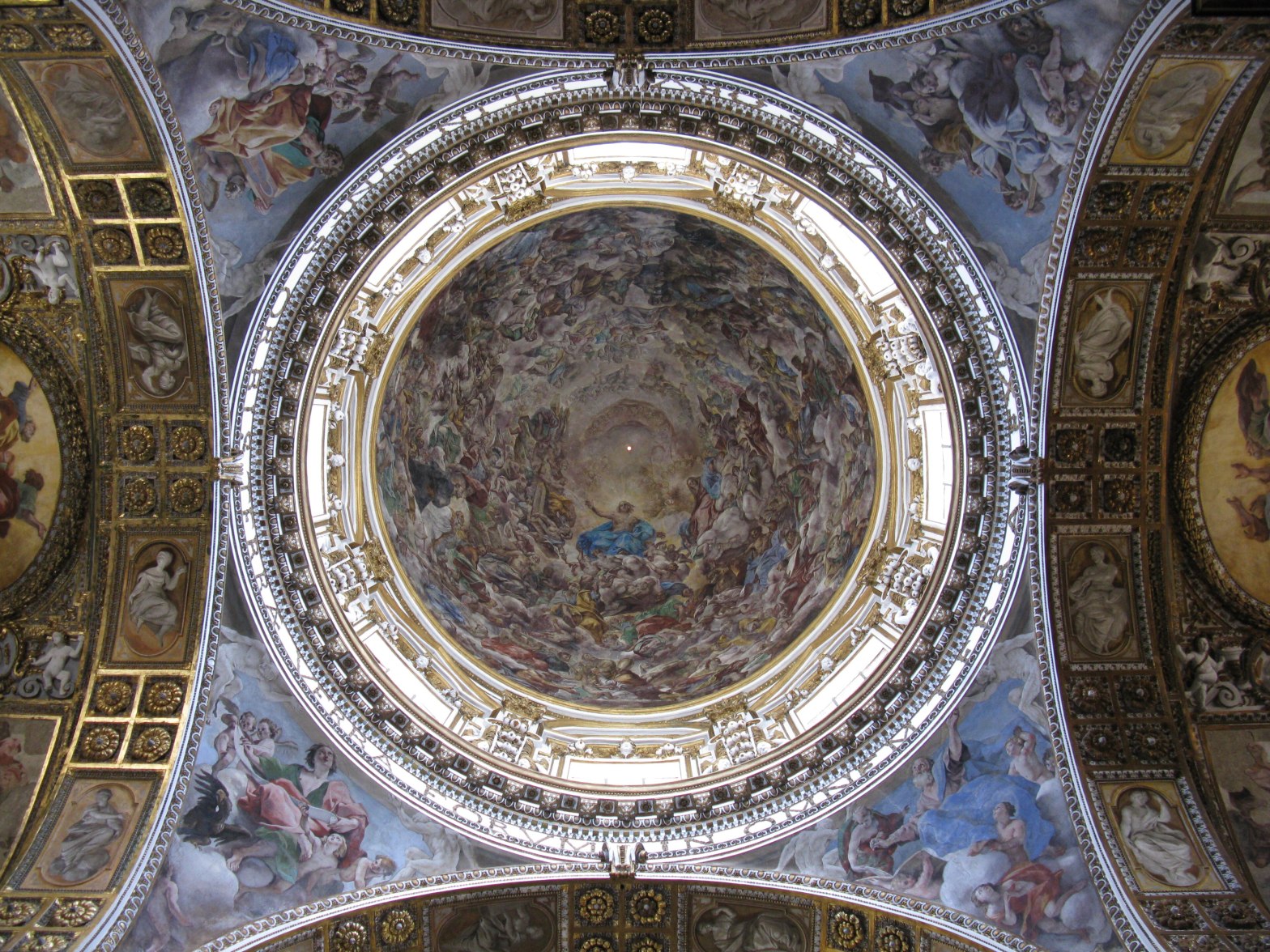
Around 1680, Beinaschi undertook the decoration of the cupola of Santi Apostoli, one of the most ambitious commissions of his career. The church had already been the setting for an extensive decorative programme by Giovanni Lanfranco, who left Naples in 1647 before completing the work. More than thirty years later, Beinaschi was entrusted with the unfinished portions, including the cupola and pendentives. According to Nicola Spinosa, he probably worked with reference to Lanfranco’s surviving designs and the requirements of the Theatine fathers, adapting an inherited scheme to the artistic circumstances of the 1680s.
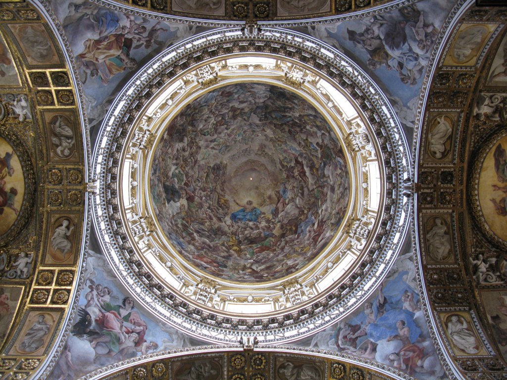
The resulting Paradise, executed around 1680–82, established Beinaschi’s command of large-scale illusionistic decoration. Its crowded assembly of heavenly figures required an organisation capable of accommodating individual groups within the continuous space of the cupola. Spinosa identifies a change in the painter’s handling of colour and light, with a richer palette and more luminous effects than in his earlier work. The example of Giovanni Battista Gaulli, encountered during the second Roman residence, had become important in this respect. Beinaschi’s more freely painted forms and expansive use of illumination modified the monumental conception he had inherited from Lanfranco.

The figure of God the Father recurs in Beinaschi’s paintings. A canvas sold at Sotheby’s in 2024, probably dating from his final years, has been related to Lanfranco’s treatment of the subject and to several other versions recorded in the Pacelli–Petrucci catalogue.

Giovanni Battista Beinaschi, God the Father, Sotheby’s, 10 April 2024, lot 23.

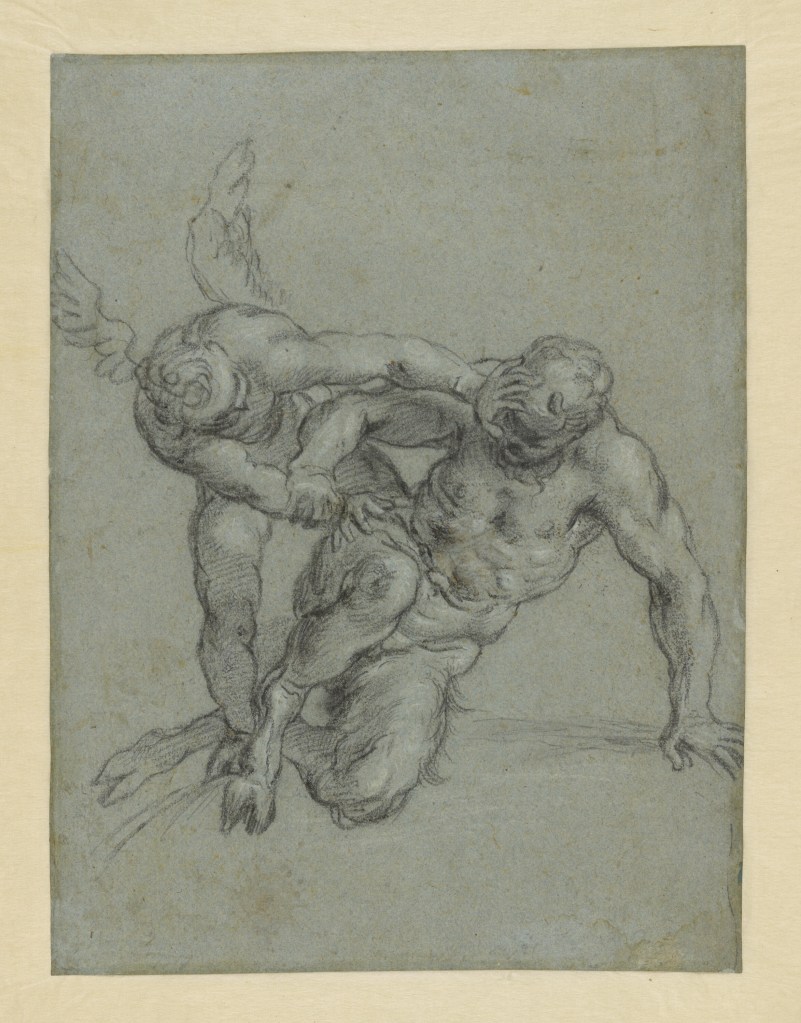
The commission also illuminates the extent of Beinaschi’s preparatory work. A drawing of Saint Stephen, discussed by Francesco Grisolia, has been identified as a study for the corresponding figure in the Paradise. Executed in black and white chalk on blue paper, it demonstrates the energetic construction of the figure through emphatic contours and the selective application of white heightening. Related drawings associated with the decoration survive at Windsor, Ottawa and Düsseldorf.

Giovanni Battista Beinaschi, Study of Saint Stephen (detail), discussed by Francesco Grisolia, in Romano Fine Art, catalogue no. 12, pp. 46–48.

Research on the Düsseldorf collection has shown that Beinaschi generally prepared his compositions through successive stages, beginning with multi-figure sketches in wash and proceeding to more detailed studies of individual figures. The vigorous execution of his frescoes was thus preceded by a substantial process of graphic preparation. The participation of assistants, among them Orazio Frezza at Santi Apostoli, made the organisation of this work especially important.

Two canvases now in the Real Academia de Bellas Artes de San Fernando, Madrid, offer a different perspective on Beinaschi’s mature painting. The Death of Abel and Adam and Eve Mourning Abel, both approximately 116 cm square, belong to a group of compositions concerned with the earliest consequences of human violence. Although their precise dates are uncertain, Spinosa assigns them to the painter’s advanced maturity, noting their incisive treatment of the figures and comparatively restrained chiaroscuro. The paintings were already attributed to Beinaschi by 1819 and may originally have belonged to the Premonstratensian convent of San Norberto in Madrid, as suggested by Alfonso E. Pérez Sánchez.
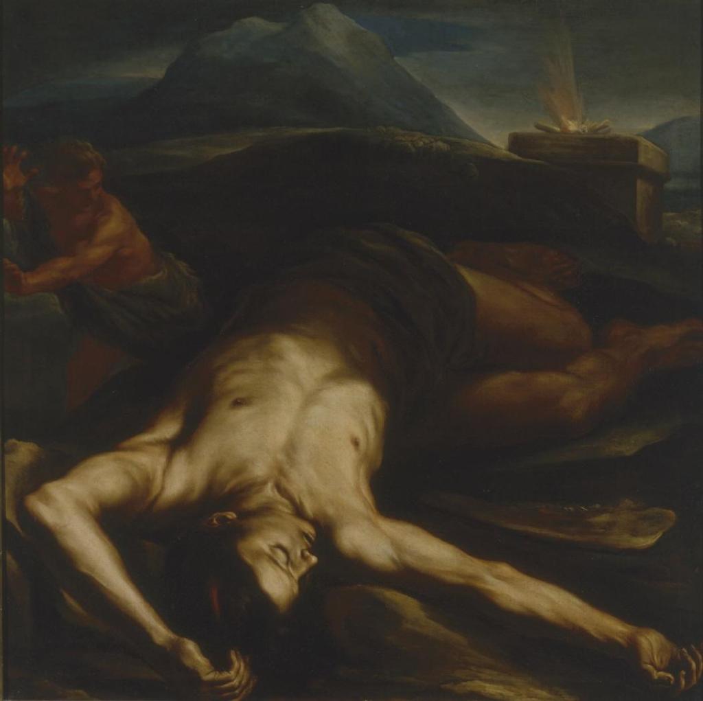
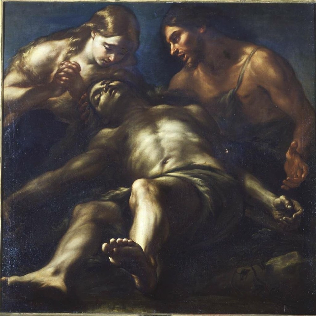
The two subjects are complementary. The death of Abel introduces the first murder into the biblical narrative, while the mourning of Adam and Eve concerns its consequences for the first human family. Their association allows Beinaschi’s interest in violent action and bodily expression to be considered alongside the representation of grief. As mentioned earlier, Patricia Rubens has compared an agonised figure in Joshua Halting the Sun with The Death of Abel, while Fausta Navarro identifies affinities between the Madrid paintings and the works associated with San Bonaventura al Palatino in Rome. The possible involvement of Angela Maria Beinaschi in Adam and Eve Mourning Abel has also been considered, although the extent of any collaboration remains uncertain.

Meanwhile, Beinaschi’s Neapolitan commissions continued to multiply. In 1681 he worked at the Girolamini, where frescoed figures of Mary Magdalene, Saint John the Baptist and Saint Augustine formed part of the church’s decoration. Further work followed at Santa Maria dei Miracoli, including scenes from the life of the Virgin, and at the Gesù Nuovo, where the decoration of the Chapel of the Crucifix is documented by a payment in April 1685. He also continued his extensive involvement at Santa Maria degli Angeli a Pizzofalcone, whose decorations had occupied him intermittently since the late 1660s.

The largest undertaking of these years was the decoration of Santa Maria delle Grazie a Caponapoli, carried out between approximately 1681 and 1686. The programme included extensive frescoes and large canvases, among them an Annunciation and a Visitation associated with the high altar. Spinosa also records a Madonna delle Grazie in Glory in the apse. In these works he recognises the increased luminosity and richness of colour characteristic of Beinaschi’s final period, together with the continuing importance of monumental figure construction.

The scale of the Caponapoli commission required the participation of assistants, including Orazio Frezza and Giuseppe Castellano. Spinosa suggests that Beinaschi may have maintained responsibility for the designs while entrusting substantial portions of their execution to collaborators. Angela Maria’s activity belongs within the same workshop environment. Recent research on the Düsseldorf collection has tentatively attributed more than sixty drawings to her, including studies copied after works by her father. If accepted, these attributions would considerably enlarge her surviving oeuvre and provide valuable evidence of artistic training and collaboration within the Beinaschi workshop.

Much of the decoration at Caponapoli has subsequently been destroyed or severely damaged. Francesco Petrucci, who visited the neglected church with Vincenzo Pacelli in 2010, recalls photographing Beinaschi’s funerary inscription there. The inscription records his death on 28 September 1688, preserving a tangible connection between the painter and the church that occupied so much of his final working life.

Donate to Inner Surfaces here.

Bibliography

These are the sources consulted. Any errors are mine.

Bean, Jacob, and Walter Vitzthum, ‘Disegni di Lanfranco e del Beinaschi’, Bollettino d’arte, 46 (1961), pp. 106–122.

De Dominici, Bernardo, Vite de’ pittori, scultori ed architetti napoletani, vol. III (Naples, 1844), pp. 534–539.

Ferrari, Oreste, ‘Beinaschi, Giovan Battista’, in Dizionario Biografico degli Italiani, vol. 8 (Rome, 1966), pp. 170–171.

Grisolia, Francesco, «Famoso disegnatore». I disegni di Giovan Battista Beinaschi nella collezione della Kunstakademie Düsseldorf al Kunstpalast (Petersberg: Michael Imhof Verlag, 2019).

Navarro, Fausta, catalogue entries 2.7–2.8, in Civiltà del Seicento a Napoli, exhibition catalogue (Naples: Electa Napoli, 1984), pp. 191–192.

Navarro, Fausta, ‘Giovan Battista Beinaschi’, in Mina Gregori and Erich Schleier (eds), La pittura in Italia: Il Seicento, vol. II (Milan: Electa, 1989), pp. 630–631.

Pacelli, Vincenzo, and Francesco Petrucci (eds), Giovan Battista Beinaschi: Pittore barocco tra Roma e Napoli (Rome: Andreina & Valneo Budai Editori, 2011).

Pascoli, Lione, Vite de’ pittori, scultori ed architetti moderni, vol. II (Rome, 1736), pp. 223–234.

Pavone, Mario Alberto, ‘Per Giovan Battista Beinaschi’, Prospettiva, 46 (July 1986), pp. 31–41.

Petrucci, Francesco, ‘Pittura barocca da Roma a Napoli, e viceversa’, in Francesco Petrucci (ed.), Genesi e divenire del Barocco tra Roma e Napoli: Dipinti da Palazzo Chigi in Ariccia e dalla collezione Koelliker, exhibition catalogue (Rome: De Luca Editori d’Arte, 2025), pp. 29–35.

Rubens, Patricia, ‘Giovanni Battista Beinaschi’, in Seicento: le siècle de Caravage dans les collections françaises, exhibition catalogue (Paris: Éditions de la Réunion des musées nationaux, 1988), pp. 128–129.

Spinosa, Nicola, Pittura del Seicento a Napoli: Da Mattia Preti a Luca Giordano. Natura in posa (Naples: Arte’m, 2011), pp. 146–155.

Tostmann, Oliver, review of Die Zeichnungen des Giovan Battista Beinaschi aus der Sammlung der Kunstakademie Düsseldorf am Kunstpalast, edited by Sonja Brink and Francesco Grisolia, The Burlington Magazine, 163 (June 2021), pp. 556–557.
Agostino Carracci: Drawing and Invention

Agostino and the Carracci

Agostino Carracci (1557–1602) belonged to one of the most influential artistic families of late sixteenth-century Italy. Together with his younger brother Annibale (1560–1609) and their cousin Ludovico (1555–1619), he participated in the renewal of Bolognese painting that would have far-reaching consequences for Italian art. The three artists shared a commitment to the study of nature, drawing from life and sustained engagement with the achievements of earlier painters. Their collaboration, both in the studio and on major decorative commissions, occupied an important place in Bolognese artistic life during the 1580s and 1590s.

Agostino’s contribution was distinctive. Trained as an engraver, he acquired a formidable technical command of printmaking and produced reproductive engravings after artists including Titian, Tintoretto and Veronese. Travel, especially to Venice, gave him opportunities to study works by painters he admired. He was also a painter, a teacher and a man of considerable learning, with interests extending to literature, mathematics and the intellectual culture of his time. His contemporaries recognised both his technical accomplishments and the breadth of his knowledge.

Drawing occupied a central place in these activities. For Agostino, it was not simply a preliminary stage in the production of paintings or engravings, but a means of studying the human figure, developing compositions and testing visual ideas. His surviving sheets encompass studies from life, preparatory sketches, decorative designs and elaborate pen drawings.

Engraving and the Practice of Drawing

Agostino’s early career was closely associated with engraving, a discipline that required exceptional control of line and a thorough understanding of the works being reproduced. He trained in Bologna with the engraver Domenico Tibaldi and subsequently developed his skills through the study of paintings by leading Italian masters. By the early 1580s he had established himself as a prolific printmaker, producing engravings after works by artists including Federico Barocci, Paolo Veronese and Tintoretto. His engravings helped disseminate celebrated compositions beyond their original locations.

The translation of painting into engraving involved more than the accurate transcription of contours. Agostino had to find graphic equivalents for differences of tone, texture and illumination, using systems of hatching and closely controlled lines to convey the effects of colour and brushwork. His experience as a printmaker contributed to a highly developed command of graphic technique, although his drawings reveal methods considerably more varied than the disciplined execution of his finished prints.

Drawing was equally fundamental to the educational programme developed by the Carracci in Bologna. Their academy, generally dated to the early 1580s, encouraged direct observation, life drawing, anatomical study and the examination of earlier art. Students worked from the living model and explored the expressive possibilities of different media. The Carracci also cultivated informal exercises, including caricature and rapid sketches, alongside the more systematic preparation of paintings and decorative schemes.

Agostino brought his technical expertise and scholarly interests to this environment. Contemporary accounts associate him with the teaching of perspective and other aspects of artistic theory. His practice encompassed studies of individual figures, compositional inventions and ornamental designs, sometimes combining several kinds of enquiry on a single sheet.

Drawing from Life and the Human Figure

The study of the human figure was central to the Carracci’s artistic education. Their practice combined observation of the living model with anatomical study and the examination of earlier masters. Agostino participated in this programme both as a draughtsman and as a teacher, alongside his activities as an engraver. His surviving drawings include studies of heads, limbs and complete figures, using a range of media that includes chalk, pen and ink, and wash.

The drawings were not all made for the same purpose. Some served the preparation of paintings or engravings, while others allowed the artist to investigate a pose, an anatomical detail or the movement of a figure without committing himself to a finished composition. The variety of these exercises is evident in a double-sided sheet at the Metropolitan Museum of Art, Seated Nude Male Figure; Ornamental Designs, a Grotesque Head, and a Leg, dated to around 1590–93. Studies of the body appear alongside decorative motifs, bringing different aspects of Agostino’s graphic practice together on a single support.

Chalk offered other possibilities. Agostino used red and black chalk for studies of individual figures and heads, sometimes in preparation for large decorative projects. Drawings associated with the Carracci frescoes at Palazzo Fava and Palazzo Magnani have helped scholars distinguish his working methods from those of Annibale and Ludovico. Mary Vaccaro’s research has drawn attention to Agostino’s sharply defined, sometimes angular contours and his use of parallel and intersecting strokes of chalk to model the figure. She contrasts these features with the smoother outlines and more delicate shading found in Annibale’s red-chalk studies of the same period.

The Carracci’s exercises also allowed room for exaggeration, humour and the invention of unfamiliar forms. Contemporary accounts associate their academy with caricature and playful graphic exercises, activities that provided opportunities to explore the expressive possibilities of the human face and figure.

Drawing and Compositional Invention

Agostino’s preparatory drawings reveal a methodical approach to the development of compositions, although the surviving examples vary considerably in their degree of finish. Some record an initial idea in rapidly drawn lines; others establish the relationships between figures, architectural settings and decorative elements with greater precision. The degree of finish depended partly on a drawing’s purpose. A drawing made for the artist’s own use could remain provisional, while a design intended for an engraver or for execution by another painter required a more fully developed composition.

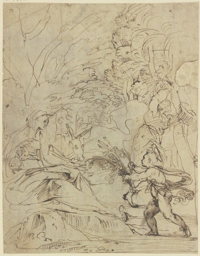
Ann Sutherland Harris has examined Agostino’s methods of invention through a series of pen-and-ink studies associated with identifiable commissions. One example is a drawing in the Städel Museum, Frankfurt, showing the Holy Family resting during the Flight into Egypt. Harris identifies it as an early study for a composition that was subsequently engraved, around 1595, by Francesco Brizio, a younger artist who trained with the Carracci and worked closely with Agostino as an engraver. The composition underwent considerable alteration: Joseph and the donkey disappeared, and the position of the Christ Child changed, although the Virgin’s distinctive pose was retained. The Frankfurt sheet appears to record an early stage in the development of a print for which Agostino supplied the invention and Brizio executed the engraving.

Francesco Brizio, The Virgin Nursing the Christ Child in a Landscape

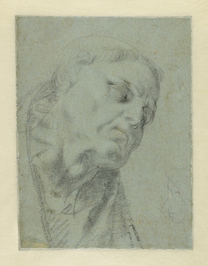
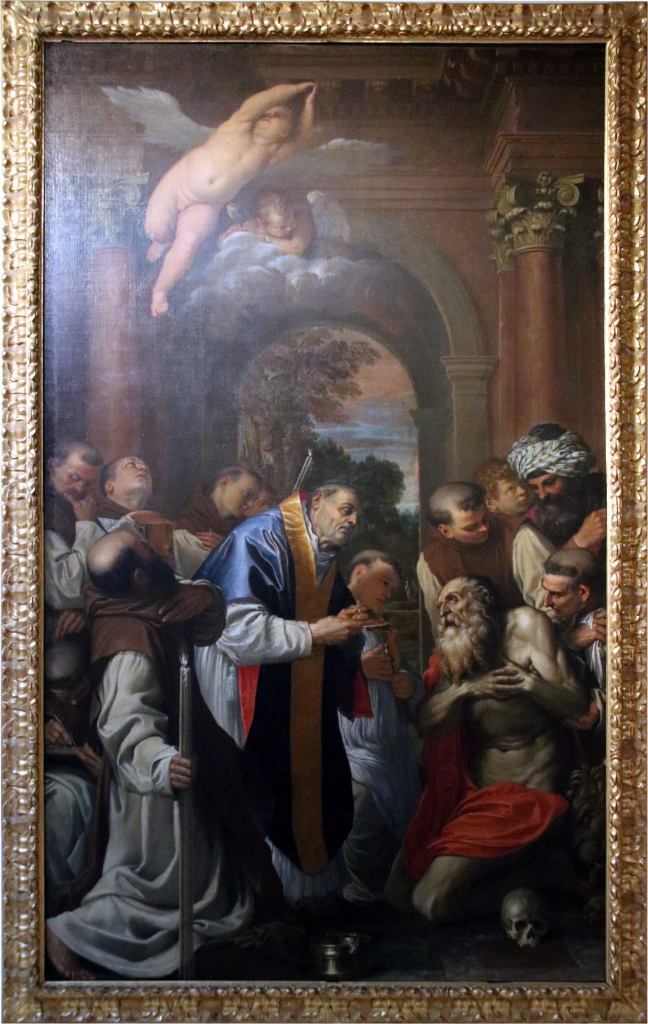
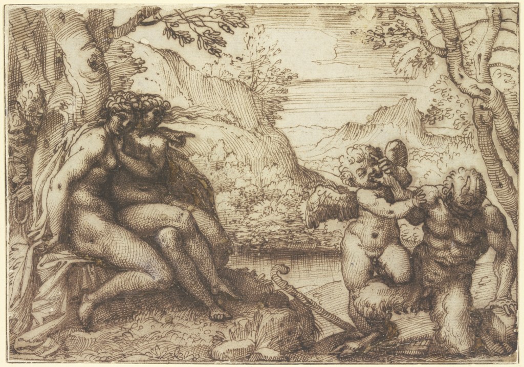
The preparation of paintings could involve a similarly sustained examination of individual figures and their relationships within a composition. Several drawings survive for Agostino’s Last Communion of St Jerome, painted for the Carthusian monastery of San Girolamo della Certosa in Bologna and now in the Pinacoteca Nazionale. Mario Di Giampaolo has discussed a double-sided sheet on which a study of the priest administering the sacrament appears opposite a composition of Cupid Subduing Pan, related to Agostino’s decoration of Palazzo Magnani. Other surviving studies for the altarpiece include individual figures and anatomical details, principally executed in black chalk.

The Last Communion was among Agostino’s most important achievements as a painter. Its preparations illustrate the attention he gave to the figures who would participate in a complex religious narrative. They also belong to a period in which his familiarity with Venetian painting informed his treatment of large-scale compositions. Di Giampaolo discusses the influence of Veronese on Agostino’s religious paintings and compares the effects of illumination in a preparatory drawing for the Adoration of the Shepherds with those of Jacopo Bassano.

Agostino Carracci, The Adoration of the Shepherds, c. 1592–94

The Later Pen Drawings

During the 1590s, Agostino developed an increasingly elaborate manner of drawing in pen and ink. Ann Sutherland Harris has traced a movement from the comparatively rough and economical sketches of his earlier career towards drawings characterised by flowing contours, emphatic hatching and a more calligraphic handling of line. His experience as an engraver remained evident in the control and variation of his strokes, although the pen offered greater freedom than the burin used to cut lines into a copper plate.

Harris has suggested that the Dutch engraver Hendrick Goltzius, who visited Bologna in 1590–91, may have contributed to this development. Goltzius was celebrated for his command of line and his ability to suggest volume through elaborate systems of swelling contours and hatching. Agostino’s drawings for Amor Vincit Omnia, engraved in 1599, and Venus, Vulcan and Cupid demonstrate a comparable interest in the expressive possibilities of penwork. In these sheets, the manipulation of line becomes an accomplished graphic performance as well as a means of preparing a composition.

Agostino Carracci, Venus, Vulcan and Cupid, late 1590s

Having worked with Annibale on the decoration of the Farnese Gallery in Rome, Agostino left for Parma in 1600, following tensions between the brothers. There he entered the service of Duke Ranuccio Farnese and undertook mythological frescoes depicting the story of Peleus and Thetis in the Palazzo del Giardino. The project remained unfinished when Agostino died in February 1602.

Drawings associated with the Parma decorations display the fluency and variety of his late pen technique. A sheet in the Hamburger Kunsthalle contains several alternative studies for Thetis riding a sea creature, together with anatomical studies and other figures. The repetition of poses and the juxtaposition of different subjects recall the working sheets discussed earlier, although the handling of the pen is more expansive. Other drawings from this period survive at Windsor Castle, including studies of legs and feet, figures in movement and exercises in perspective.

Agostino Carracci, studies for Thetis Riding a Sea Creature, c. 1600–02

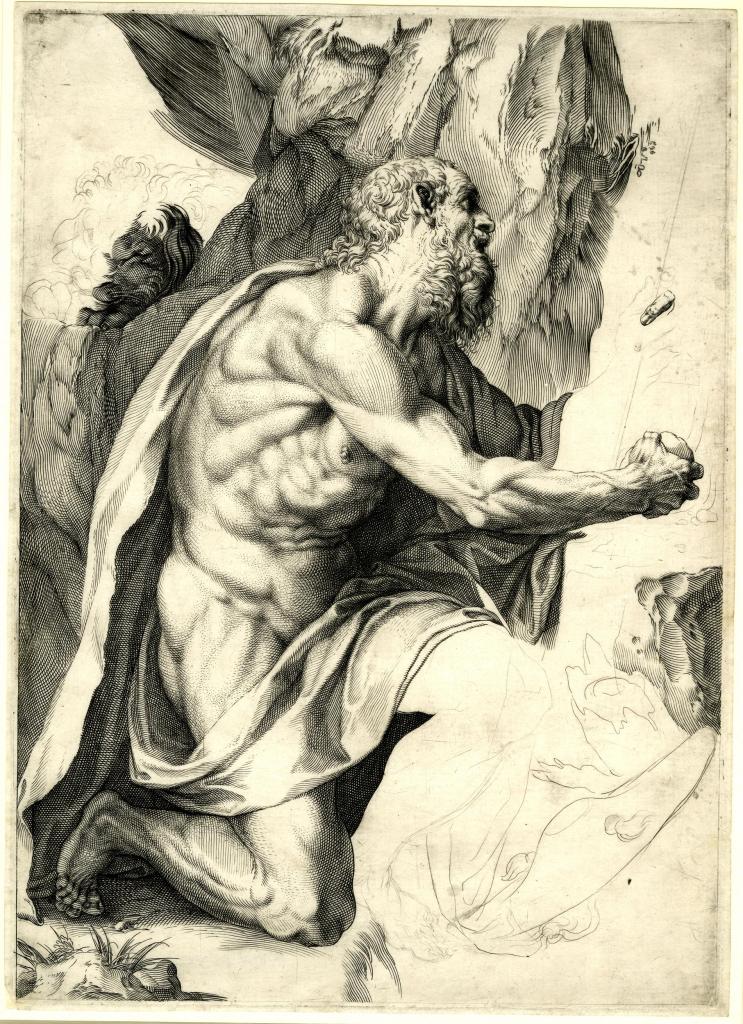
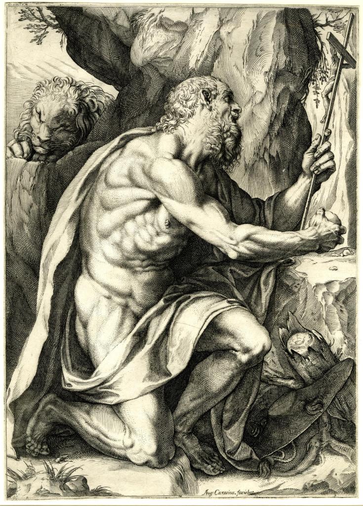
Recent research by Mary Vaccaro has supplied additional evidence for dating some of these drawings. In an article published in 2026, she identifies a watermark found on several Windsor sheets and on drawings in other collections, connecting the paper with material used in Parma around the time of Agostino’s employment at the Farnese court. Her findings support the attribution of a group of energetic pen studies to the artist’s final years, rather than to the earlier period of teaching and experimentation in Bologna. Among the related works is a sheet in Frankfurt containing studies for an engraving of the penitent St Jerome, left unfinished at Agostino’s death.

Collaboration and Artistic Identity

The fresco cycles at Palazzo Fava and Palazzo Magnani had depended upon close collaboration between the three Carracci, who exchanged ideas and sometimes contributed to the same compositions. Carlo Cesare Malvasia, writing in the seventeenth century, recalled their collective attitude to authorship in the declaration L’abbiam fatta tutti noi (‘We all did it’). Their close working relationship has also made it difficult for later scholars to distinguish their individual contributions, particularly among the surviving preparatory drawings.

Agostino’s involvement extended beyond the execution of designs conceived by his relatives. His preparations for the frescoes at Palazzo Fava, including drawings for narrative figures and decorative ornament, demonstrate his participation in developing the compositions themselves. Mary Vaccaro has argued that several studies formerly attributed to Annibale should instead be recognised as Agostino’s work. The proposed reattributions also suggest how ideas could develop through an exchange between the brothers, whose respective contributions were not always confined to separate stages of production.

Attributed to Agostino Carracci, Studies for Decorative Consoles, c. 1585

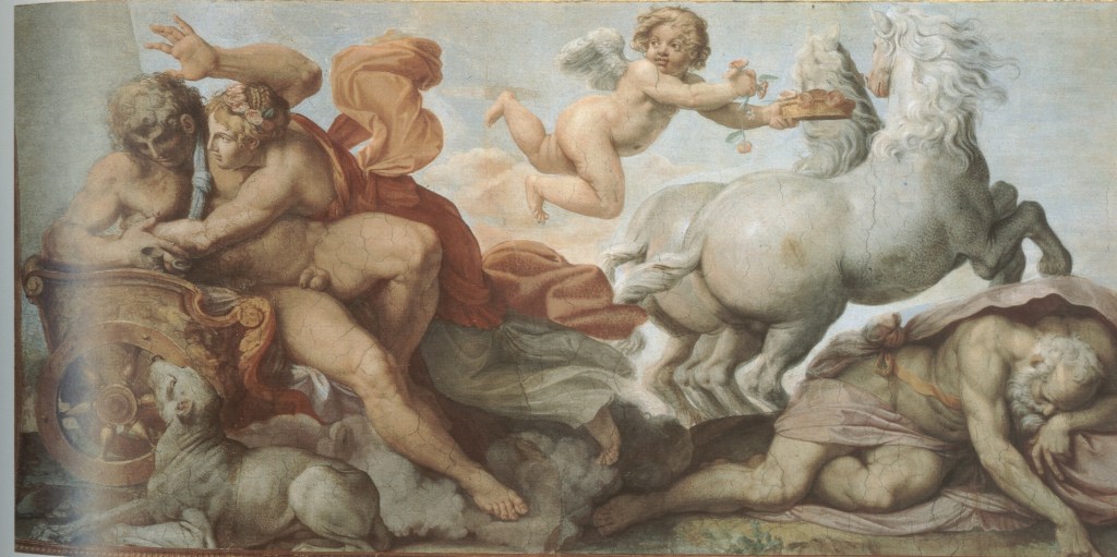
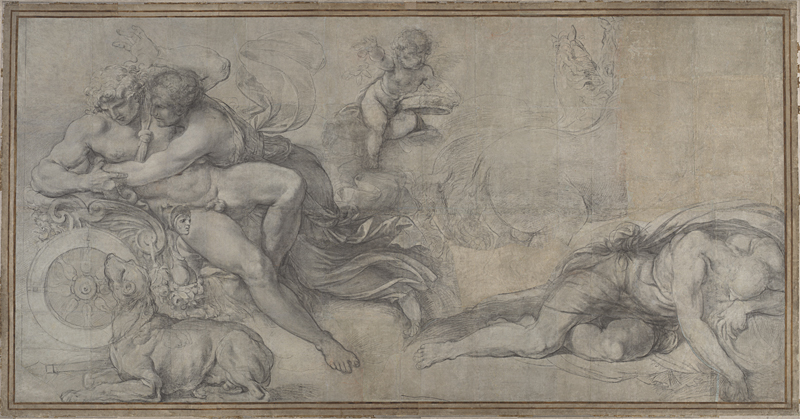
The same collaborative practice continued in Rome, where Agostino assisted Annibale with the decoration of the Farnese Gallery. He was responsible for two of the large mythological scenes on the vault, including Aurora and Cephalus. Diane De Grazia has examined the surviving preparatory drawings and cartoons, arguing that Agostino devised these compositions while Annibale subsequently introduced alterations to individual figures. Her research gives greater prominence to Agostino’s participation in the invention of the Gallery’s decoration, although the division of responsibilities remains a subject of scholarly discussion.

Agostino’s reputation among his contemporaries rested upon a combination of artistic skill and intellectual accomplishment. His knowledge of literature, mathematics and artistic theory distinguished him within the Carracci circle, while his activities as an engraver, painter, draughtsman and teacher gave his career an unusual breadth. His drawings preserve something of that range, from the study of individual figures to the preparation of engravings, paintings and large decorative schemes.

Donate to Inner Surfaces here.

Bibliography

De Grazia, Diane, ‘L’altro Carracci della Galleria Farnese: Agostino come inventore’, in Les Carrache et les décors profanes: Actes du colloque de Rome (2–4 octobre 1986), Rome: École française de Rome, 1988, pp. 97–113.

Di Giampaolo, Mario, ‘Da Venezia a Bologna: un importante disegno di Agostino Carracci’, Prospettiva, nos. 57–60 (1989–90), pp. 153–55.

Harris, Ann Sutherland, ‘Agostino Carracci’s Inventions: Pen-and-Ink Studies, 1582–1602’, Master Drawings, 38, no. 4 (Winter 2000), pp. 393–423.

Robertson, Clare, ‘The Carracci as Draughtsmen’, in Clare Robertson and Catherine Whistler, Drawings by the Carracci from British Collections, Oxford: Ashmolean Museum, 1996, pp. 27–35.

Vaccaro, Mary, ‘Two Red Chalk Drawings in the Uffizi by Agostino (not Annibale) Carracci’, Master Drawings, 54, no. 2 (Summer 2016), pp. 225–34.

Vaccaro, Mary, ‘Towards a Study of Watermarks on Carracci Drawings at Windsor Castle and Elsewhere’, The Burlington Magazine, 168, no. 1483 (October 2026), pp. 950–59.

Antonio Mancini: A Painter’s World

Antonio Mancini (1852–1930) was celebrated during his lifetime for the extraordinary vitality of his painting, his command of colour and light, and the unconventional methods through which he achieved his effects. His reputation rested initially upon the paintings of Neapolitan street children, the scugnizzi, and young performers, among them the much-depicted Luigiello. Later, his portraits attracted an international clientele, while the increasingly substantial applications of pigment and unusual materials employed in his mature work became objects of fascination in their own right. Yet the emphasis frequently placed upon Mancini’s instinctive gifts and technical brilliance has sometimes obscured the breadth of his artistic culture.

Cinzia Virno has challenged the longstanding characterisation of Mancini as an intellectually unsophisticated artist, drawing attention to his extensive correspondence, notebooks and personal relationships. His writings, frequently composed on whatever paper came to hand, reveal a sustained preoccupation with pictorial problems and a close interest in the work of other painters. Although their often agitated and ungrammatical language can make them difficult to interpret, they provide considerable evidence of his artistic thinking. Mancini was especially concerned with the representation of observed reality through relationships of colour, tone and light. Fidelity to nature did not mean the mechanical transcription of appearances, but their organisation into a convincing pictorial whole.

His artistic education began in Naples, where he studied drawing with the sculptor Stanislao Lista before entering the academy and becoming a pupil of Domenico Morelli, for whom he retained profound admiration. The city’s churches and collections also afforded opportunities to study Caravaggio and the seventeenth-century Neapolitan painters, notably Jusepe de Ribera, Massimo Stanzione and Mattia Preti. Their treatment of the human figure and the dramatic possibilities of illumination formed part of the artistic inheritance upon which Mancini drew. His knowledge of this tradition was not confined to formal instruction: he repeatedly sought out paintings that interested him and examined their methods of execution.

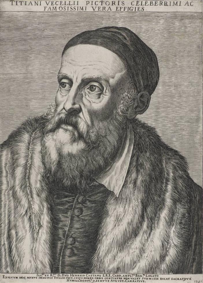
A journey to Venice in 1872, undertaken with Albert Cahen d’Anvers, made a particularly strong impression. Mancini admired Titian’s tonal painting and Tintoretto’s colour, writing to his parents that he had encountered an exceptional collection of pictures at the Accademia and regretting that he had not seen them before beginning his training. His admiration for Titian persisted. Ugo Ojetti later recalled Mancini’s fascination with Titian’s Portrait of Pope Paul III, which he had attempted unsuccessfully to copy when young. He continued to study its drawing, modelling, brushwork, tonal relationships and glazes, regarding it as an unsurpassed achievement.

Mancini’s artistic horizons widened further through his meeting with Mariano Fortuny in Naples in 1874 and his visits to Paris in 1875 and 1877–78. He encountered contemporary French painting and knew Edgar Degas, although Virno cautions against attributing too much of his development to French influence. In Rome, his interests extended to Rubens, Frans Hals and Flemish painting, while Diego Velázquez became an especially important point of reference. Mancini reflected upon Velázquez’s Portrait of Innocent X, in the Galleria Doria Pamphilj, admiring the apparent freedom of its execution, the subtle organisation of chiaroscuro and the extraordinary harmony achieved through passages of paint that could seem almost accidental when viewed closely. At the proper distance, these individual touches resolved into a unified image. He contrasted Velázquez’s directness with the laborious imitation of Old Master techniques by painters preoccupied with elaborate procedures of glazing.

Such observations illuminate Mancini’s own conception of painting. The distinction between the physical appearance of brushwork and its effect upon the spectator, the relationship between spontaneity and preparation, and the capacity of colour to establish form were recurring concerns throughout his career. They also help to explain why his apparently unorthodox procedures were accompanied by sustained reflection on the practical and expressive possibilities of his medium.

Mancini’s artistic culture provides a starting point for this exploration of his world as a painter. The essay concentrates upon the studio and its arrangements of models, costumes, paintings, sculptures and other objects; upon his representations of artistic activity; upon the materials and techniques through which he developed his distinctive pictorial language; and upon the self-portraits in which he reflected upon his own identity and profession. This particular focus leaves other important aspects of his achievement in the background, notably his extensive production of drawings and pastels and his landscapes, to which he returned with renewed interest in his later years.

The Studio, Models and Artistic Invention

The studio occupied a central place in Mancini’s artistic practice. Although he insisted upon direct observation, his paintings frequently emerged from carefully arranged settings in which models, costumes, fabrics and miscellaneous objects were brought together for their pictorial possibilities. Cinzia Virno emphasises the preparation that preceded his apparently spontaneous execution. Mancini selected and dressed his models, established their poses, arranged the lighting and assembled the objects surrounding them. Once these conditions were settled, he generally worked rapidly, translating his observations directly into paint.

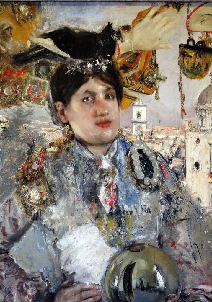
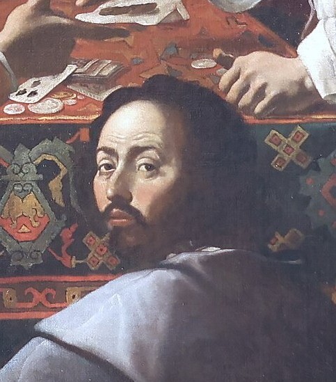
The environments he constructed could be extraordinarily elaborate. In La Corallaia, a young woman appears among an assortment of colourful objects, including a glass sphere that Virno associates with Mancini’s knowledge of Jan van Eyck. In I poveri si divertono con le gioie dei ricchi (1873), the heads of Luigiello and a young girl emerge from an arrangement of puppets, playing cards, a sword, fabrics and other possessions. Describing Mancini’s studio around 1920, the critic Cipriano Efisio Oppo recalled an accumulation of frames, theatrical ornaments, sculptural busts, prints, photographs, reproductions, books, mirrors and textiles. These materials supplied the painter with an extensive repertory from which to construct his settings.

In La modella (1878–79), Mancini brought the female model and the activity of painting together within a single composition. The picture retains something of the French artistic atmosphere he had encountered during his recent stay in Paris. Virno dates its execution to late 1878, shortly after his return to Naples in October. The small figure of a painter in the background was formerly identified as Mancini himself, but Virno cites the testimony of the artist’s nephew Alfredo, who recognised the figure as Mancini’s younger brother Angelo. The painting thus brings a member of the artist’s family into a representation of the working studio.

View La modella (1878–79), reproduced on Fine Art America.

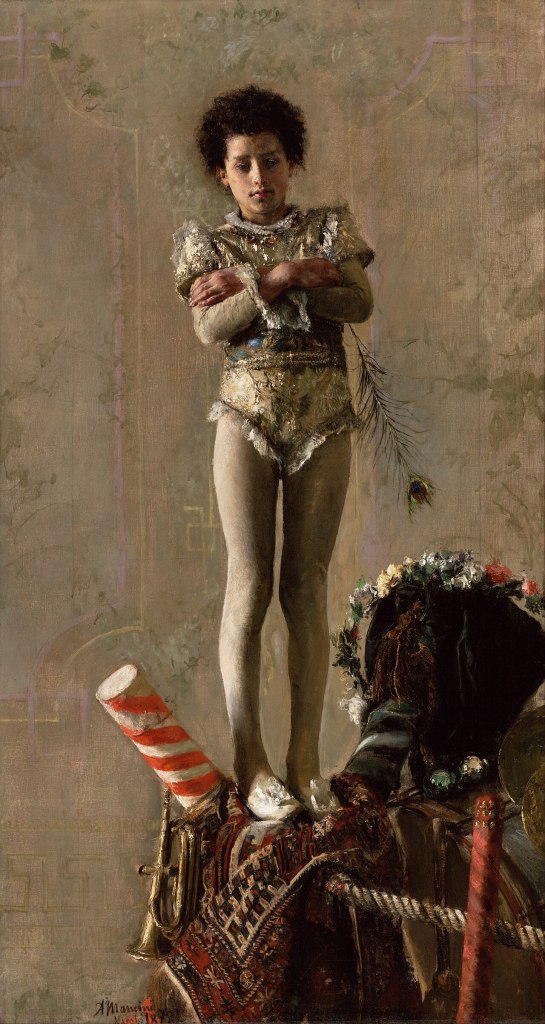
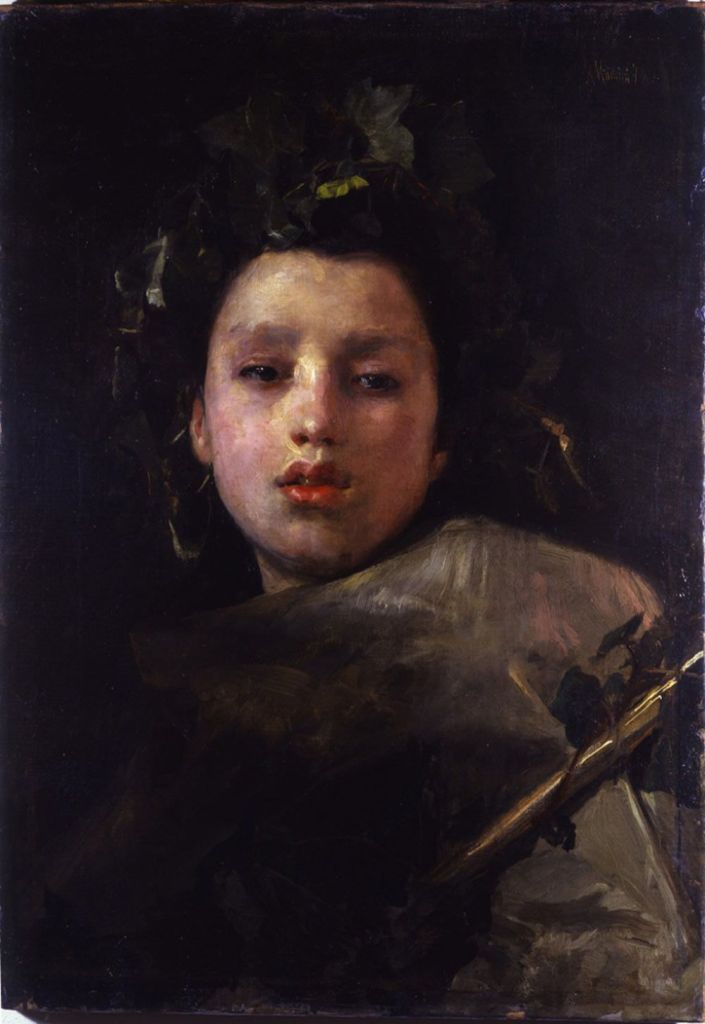
Mancini’s models frequently assumed identities quite different from their everyday circumstances. His early paintings of the saltimbanchi drew partly upon childhood memories of travelling performers who had stayed at his family’s inn in Narni. Luigiello subsequently appeared in several such roles, while other boys were represented as seminarians or religious figures. In Bacco fanciullo (1877), the familiar model becomes a youthful Bacchus, in a composition that Virno relates to Caravaggio and the Neapolitan seventeenth-century tradition. Costume, gesture and setting enabled Mancini to transform an individual sitter into a character, while retaining the particularity of the observed model.

This practice continued into his maturity and was not confined to professional models. Mancini repeatedly represented his father Paolo in different guises, among them a fruit seller, a musician, an antiquarian and an elderly warrior. His association with the German collector Otto Messinger likewise encouraged paintings incorporating historical dress, weapons, sculpture and antique furnishings. Works such as Guardia svizzera vaticana and Il brindisi brought together elaborate costumes and studio objects whose contrasting colours and textures became important elements of the compositions.

See Il brindisi and Guardia svizzera, illustrated in Cinzia Virno’s article on About Art Online (figs. 31 and 33).

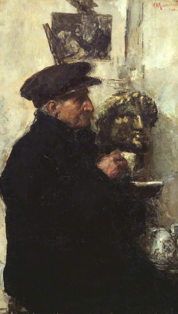
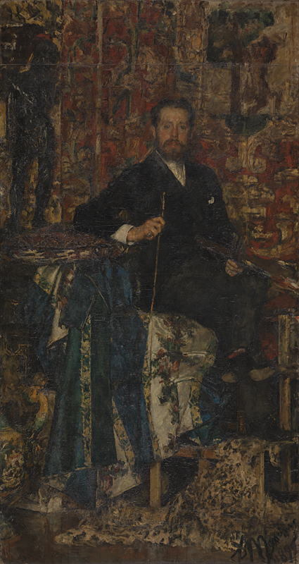
Sculpture had a particular place within this environment. Mancini’s earliest artistic training had taken place in the studio of Stanislao Lista, where he and Vincenzo Gemito drew from plaster casts and sculptural models. Later, sculpted heads and figures appeared among the objects assembled for his paintings. In Il venditore di statue, the human model shares the composition with numerous small sculptures, while the portrait of Mancini’s father now in the Tate collection includes an antique sculpted head. A contemporary reviewer, writing in The Illustrated London News in 1905, contrasted the father’s composed, good-humoured expression with the severe, almost sphinx-like appearance of the antique bronze behind him.

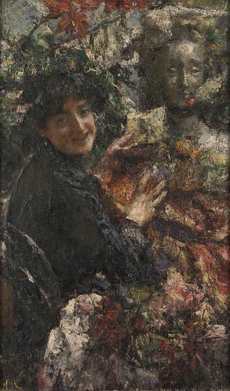
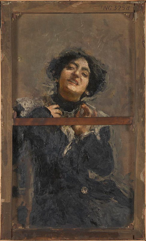
In Aurelia (1906), now in the National Gallery, London, Mancini returned to one of his favourite models, Aurelia Ciommi, known as La Cornacchia (the Crow). She appears among flowers, fabrics and a sculpted female bust, possibly recalling the Renaissance sculptures of Francesco Laurana. Virno emphasises the importance accorded to these surrounding objects, whose pictorial treatment approaches that of the model herself. Mancini also painted a less finished portrait of Aurelia on the reverse of the canvas, showing her in a different pose, without the elaborate arrangement of studio objects.

Pictures within Pictures

Among Mancini’s most inventive subjects are paintings in which pictures themselves become objects of display, exchange or artistic activity. The motif appeared during his final years in Naples and continued into his early Roman period. These works extend his practice of assigning different roles to familiar models, but introduce a further element: the models handle paintings, present them to spectators or assume the occupation of the artist.

An early example was Si vende (1882), exhibited at the Naples Promotrice, where it was purchased by Giuseppe Tipaldi, the society’s vice-secretary. The painting, subsequently destroyed during the Second World War, represented a young woman offering a picture for sale. Its title, For Sale, made the commercial transaction part of the subject, while the circumstances of its exhibition provide a documented instance of Mancini’s own efforts to find purchasers for his work. In correspondence with Tipaldi, he expressed gratitude for the purchase but also complained about the public’s tendency to misunderstand artistic merit and favour fashionable or conventional painting.

The critic Francesco Netti devoted an extended discussion to Si vende, paying particular attention to Mancini’s handling. Netti admired the painter’s ability to convey the girl’s presence and expression through brushwork that could appear irregular, summary or insufficiently finished by conventional standards. His response distinguished pictorial accomplishment from the careful completion of details, recognising considerable artistic control in the apparent roughness of the execution. The painting thus prompted contemporary consideration of the very qualities of Mancini’s work that were increasingly attracting critical attention.

A related invention appears in Ciociara, also known as Ragazza che espone un quadro (c. 1884), painted after Mancini’s move to Rome. Virno identifies the model as a young woman of Ciociarian origin, recognisable through her shawl and large round earrings. She holds a painting depicting a view of Rome, with the dome of St Peter’s visible in the distance. Unlike the picture presented in Si vende, this small canvas rests against the girl’s shoulder, forming part of the arrangement of the figure. Virno remarks upon the greater breadth and assurance of Mancini’s handling and relates the model to the young woman represented in La modellina pittrice, whom she considers slightly older.

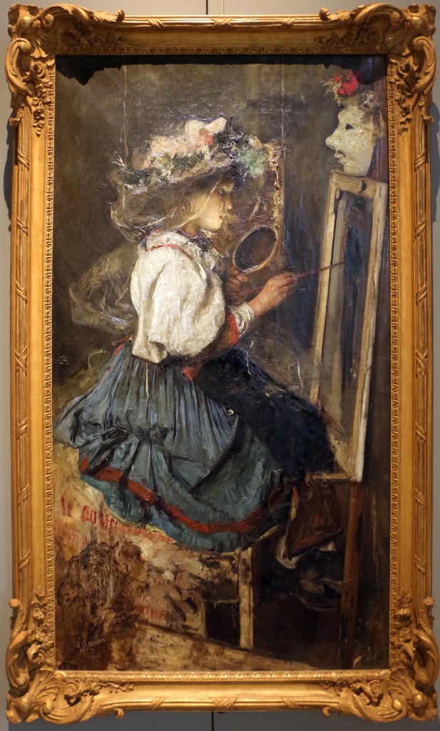
In La modellina pittrice (1884), now in the Museo Civico Ala Ponzone, Cremona, the relationship between model and painting becomes more elaborate. The young woman has taken up the painter’s equipment and attempts to make her own portrait while looking into a mirror. Contemporary reviewers explained the scene as an episode in which the model, taking advantage of her master’s absence, tries her hand at painting. Their accounts establish that the reversal of roles was central to the picture’s original reception. The person ordinarily observed and represented by the painter has become an artist engaged in representing herself.

The work was exhibited at the Turin Promotrice in 1884. Mancini had initially approached Adolphe Goupil for assistance in arranging its submission, but eventually relied upon Giuseppe Bottero, a painter and naval officer then in Turin, to present it to the exhibition committee. In a letter of 3 March, Mancini gave instructions concerning its delivery and specified a price of 1,500 lire. The contemporary reception was mixed, although some reviewers praised the originality of the subject, the model’s pose and the painter’s execution. The surviving correspondence also reveals Mancini’s close attention to the practical business of exhibiting and selling his pictures.

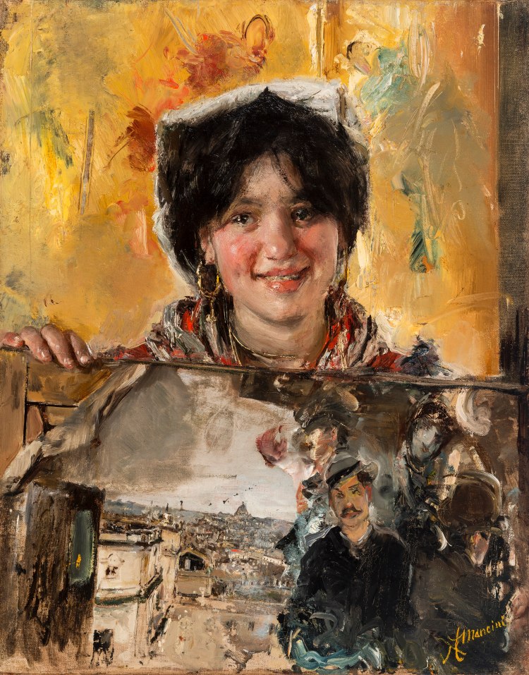
A different form of pictorial play appears in Dispetto di modella, also known as Capriccio di modella, which Virno assigns to Mancini’s first Roman period. Here a smiling young woman dressed as a gypsy appears to emerge from a canvas, with her head and hand projecting through its surface. She supports the canvas with one hand and holds a painter’s brush in the other. Mancini placed his signature in miniature upon the handle of that brush, introducing another reference to artistic authorship. Virno describes the invention as particularly ingenious, comparing its handling and colour with those of Pastorello in ciocie.

The picture differs from La modellina pittrice in its more playful treatment of the relationship between the represented figure and the painting itself. The girl’s apparent emergence through the canvas disrupts the conventional boundary between pictorial illusion and the physical support, while the brush bearing Mancini’s signature introduces a further joke about artistic authorship. There is something distinctly modern in this self-conscious manipulation of the conventions of representation, achieved with an irreverence that gives the composition much of its character.

View Dispetto di modella in the Fondazione Federico Zeri photographic archive.

The Material Practice of Painting

Mancini’s treatment of paint became increasingly distinctive over the course of his career. His early practice was founded upon direct observation and an approach he himself described as alla prima, establishing forms through colour without an elaborate preparatory drawing. Virno relates this method to his study of Caravaggio and seventeenth-century Neapolitan painting. In his early works, Mancini generally began with the background, indicating the contours of the figure in a few strokes before developing the composition in paint. The apparent immediacy of the execution depended upon a precise understanding of colour, light and tonal relationships. He believed that excessive retouching could compromise the unity of the original impression.

Technical investigations undertaken by Fabio Frezzato, Gianluca Poldi and Maria Letizia Amadori, published in 2021, have provided further evidence of his working procedures. Their examination of thirty-five paintings, representing different periods of his career, revealed relatively limited preliminary drawing and comparatively few alterations during execution. In Autoritratto con filo di paglia, painted around 1880, infrared examination disclosed a small number of graphic indications beneath the paint, including a contour subsequently adjusted as the hand was modelled. The researchers emphasise that Mancini’s rapid execution was accompanied by considerable forethought and an exceptional command of his materials.

His methods became more elaborate through the development of the graticola, a system of two corresponding grids of threads, one positioned before the model and the other against the canvas. Virno traces experiments with this apparatus to the first half of the 1880s, although its use became more regular after 1890, particularly in large-scale portraiture. The intersecting threads supplied reference points through which Mancini could establish the proportions and positions of different parts of the composition. They did not constitute a rigid mechanical framework: he could add further divisions as work progressed, and the arrangement remained subordinate to his observation and artistic judgement.

The system was closely connected with Mancini’s practice of working at a considerable distance from his subject. He would study the sitter, advance rapidly towards the canvas to apply paint, and retreat to inspect the effect. Lady Gregory, who sat for him in Ireland in 1907, left a vivid account of this procedure. She watched Mancini construct an increasingly intricate network of threads, adding new divisions as the portrait developed. He repeatedly withdrew to the far end of the room before approaching the canvas, sometimes applying his brush at the last moment between the threads. The physical exertion involved was considerable, yet the method allowed him to preserve his sense of the composition as a whole.

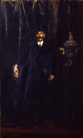
For Mancini, viewing distance was fundamental to pictorial effect. His admiration for Velázquez, discussed earlier, was closely related to the capacity of individual strokes of colour to achieve coherence when seen from an appropriate position. In a letter to Ralph Curtis, he explained that the grid helped him maintain proportional relationships, but insisted that measurements alone could never establish the truth of a painting. Light, colour and expression remained matters of artistic judgement. The system also left traces upon the works themselves. Mancini sometimes removed the threads while the paint was still sufficiently soft to retain their impressions, and these marks could remain conspicuous in the finished surface. Ritratto del marchese Giorgio Capranica del Grillo (1889) was among the early large portraits in which Virno identifies a particularly developed use of the apparatus.

The physical substance of pigment became an increasingly prominent feature of Mancini’s painting. Smooth passages could coexist with thick accumulations of colour projecting from the surface. The technical investigations by Frezzato, Poldi and Amadori document changes in the thickness and construction of his paint layers, particularly from the 1880s onwards. His palette was already substantially established during the 1870s, but the ways in which he applied and combined his materials continued to change. Virno records his particular interest in the expressive possibilities of black, including its capacity to establish warm shadows and intensify adjacent colours. Discussing the Ritratto di Otto Messinger, the critic Ugo Fleres admired Mancini’s ability to employ extensive passages of black without sacrificing the brilliance of the surrounding colour.

Antonio Mancini, Ritratto di Otto Eugenio Messinger, 1909. Oil on canvas. Galleria Nazionale d’Arte Moderna e Contemporanea, Rome. Image: Wikimedia Commons, Public Domain.

Mancini also introduced materials that were not conventionally part of oil painting. His relationship with the Dutch painter and collector Hendrik Willem Mesdag, who provided a comparatively regular market for his work, enabled him to undertake increasingly ambitious experiments. Glass, fragments of mirror, paper, fabric, lace and buttons could be incorporated into the paint itself. Mancini explained that, when seeking to reproduce the sparkling effect of white silk, he inserted a curved fragment of mirror at the point where the brightest highlight occurred. Frezzato, Poldi and Amadori identify the incorporation of silvered and gilded papers, glass and mother-of-pearl as particularly striking features of his technique. These materials extended the means through which he could represent light and texture, while giving the painted surface an increasingly pronounced physical presence.

The expenditure of paint could be extraordinary. During Mancini’s visit to Dublin in 1907, Hugh Lane supplied his artistic materials, and Lady Gregory recalled Lane’s alarm at the quantities consumed. According to her account, Lane occasionally scraped surplus pigment from Mancini’s pictures in his absence, returning it to the palette in the hope that it might be used again. During the years at Frascati, from 1911 to 1917, when the collector Du Chêne de Vère supplied canvases, colours, models and other materials, Mancini’s experimentation became especially extensive. His procedures included painting with his fingers and incorporating a widening variety of substances into the surface.

Mancini’s handling attracted admiration and bewilderment among his contemporaries. The visible impressions of the graticola, the density of the impasto and the inclusion of unexpected materials exposed aspects of the painter’s working process that more conventional techniques might conceal. His pursuit of pictorial truth nevertheless remained closely tied to the observation of colour and light. Paint could imitate the appearance of an object, but its thickness, texture and reflective properties could also contribute directly to the effect he sought.

Self-Portraiture and Artistic Identity

Self-portraiture occupied Mancini throughout much of his career, providing opportunities to experiment with pictorial technique, explore changes in his appearance and present himself in relation to his profession. Cinzia Virno has described the succession of self-portraits as an autobiografia di stati psichici in pittura, an autobiography of psychological states expressed through painting. Their character varied considerably, from the troubled images of his early adulthood to the more playful and confident representations of his later years. Several also incorporate works of art, painting implements or inscriptions, making his artistic identity part of the subject.

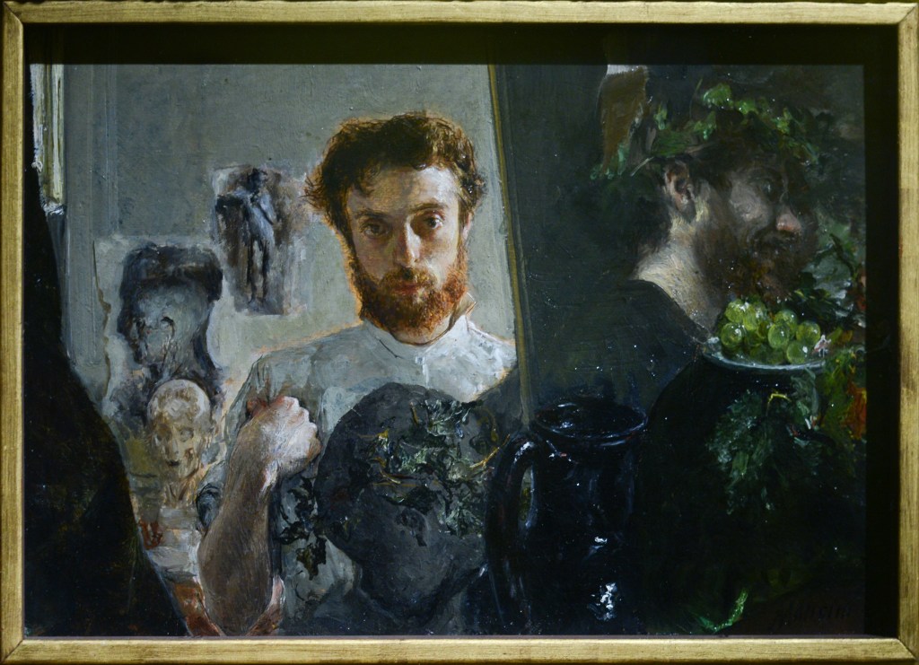
An early example is Autoritratto nello studio, also known as Doppio autoritratto (1878), now in the Galleria d’Arte Moderna di Palazzo Pitti, Florence. The small panel is divided into two contrasting compositions, resembling a diptych. On the left, Mancini represents himself in a brightly illuminated studio surrounded by fragments of sculpture and graphic studies. On the right, he appears in profile against a dark background, holding a plate of fruit. Virno identifies a deliberate reference to Caravaggio in the latter image, particularly in the treatment of illumination and the presentation of the fruit. The two representations bring together the painter’s working environment and his engagement with an earlier pictorial tradition.

Another statement of artistic interests appears in Autoritratto con filo di paglia, dated by Virno to around 1880. Here, in the image behind Mancini, she identifies several works of art and representations of figures important to his intellectual and artistic formation. These include a portrait of Alessandro Manzoni, a miniature depiction of Vincenzo Gemito’s bust of Mariano Fortuny, and an image of Domenico Morelli as the dead Christ. Mancini also holds another small painting, possibly a view of the Villa Comunale in Naples that he had painted around the same period. Virno suggests that the brush accompanying the little picture may emphasise his authorship. Although some of these identifications remain tentative, the accumulation of references gives the self-portrait a distinctly autobiographical character, encompassing literature, sculpture, painting and personal artistic relationships.

Autoritratto con filo di paglia in bocca (5th image)

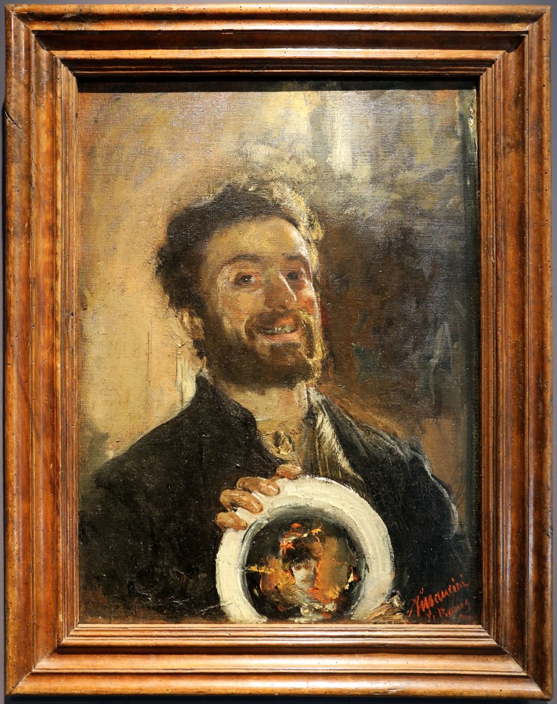
The painting belongs to the years preceding Mancini’s hospitalisation in Naples from November 1881 to February 1882. During this period of psychological disturbance he produced numerous self-portraits, often in restricted colours and with exaggerated or unsettling expressions. Some carried inscriptions relating to his distress. Virno records that Mancini continued to draw and paint during his confinement, when his own reflection provided a readily available subject alongside the hospital’s doctors and attendants. In Autoritratto con piatto (1882–83), he presents one of the decorated ceramic plates that he produced and sometimes exchanged for meals. The plate bears a painted head, making the image another representation of the artist displaying his own work. Virno associates the portrait’s expression with the earlier troubled self-portraits, while drawing attention to the accomplishment of its economical brushwork.

After the 1880s, Mancini’s production of self-portraits became less continuous as he increasingly undertook commissioned portraits. His international reputation and growing financial security were accompanied by changes in his presentation of himself. In the 1920s he frequently adopted the familiar attributes of the painter, appearing with brushes, palette or canvas, sometimes smiling broadly. Elsewhere he assumed theatrical identities through costume, representing himself as a soldier, pilot or historical warrior. Virno contrasts the professional confidence of many of these later images with the distress expressed in the self-portraits of his earlier years.

Among his most unusual experiments is Autoritratto sullo specchio, painted during the Frascati period. Mancini used a mirror as the support, placing his painted likeness in a relatively small area at the lower right while leaving much of the reflective surface exposed. Virno emphasises the playful character of the invention, in which the spectator and the surrounding environment can enter the composition through their reflections. The work also relates to Mancini’s wider experiments with mirrors and reflective materials, although here the mirror becomes the support for the image itself. The relationship between painted representation and the physical object acquires a particularly direct form.

View Autoritratto allo specchio (1915–17), illustrated in Cinzia Virno’s article in About Art Online (fig. 40).

Mancini returned to self-portraiture in 1929, the year before his death, with two markedly different paintings. In Autoritratto con turbante rosso, also known as Autoritratto in extremis, he concentrated upon his aged appearance, using broad handling and a dark background. Virno reproduces later critical comparisons with Rembrandt, although these belong to the painting’s reception rather than establishing a particular work by Rembrandt as Mancini’s source. The image presents an elderly painter confronting the physical signs of age, in contrast to the more expansive professional self-representations of the preceding decade.

In Autoritratto-biografia (1929), Mancini combined his likeness with an extensive handwritten account of his life. Executed in his studio in Via delle Terme Deciane, Rome, the painting places the aged artist at the lower right of a canvas largely occupied by inscriptions. Among the people named are Domenico Morelli, Filippo Palizzi, Vincenzo Gemito, Edgar Degas, John Singer Sargent, Lady Gregory and Otto Messinger, together with members of Mancini’s family. The writing also recalls places associated with his career, including Naples, Rome, Paris, London and Dublin.

See Cinzia Virno’s article on Autoritratto-biografia, illustrated in About Art Online.

Virno reproduces documentation in which Mancini describes himself indicating the inscriptions with one hand while holding his painter’s tools with the other. The written account is therefore accompanied by an image of its author explicitly identifying himself through his profession. Dario Cecchi, whose response Virno records, recognised that the inscriptions were integral to the composition rather than supplementary biographical information. Mancini’s professional relationships, travels and personal history occupy the same pictorial field as his self-portrait.

The arrangement invites comparison with Autoritratto sullo specchio. In the earlier work, the unpainted mirror admits the spectator’s reflection into the image; in Autoritratto-biografia, the surrounding space is filled with Mancini’s own recollections. The latter is an exceptionally personal work, but its written record also returns us to the artistic culture that occupied him throughout his life. The painter who had studied the works of Titian, Caravaggio and Velázquez, cultivated relationships with contemporary artists and continually experimented with the materials of painting now assembled the people and experiences of his career around his own image, incorporating the history of his profession into the final account of himself.

Producing these essays requires care, time, research, and resources. Contributions to help sustain this exploration would be greatly appreciated.

Donate to Inner Surfaces here.

Bibliography

I consulted these sources. Any errors are mine.

Carrera, Manuel, Fernando Mazzocca, Carlo Sisi and Isabella Valente (eds), Antonio Mancini e Vincenzo Gemito, Cinisello Balsamo: Silvana Editoriale, 2023.

Frezzato, Fabio, Gianluca Poldi and Maria Letizia Amadori, ‘Antonio Mancini. Evoluzione tecnica di un realista visionario’, in Teresa Perusini (ed.), Tecnica della pittura in Italia fra Ottocento e Novecento, Padua: Sargon Editore, 2021, pp. 37–58.

Hiesinger, Ulrich W., Antonio Mancini: Nineteenth-Century Italian Master, Philadelphia: Philadelphia Museum of Art, in association with Yale University Press, 2007.
Virno, Cinzia, Antonio Mancini: Catalogo ragionato dell’opera, 2 vols, Rome: De Luca Editori d’Arte, 2019.
Virno, Cinzia, ‘L’evoluzione artistica: tecnica, modelli, soggetti’, in Antonio Mancini: Catalogo ragionato dell’opera, 2 vols, Rome: De Luca Editori d’Arte, 2019, vol. 1, pp. 1–31.

Virno, Cinzia, ‘Va all’asta “Autoritratto biografia”, l’opera più “iconica” di Antonio Mancini (che dovrebbe essere acquistata dallo Stato)’, About Art Online, 1 December 2024.

Virno, Cinzia, ‘“Antonio Mancini (1852–1930). Il successo internazionale e i suoi mecenati”: la vita e l’opera del grande Maestro in un evento on line alla Galleria Berardi’, About Art Online, 13 September 2026.

Dosso Dossi’s ‘Jupiter Painting Butterflies’: Painting, Otium and Princely Identity

Alberti, Lucian and the Transformation of a Story

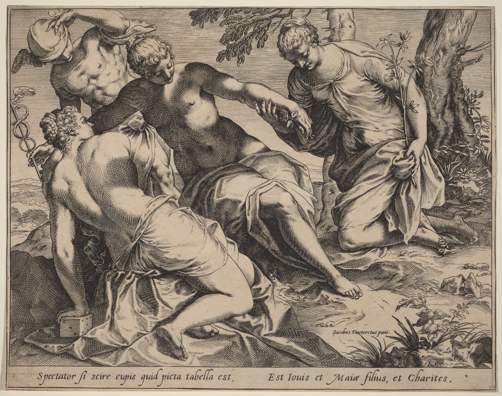
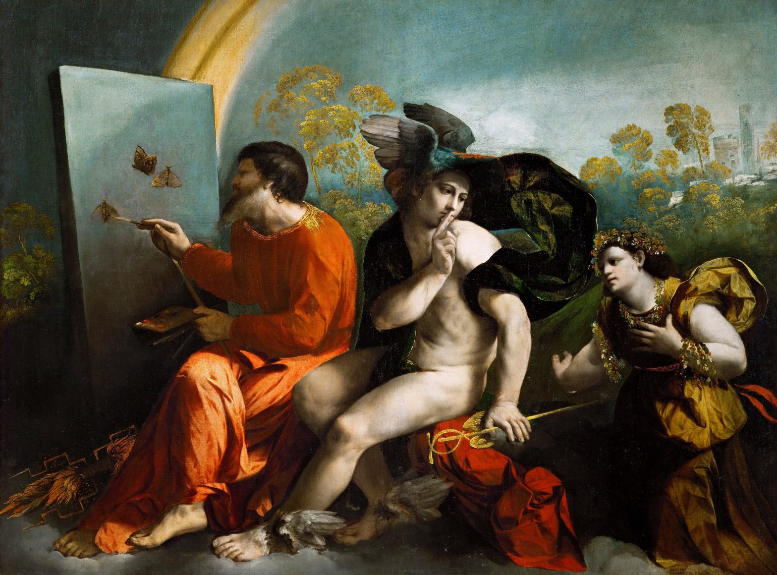
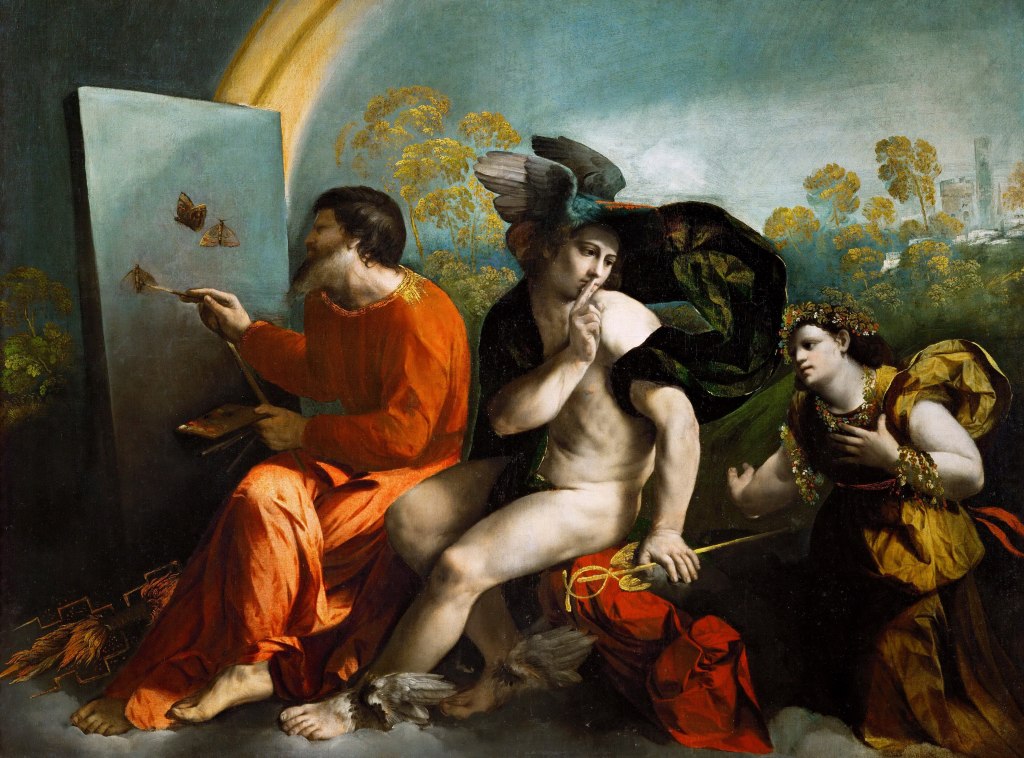
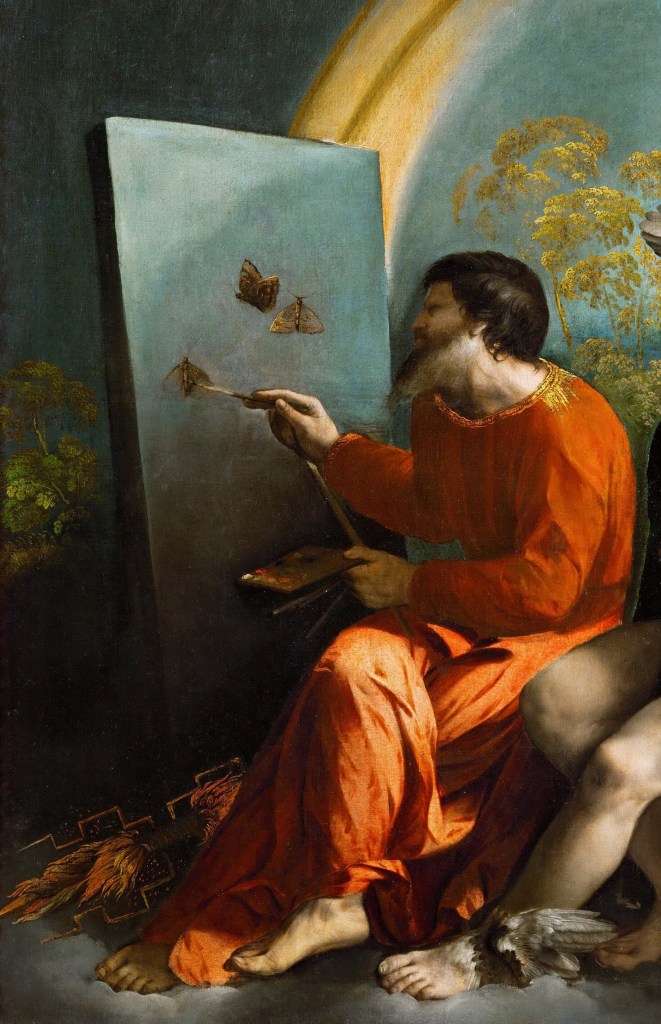
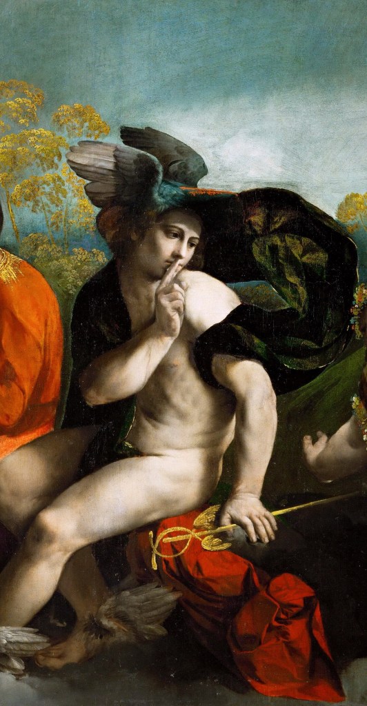
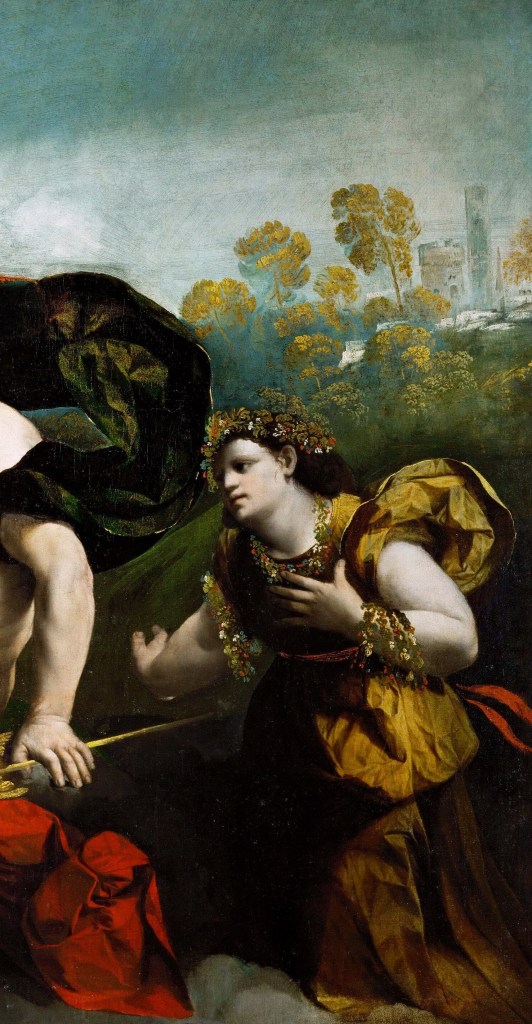
Dosso Dossi’s painting begins with an improbable occupation for the ruler of the gods. Jupiter sits before an easel, palette, brushes and mahlstick in hand, while butterflies appear on the blue surface before him. His thunderbolts lie unused at his feet. Mercury, seated beside him on the same bank of cloud, turns towards an approaching woman and raises a finger to his lips. She is richly dressed, crowned and garlanded with flowers. Behind them the landscape is caught in uncertain weather, with wind, changing light and an arc across the sky. The combination is sufficiently strange that the picture has generated more than a century of attempts to identify both its literary source and its precise subject.

The earliest interpretation to acquire lasting authority was proposed by Julius von Schlosser in 1900, following seventeenth-century descriptions by Marco Boschini and Giustiniano Martinioni. Both writers connected the picture with a dialogue then attributed to Lucian of Samosata. The text is in fact Leon Battista Alberti’s Virtus, one of the Intercenales, the short prose pieces he composed during the 1430s. The dialogue circulated under Lucian’s name and continued to be treated as a Lucianic work long after Dosso’s lifetime. The confusion is significant because the dialogue belongs to a Renaissance culture in which antique forms could be imitated, displaced and refashioned with considerable freedom. Alberti’s Intercenales were conceived for convivial reading, yet their humour could carry serious reflections on human conduct. The combination of play and argument, serio ludere, is already close to the tone often sensed in Dosso’s painting.

In Virtus, the personification of Virtue attempts to gain admission to Jupiter after being assaulted and humiliated by Fortune. She has been beaten, stripped and left in the mud. When she reaches the gods, Mercury prevents her from obtaining an audience. Virtue complains that the Olympians always have some excuse for avoiding her: they are occupied with making gourds flower at the proper time or ensuring that the wings of butterflies are beautifully painted. Even after the gourds have flowered and the butterflies are flying, the gods continue to neglect her. Jupiter ultimately refuses to intervene against Fortune.

The connection with Dosso is unmistakable, but so are the differences. Alberti never describes Jupiter sitting at an easel, nor does he say that the god personally applies colour to butterfly wings. The woman in Dosso’s picture is not naked, dirty or desperate. She appears in costly contemporary dress and is adorned with flowers. Mercury does not merely deny her entry but turns towards her with a gesture of silence. Fortune, who drives Alberti’s narrative, is absent altogether. Jupiter, scarcely present as a character in the dialogue, becomes the dominant figure of the painting.

The contrast is particularly clear when Dosso’s invention is compared with the later treatment of the same story in the Camera del Camin Nero at the Castello del Buonconsiglio in Trent. There Dosso Dossi represented a seminude, dishevelled Virtue approaching the gates of Olympus while Mercury bars her way. The fresco remains much closer to Alberti’s description. The Kraków painting therefore cannot be explained simply as an illustration of Virtus. Its departures from the text are too substantial and too deliberate.

That does not make Alberti irrelevant. The phrase about the gods attending to the beautifully painted wings of butterflies offered a remarkably suggestive conceit, and Dosso could convert it into something that Alberti had not imagined: Jupiter himself as painter. Fiorenza has discussed this transformation in terms of aemulatio, the humanist practice of taking an admired model as a point of departure while altering and attempting to surpass it. In Renaissance discussions of imitation, including those associated with Poliziano, Pico, Erasmus and Celio Calcagnini, invention did not depend upon reproducing a single authority faithfully. A writer might draw upon several voices and transform what had been inherited. Dosso’s relation to Alberti can be understood in similar terms without requiring the painting to correspond point by point with the dialogue.

The Lucianic attribution adds another layer to that process. Alberti himself had written in a mode indebted to Lucian, combining antique gods, satire and moral argument. At Ferrara, genuine and pseudo-Lucianic material circulated within an unusually receptive humanist culture. By the early sixteenth century Lucian’s dialogues were available in Latin translation, and a complete Greek edition appeared in Venice in 1522. The apparent antiquity of Virtus would therefore have enhanced rather than diminished its usefulness at court. What Dosso received was not simply a story but an already hybrid literary object: a Renaissance dialogue written in imitation of an ancient author and subsequently taken for an ancient text.

The comic disproportion at the centre of the painting also survives from this literary culture. The supreme god has laid aside the thunderbolt in order to concern himself with butterflies. Schlosser compared the effect with Ariosto’s mock-heroic manner, and the comparison is worth retaining even if his interpretation does not explain every feature of the painting. The humour does not destroy Jupiter’s authority. It depends upon it. The greater the power attributed to the god, the more striking his absorption in so delicate and apparently inconsequential an activity becomes.

Dosso’s changes to Alberti consequently open several possibilities at once. The butterflies retain their literary ancestry, but Jupiter’s new occupation places painting itself at the centre of the image. Mercury’s gesture acquires a prominence it does not possess in the dialogue, while the transformation of Virtue into an elegant, flower-covered figure allows later interpretations of her as Flora, Eloquence or another personification to arise. Alberti provided the initial conceit, but Dosso’s invention begins where the correspondence with the text starts to loosen.

Painting and Pictorial Eloquence

If Alberti supplied the conceit, Dosso made painting itself one of the principal subjects of the picture. Peter Humfrey identifies the art of painting as central to the work, while Vincenzo Farinella develops the theme through Philostratus’s Imagines. In the proem to that text, painting is placed beside poetry and described as an invention worthy of the gods: the Seasons colour the earth, while celestial phenomena adorn the heavens. Farinella relates Dosso’s Jupiter to this conception of divine artistry. The god does not simply govern the natural world but appears to participate in its colouring.

The fiction is sustained by the relation between Jupiter’s canvas and the world around it. He paints against a field of blue that recalls the sky beyond, while the picture itself displays effects of colour, moisture and changing light. Giancarlo Fiorenza treats the rainbow, flowers and butterflies as part of this larger demonstration of colorito: Jupiter’s act of painting nature becomes an analogue for Dosso’s own ability to represent it. The conceit is particularly apt because the objects involved are fragile or transitory. Butterfly wings, moving air, atmospheric light and passing weather offer painting an opportunity to arrest effects that cannot remain still.

Farinella connects Jupiter’s activity more closely with Alfonso I d’Este. Alfonso was not simply a collector and patron. He took a practical interest in making things, including metalwork, wood-turning and work in clay and ceramics, and Farinella also considers the possibility that he painted. In 1493, when he was seventeen, Alfonso wrote to Venice asking for pigments of the finest quality, including ultramarine. Such evidence makes the image of a ruler absorbed in manual artistic activity particularly suggestive at the Ferrarese court. Jupiter need not be a literal portrait of Alfonso for the association to operate. The god can retain his mythological identity while evoking a prince whose cultivation of the arts extended beyond patronage.

The technical examination of the painting gives this interest in artistic process an unusually concrete dimension. When the canvas was relined in 1964, a rapidly executed underdrawing for all three principal figures was found to have penetrated the unprimed support and become visible on the reverse. X-radiography shows that Dosso subsequently revised the composition extensively. Mercury’s head, headdress, hand and right knee were altered; Jupiter’s brush and mahlstick were shortened; the butterflies were changed; and the silhouettes of all three figures were adjusted. The woman underwent the most substantial revision. X-radiography shows that she was initially conceived with bare legs and in a different pose; at an intermediate stage her dress was slit high at the side, before Dosso arrived at the fully clothed kneeling figure visible today.

Humfrey notes an especially pointed detail. Jupiter himself paints the butterflies directly, without underdrawing, holding his brush loosely about halfway along the handle. His procedure is therefore closer to Dosso’s own relatively free handling than to the more fully planned practice associated with Central Italian painting. The god who paints within the picture does so in a manner that recalls the painter who made the picture.

The physical surface was itself carefully differentiated. Dark preparation lies beneath much of the background and probably the sky; Jupiter’s red garment is painted over a white-lead preparation, while Mercury’s green-yellow costume rests on a yellow ground, probably containing lead-tin yellow. Thick, sharply textured paint occurs in Mercury’s staff, the woman’s flower wreath and red sash, Jupiter’s collar and the thunderbolt. Humfrey associates some of these dense passages with an oil-tempera emulsion. The differentiated preparations, textured passages and revisions reinforce the picture’s sustained attention to the material process of painting.

The relation between pictorial and verbal eloquence enters the interpretation most clearly through André Chastel. He proposed that the approaching woman is not Virtue but Eloquence or Rhetoric, while Mercury assumes the role of Harpocrates, the god of silence. On this reading, rhetoric is checked while Jupiter remains absorbed in the silent activity of painting. Humfrey describes the implication as a comparison between the sister arts in which painting achieves through images what rhetoric achieves through words.

It is better to regard this as a possible paragone between verbal and pictorial eloquence than to make the picture into a formal statement of artistic theory. Even so, the suggestion is attractive in a work whose starting point lies in literary culture but whose invention departs so markedly from its textual source. Fiorenza approaches the question from another direction through Mercury’s gesture and Celio Calcagnini’s Descriptio silentii. Silence itself could possess rhetorical force, while painting was traditionally capable of being understood as a form of mute eloquence. Dosso’s image therefore allows the claims of painting and rhetoric to meet without requiring one to be a simple translation of the other.

Fiorenza also places the work within Ferrarese discussions of ingegno and vivid representation. Ancient accounts of painters able to render difficult or fleeting phenomena remained pertinent, above all Pliny’s praise of Apelles. Dosso’s choice of butterflies, atmospheric effects and unstable weather belongs naturally to such a conception of pictorial skill. The joke of Jupiter attending to butterfly wings can therefore retain its lightness while carrying a more serious claim for what painting is able to do.

Otium, Princely Identity and the Belvedere

The setting in which such an image could acquire political meaning was Alfonso I d’Este’s Belvedere, the delizia created from 1513 on an island in the Po beside Ferrara. Biagio Rossetti’s surviving letter of November that year records the early planning of the site, later known as the Belvedere, Pulcher visus or Calliopsis. Trees were cleared and reordered; fields, an oak grove, poplars and elms were incorporated into the grounds; a walled garden was laid out; and the island housed deer, goats, rabbits, peacocks, ostriches and other unusual animals. Its position offered views towards Ferrara and its fortifications while allowing withdrawal into greenery and the cooler air of the river. By 1516 the principal building campaign was substantially complete.

The literary descriptions of the Belvedere emphasise its character as a place apart from ordinary court business. Ariosto evokes it in Orlando Furioso as a garden capable of surpassing the islands of the Phaeacians, the Hesperides and Circe, and imagines Venus removing there with Cupid and the Graces. Other Ferrarese texts similarly present the island as a locus of refreshment, cultivation and imaginative freedom. Dosso himself was repeatedly employed there. Payments document work on the chapel from 1518, further activity in 1519 and 1522, and decorative work during the later 1520s. The exact original destination of Jupiter Painting Butterflies is not documented, but its association with the Belvedere has considerable contextual force.

The relevant form of leisure was otium, not simple inactivity. At court it could designate a withdrawal from negotium, the pressures of government and public affairs, in which study, conversation, artistic activity and cultivated pleasure restored the mind. Farinella connects this conception with later Ferrarese descriptions of Alfonso’s habits and surroundings. Giraldi could speak of otio honestissimo in negotio, while the Ciceronian model of Scipio, “never less idle than when idle, never less alone than when alone”, was explicitly associated with Alfonso. The same tradition appears in the decoration of the duke’s studio dei marmi in the Via Coperta, where inscriptions and imagery gave intellectual withdrawal a place within the exercise of rule.

Seen against that background, Jupiter’s discarded thunderbolt acquires particular force. The emblem of his sovereign power remains immediately available, but it is not being used. His attention is given instead to the delicate work before him. Farinella reads the scene as an image of the ruler protected from interruption while engaged in a form of restorative and intellectually legitimate leisure. If the approaching woman remains Virtue, her presence need not reproduce Alberti’s abused and neglected personification literally. She can stand more broadly for claims upon the ruler which are temporarily held at a distance while Mercury guards the interval of otium. The polarity between leisure and obligation is therefore spatially embodied without requiring either term to be condemned.

The same balance appears in Alfonso’s devices. The duke’s best-known martial emblem commemorated the battle of Ravenna in 1512: a flaming mortar or explosive projectile accompanied by the motto Loco et tempore, “in the right place and at the right time”. Ariosto used a related formulation, À lieu et temps. The device celebrated not violence in itself but the disciplined employment of force at the proper moment. The ruler’s virtue lay partly in possessing power and partly in knowing when to withhold it.

At the Belvedere this imagery was paired with the butterfly. Balbo’s description of the site refers to gilded triple-flame globes and butterflies decorating the architecture, while later accounts record enormous butterflies associated with triple flames on its railings and pinnacles. Traces of the same decorative scheme survive in a tapestry designed by Battista Dossi and woven by Nicholas Karcher around the middle of the century. Fiorenza and Farinella both attach considerable importance to this conjunction. The heavy, destructive object and the weightless insect formed an opposition between force and delicacy, martial preparedness and cultivated repose.

Ancient emblematic traditions offered another way of understanding the pairing. The crab and butterfly associated with Augustus conveyed the principle later expressed as festina lente, “make haste slowly”: decisive action controlled by deliberation. Farinella relates the Belvedere imagery to this tradition of concordia discors, the reconciliation of apparently opposed qualities within a ruler. The butterfly does not cancel the artillery device; the two depend upon each other. The prince capable of defending his state is also the prince capable of suspending action and giving his attention to art.

Fiorenza develops the same material through the language of prudence and political timing. Alfonso’s devices and the picture alike concern the ability to judge the appropriate moment. Jupiter sits at ease with the thunderbolts close at hand. His apparent effortlessness is not impotence but controlled capacity. The image can therefore be related to a broader speculum principis tradition in which mastery of oneself precedes mastery of circumstances. Strength has value because it can be governed.

The Belvedere itself offered an architectural equivalent. Alfonso had transformed a comparatively barren river island into a productive and pleasurable environment of gardens, orchards, woodland and cultivated fields. Ferrarese writers praised that intervention in terms that associated good rule with the ordering of nature. Fiorenza brings this material into relation with Cicero’s De natura deorum, where human cultivation creates a natura altera, a “second nature”, through agriculture, building and the controlled use of the landscape. The prince who reshapes the island and the Jupiter who attends to nature through painting can consequently occupy related conceptual territory.

This was also a dynastic landscape. The Po, identified with the ancient Eridanus, carried associations with Ferrara’s legendary past and with Este claims to a renewed golden age. Humanists around Alfonso repeatedly turned the river, its fertility and its mythology into material for political praise. Giovanni Battista Balbo’s Pulcher visus celebrates the Belvedere as a place where the spirit could recover after martial exertion. Giulio Cesare Scaliger’s Elysium Atestinum recasts the Po landscape as an Este Elysium in which divine favour, fertility and Alfonso’s rule converge. In related court poetry the alternation between warfare and peace, exertion and refreshment, becomes part of the image of successful government.

The butterfly and the thunderbolt compress much of that material into two forms. One belongs to ephemerality, colour and the pleasures of painting; the other to Jupiter’s authority and Alfonso’s artillery. Between them lies the question posed by loco et tempore: not whether the ruler possesses power, but when and how he chooses to exercise it.

Season, Weather and Transition

Fiorenza gives the landscape and weather a more active role than interpretations centred primarily on Alberti or princely otium. In his account, the painting represents not a fixed moment but a seasonal transition. The woman is identified as Flora, goddess of spring, while Mercury mediates the passage towards summer. Jupiter presides over the change as a deity of weather and seasonal order.

The identification of the woman as Flora rests first on her appearance. Her flower garlands accord more readily with descriptions of Flora than with Alberti’s humiliated Virtue, and Fiorenza draws upon Ovid’s Fasti as well as later mythographic traditions. Flora belongs to the season of flowering, but in Dosso’s picture the flowers are already passing their fullest bloom. Her position at the right therefore becomes part of a temporal sequence rather than merely an iconographic identification.

Mercury occupies the centre of that sequence. Fiorenza draws attention to his associations not only with eloquence and mediation but also with wind and seasonal change. In Virgilian tradition Jupiter can send Mercury as leader of the winds, while the month of May, Maia and the Pleiades provided further connections with the god. The later part of spring was also the period in which storms subsided and navigation became safer. Mercury’s gesture of silence can therefore be read not only as an instruction to the woman but as an image of cessation: the turbulent weather of late spring is being quietened as the season changes.

The landscape supports that reading. Fiorenza describes a passing storm, wind moving through the figures’ clothing, humid air, lightning and the coloured arc crossing the sky. He interprets the arc as a rainbow and notes that X-radiography shows it originally extended further across the composition. The combination of storm and clearing weather places the scene between meteorological states. Jupiter, traditionally tonans et fulgens, the god who thunders and flashes with lightning, sits with his thunderbolts at his feet while the atmosphere changes around him.

Classical texts supplied a wider framework for such an image. Hesiod and Ovid associated Jupiter with the ending of the perpetual spring of the Golden Age and the institution of the seasons. Fiorenza also invokes agricultural and philosophical writing in which Jupiter governs rain, fertility and the ordered processes of nature. In Cicero, Jupiter belongs to the administration of the natural world; in Virgil’s Georgics, weather can appear as both disruptive force and necessary condition of cultivation. Dosso’s god is therefore able to occupy the role of ruler not only of Olympus but of seasonal process.

The horizontal structure of the picture becomes especially important here. Fiorenza reads it from the woman at the right, through Mercury, towards Jupiter at the left. Flora belongs to the fading spring; Mercury marks the threshold; Jupiter introduces summer. The composition itself becomes a movement through time. Fiorenza compares this kind of seasonal organisation with the imagery of the months at Palazzo Schifanoia and, more cautiously, with Mercury’s role in Botticelli’s Primavera, where he also stands at the edge of a garden world and appears to regulate atmospheric conditions.

Such a reading also brings the Belvedere back into view. The island was most fully experienced in spring and summer, when its gardens, orchards, woodland and riverside setting could serve the pleasures of courtly retreat. Ferrara’s Festa del Maio, with its branches, regattas and the figure of the Regina del Po, gave the arrival of the season a civic and courtly form. Fiorenza relates these festivities to the broader Este habit of linking seasonal renewal with dynastic and political order. In the frescoes of Palazzo Schifanoia, the months likewise combine agricultural time, courtly pleasure and princely government.

The seasonal argument also sharpens the relation between painting and nature. The effects that indicate change of season are the same effects through which Dosso displays his command of colour and atmosphere. Wind is made visible through drapery; humidity through tonal modulation; passing rain through the darkened sky; clearing weather through changing light. The landscape does not simply illustrate a season but makes transition itself available to painting.

This is also where the interpretation of the coloured arc becomes significant. Fiorenza treats it as a rainbow belonging to a passing storm and to the wider meteorological structure of the picture. Marcin Fabiański later rejects that identification, arguing that the arc is instead the yellow light of dawn and part of a scene in which Mercury restrains Aurora from waking Jupiter. His reading depends upon a much more elaborate reconstruction, but the disagreement is useful because it reveals how much weight can rest on a single atmospheric feature. Whether understood as rainbow or dawn, the arc marks a change in light and helps prevent the landscape from settling into a single stable condition.

Fiorenza’s seasonal interpretation does not require every element to carry one meaning. Mercury remains the eloquent god who can impose silence even while he governs a change in the weather; Jupiter remains painter and ruler while also presiding over seasonal order. The woman’s identification as Flora is more debatable, but the larger emphasis on spring, summer and transition draws support from the flowers, butterflies, weather and the temporal structure of the composition.

The Woman at the Right

The most persistent iconographic difficulty concerns the woman approaching from the right. Alberti’s Virtus makes Virtue the obvious starting point, and the traditional title Jupiter, Mercury and Virtue preserves that identification. Dosso’s figure, however, bears little resemblance to Alberti’s naked, dirty and humiliated personification. She is richly dressed, crowned and garlanded with flowers, and her bearing contains none of the desperation described in the dialogue.

Farinella retains Virtue but argues that Dosso has transformed her function. Rather than representing Alberti’s abused petitioner literally, she may stand for the claims of public responsibility upon the ruler. Mercury prevents those claims from interrupting Jupiter’s otium, allowing the Alberti source to remain active while its narrative is reshaped for a courtly context. This has the advantage of keeping the woman within the original literary framework without requiring her appearance to conform to Alberti’s description.

Fiorenza instead identifies her as Flora. The flower garlands are central to the proposal, which he supports through Ovid’s Fasti and other descriptions of the goddess. Flora belongs to spring, and her presence allows the composition to be read in seasonal terms, with Mercury mediating the movement towards summer. The identification therefore forms part of a wider argument about flowers, butterflies, weather and changing light rather than depending on costume alone.

Chastel offers a different solution by identifying the woman as Eloquence or Rhetoric. Mercury’s gesture of silence then acquires a pointed relation to her identity: verbal eloquence is held at bay while Jupiter remains occupied with painting. The proposal connects naturally with the picture’s concern with artistic making and with the Renaissance notion of painting as a form of mute eloquence. It also helps to explain why a richly dressed and dignified woman might replace Alberti’s distressed Virtue.

The extensive alteration of the figure during execution, discussed earlier, adds a further reason for caution in treating her final appearance as the straightforward transcription of a fixed literary type. What can be said with greater confidence is that Dosso substantially recast the female petitioner supplied by Alberti. Whether he intended that transformed figure to remain Virtue or to evoke Flora or Eloquence is much harder to establish.

Conclusion

The continuing attraction of Jupiter Painting Butterflies lies partly in its refusal to settle easily into one interpretation. Its central themes are clearer than its individual identifications: painting, princely otium, controlled power, seasonal change and the relation between verbal and pictorial eloquence all recur with some consistency across the scholarship. The woman at the right remains harder to name, and even Jupiter’s activity is not entirely secure. Marcin Fabiański’s emphasis on the god’s closed eyes has reopened the possibility that the scene is not simply one of painting but of dream, although his larger reconstruction of Aurora, Flora and the Kraków epithalamium is considerably more speculative. The fact that such proposals continue to arise is part of the picture’s fascination. Its beauty is bound up with an elusiveness that has repeatedly drawn scholars back to the same small group of gestures, objects and atmospheric effects.

Producing these essays requires care, time, research, and resources. Contributions to help sustain this exploration would be greatly appreciated.

Donate to Inner Surfaces here.

Bibliography

Alberti, Leon Battista. Intercenales. Edited by Franco Bacchelli and Luca D’Ascia. Bologna: Pendragon, 2003.

Fabiański, Marcin. ‘L’iconografia del Giove pittore di farfalle di Dosso Dossi, ossia il sogno di primavera di Alfonso d’Este’. Artibus et Historiae 36, no. 71 (2015): 113–124.

Farinella, Vincenzo. Dipingere farfalle. Giove, Mercurio e la Virtù di Dosso Dossi: un elogio dell’otium e della pittura per Alfonso I d’Este. Florence: Polistampa, 2007.

Fiorenza, Giancarlo. Dosso Dossi: Paintings of Myth, Magic, and the Antique. University Park, PA: Pennsylvania State University Press, 2008.

Humfrey, Peter, and Mauro Lucco. Dosso Dossi: Court Painter in Renaissance Ferrara. Edited by Andrea Bayer, with contributions by Andrea Rothe, Andrea Bayer, Dawson Carr, Jadranka Bentini and Anna Coliva. New York: Metropolitan Museum of Art, 1998. See especially Peter Humfrey, catalogue entry 27, ‘Jupiter, Mercury, and Virtue’, pp. 170–173.

Jacopo Bassano’s Progress: Some Representative Works

Bassano outside Venice: formation and first maturity

Jacopo Bassano’s career was shaped by a productive tension between the Venetian artistic world and the provincial setting in which he chose to remain. Born into a family workshop in Bassano del Grappa, he trained first with his father, Francesco il Vecchio, and then, in the early 1530s, in Venice with Bonifazio de’ Pitati. He returned to Bassano and took over the family workshop after Francesco’s death in 1539. Although he maintained contacts with Venice and worked for Venetian patrons, the greater part of his career unfolded in the terraferma rather than in the lagoon city itself.

The organisation of the Dal Ponte workshop formed an important part of that career. The surviving Libro secondo, the second of four account books and the only one to have survived, records a business in which commissions were undertaken collectively and individual authorship was not normally specified. Different parts of a painting could be distributed according to the skills and availability of those working in the shop. This arrangement preceded Jacopo’s maturity as an independent painter and later provided the structure within which his own sons could participate in an expanding production. By the later sixteenth century Francesco, Leandro and Gerolamo had established workshops in Venice, while Giambattista remained in Bassano and continued the family business after Jacopo’s death.

Jacopo’s early formation also brought him into contact with wider currents of Venetian and north Italian painting, while prints extended that range further. He absorbed these encounters selectively over the course of his career.

Jean Habert sees the beginnings of that process in the Flight into Egypt in the Museo Civico at Bassano, generally dated to 1534. There, Jacopo combines the Venetian example of Bonifazio de’ Pitati with the closer naturalism Habert associates with Savoldo and Moretto.

Titian provided compositional models to which Bassano would return over many years. In the period after Francesco’s death, Jacopo’s compositions became more animated and his figure style increasingly responsive to the elongated, anti-classical forms associated with Parmigianino. Schiavone contributed supple rhythms and fluid handling, while Tintoretto offered a further stimulus towards pictorial invention and, increasingly, the expressive use of light. Central Italian prints enlarged the repertory of figures and compositional devices available to the workshop.

The Flight into Egypt of about 1544–45, now in the Norton Simon Museum, marks what Habert describes as a moment of equilibrium within this development. He regards it as characteristic of Jacopo’s first maturity. The peasant driving oxen, with his straw hat and muscular neck, evokes the countryside around Bassano, while Habert also draws attention to the harmonious arrangement of planes and colours and to the freedom of execution achieved by this stage.

The Adoration of the Shepherds in the Royal Collection, now dated to about 1546, shows more precisely how Bassano used Titian. Its frieze-like arrangement of figures relates to Titian, while a woodcut after Titian’s Adoration of the Shepherds provided the immediate source for several elements, including the Virgin revealing the Child, the column and the procession of shepherds. At the same time, the high viewpoint of the landscape recalls Bonifazio. The result brings together sources from Jacopo’s Venetian formation within a painting already recognised for the direct naturalism that would become an increasingly prominent element of his work.

Portraiture and natural observation

Portraiture offers another way of following Bassano’s development, although the extent of his activity in the field remains difficult to define. William Roger Rearick showed how heterogeneous the group of portraits formerly assembled under Jacopo’s name had become and attempted to reconstruct a smaller autograph corpus from signed works, documentary evidence and portraits embedded within religious or votive paintings. In the mid-1530s, these included likenesses of local office-holders and, in a votive painting of 1536, portraits of the podestà Matteo Soranzo, his daughter Lucia and his brother Francesco, as well as the probable self-portrait inserted into The Three Children Saved from the Fiery Furnace. Rearick saw in these works a directness of observation that remained distinct from the more formal conventions of Venetian portraiture.

The portrait traditionally identified as Francesco Soranzo, now in Nancy, belongs to this early group. Rearick proposed the identification through comparison with Francesco’s likeness in the Soranzo votive painting of 1536, while acknowledging that the sitter’s identity must remain hypothetical. He characterised the independent portrait by its simplicity of format, matt earth colours and unsparing treatment of the sitter.

Jacopo Bassano?, Francesco Soranzo?, c. 1536.

A drawing of a young man in the Louvre, dated 1538, reveals a comparable intimacy and clarity; Rearick tentatively identified the sitter as Jacopo’s younger brother Giambattista.

Jacopo Bassano, Bust of a Young Man

Between 1538 and 1541, when Bassano’s painting became increasingly responsive to Pordenone, Parmigianino and Francesco Salviati, Rearick regarded portraiture as the field in which his underlying naturalism could be seen most clearly. After the early 1540s, however, the surviving evidence becomes much more fragmentary. He accepted only a very small number of portraits from the following two decades, leaving a long gap in the reconstruction of Jacopo’s activity as a portraitist.

The Prelate in the Museum of Fine Arts, Boston, which Rearick dated to about 1570, belongs to a much later stage. The identity of the sitter is unknown. The setting is reduced to a minimum and attention concentrated on the head; Rearick describes fluid brushwork and liquid impasto, while the plum-coloured vestments and black beretta provide the principal accents of colour. Compared with the earlier portraits, the handling has become freer and the presentation more concentrated.

In Rearick’s reconstruction, these changes anticipate the still greater simplicity of the Elderly Man in Vicenza, which he regarded as an example of Jacopo’s late portrait style.

Animals as subjects: Two Hunting Dogs Tied to a Tree

Bassano’s interest in animals became one of the most recognisable features of his work. In Two Hunting Dogs Tied to a Tree, painted around 1548–50 and now in the Louvre, that interest is given unusual independence. The painting was commissioned in 1549 by the Venetian nobleman Antonio Zantani, showing that such subjects already formed part of Jacopo’s work for private patrons beyond Bassano.

Jean Habert treats the picture as a decisive statement of Bassano’s animal painting because the dogs are no longer subordinate to a religious narrative. The subject marks a shift in emphasis rather than a new concern. Animals had appeared repeatedly in Jacopo’s earlier compositions, but here close observation has been detached from narrative and made sufficient in itself.

The importance attached to this aspect of his work was already apparent to contemporaries. Vasari wrote in 1568 that paintings by Bassano containing many kinds of animals were dispersed through Venetian collections and highly esteemed there. Three years later Rocco Benedetti praised him as miracoloso in pingere cose pastorali, while Raffaello Borghini later singled out the skill with which he made animals and household objects appear natural. Animal painting had become closely bound to the wider pastoral identity for which Bassano was increasingly known.

Light and the approach to the biblical pastoral

During the first half of the 1550s, light assumed a more active role in Bassano’s painting. Tintoretto was one stimulus behind this development. His example offered a model of light as a dramatic and spatial force: strong chiaroscuro, abrupt illumination and unstable pictorial space could heighten the action of a scene. In the Beheading of Saint John the Baptist, about 1551, now in Copenhagen, Habert notes the conjunction of Mannerist invention with restrained, dissonant colour. The Way to Calvary in Budapest, about 1552, and Dives and Lazarus in Cleveland, about 1553, continue this investigation; in the latter, luminous contrasts intensify and the shadows deepen within a heavier, muted atmosphere.

Titian’s example was different. Bassano had responded to his work throughout his career, but in Titian’s later paintings colour, broken handling and darkness could combine to create mood and atmosphere rather than simply sharpen dramatic contrast. The Martyrdom of Saint Lawrence, painted around 1558 for the Gesuiti in Venice, provided an important model of this kind. Bassano drew on both possibilities: from Tintoretto, a more forceful organisation of light and shadow; from Titian, a more atmospheric and poetic conception of illumination, in which twilight or darkness could determine the emotional tenor of the whole painting.

This concern became increasingly his own. Kirsi Eskelinen has stressed Bassano’s attention to different times of day, from morning and afternoon to twilight and night, and notes that he could repeat a composition under changed conditions of illumination. By the early 1560s such effects could become subtle. Alessandro Ballarin described the filtered light of Saint Jerome Meditating, about 1563, with its suggestion of the humidity of the cave, as an instance of Bassano’s “impressionism”.

The Annunciation to the Shepherds in Washington, dated about 1555–60, shows these experiments entering the pastoral mode that would soon become central to Bassano’s work. Habert sees a shift here from the more emphatic artifices of Mannerism towards a greater role for landscape, chiaroscuro and figures drawn from country life. The kneeling shepherd seen from behind, with the soles of his feet exposed, became one of the motifs subsequently repeated by Jacopo and his workshop. Claudia Caramanna notes that elements from the composition were borrowed for an illustration of the story of Judah and Tamar in Gabriele Simeoni’s Figure del Vecchio Testamento (Venice, 1574), evidence that Bassano’s pastoral inventions were already circulating beyond the workshop.

The biblical pastoral

By about 1560 Bassano had begun to formulate the type of painting on which much of his later reputation would rest. Kirsi Eskelinen treats The Journey of Jacob at Hampton Court, painted around 1560–61, as an early example. Its pastoral conception was indebted to Titian’s drawings, including the Arcadian Landscape with Shepherds in the Albertina, and more broadly to the Giorgionesque tradition from which Titian’s own pastoral imagery had developed. Biblical narrative was now being placed within a landscape conceived not merely as setting but as an essential part of the subject.

Claudia Caramanna defines the new biblical-pastoral formula by the relocation of Scripture into the countryside around Bassano, sometimes with Monte Grappa itself appearing on the horizon. In works such as Meeting of Jacob and Rachel at the Well and Moses Striking Water from the Rock, the principal biblical action occupies a relatively small part of the composition while shepherds and animals dominate the foreground. This redistribution could make the narrative difficult to identify. Caramanna notes that paintings of this kind were consequently described in contemporary records simply as pictures filled with animals rather than by their biblical subjects.

The pastoral mode also altered Bassano’s relation to an older Venetian tradition. Giorgione and the young Titian had associated landscape with an Arcadian ideal, but Bassano brought that inheritance into contact with the observed world of the terraferma. Eskelinen suggests that the appeal of these paintings may have been connected with the culture of the Venetian villa, pastoral poetry and the idealisation of rural life. Their country setting was therefore neither straightforward genre painting nor simply a decorative background to sacred history. The biblical event and the rhythms of rural existence were allowed to coexist within the same pictorial field.

Caramanna argues that the pastorals made Bassano’s work readily recognisable within Venetian artistic culture. Their success also encouraged repetition and variation by the workshop, a development that became increasingly important once Jacopo’s eldest son, Francesco, and his other sons entered the family enterprise.

From workshop success to an international market

During the 1570s Bassano’s market widened considerably. Claudia Caramanna shows that Jacopo was no longer dependent on commissions from patrons with whom he had direct contact. Paintings also moved through merchants and intermediaries, allowing the workshop to reach collectors beyond the Venetian mainland.

One of the clearest documents concerns Spain. In 1574 Diego Guzmán de Silva, the Spanish ambassador in Venice, sent Philip II a Journey of Jacob by the celebrated painter from Bassano. The king was evidently unfamiliar with Jacopo’s work, but received the painting favourably. Caramanna regards the episode as the beginning of a sustained Spanish interest in Bassano paintings. Two years later, correspondence from Madrid referred to merchants bringing paintings by “Bassano” into Spain, where his skill in depicting animals was noted and the value of the works discussed.

Demand also spread within Italy. By the later 1570s Jacopo’s paintings were entering aristocratic collections beyond the Veneto, including that of Paolo Giordano I Orsini, Duke of Bracciano, while works were also circulating through dealers in Rome. The geographical reach of the workshop had therefore become far greater than Jacopo’s own place of residence might suggest.

By the end of the decade, Bassano’s work was also reaching patrons of increasingly high rank. Cardinal Ferdinando de’ Medici acquired numerous paintings by Bassano from 1578 onwards, while Jacopo was working on a group of paintings for the Bohemian chancellor Wratislaw von Pernstein. In 1587 the Dutch traveller Aernout van Buchell described him as the leading painter of his day and recorded a large cycle of the Months of the Year at Bassano.

This expansion coincided with increasing collaboration between Jacopo and his sons. Rearick and Ballarin substantially revised the older belief that Jacopo had largely handed production over to the family during the 1570s. Instead, he continued to devise and execute autograph works while directing a workshop capable of supplying a much broader market.

Late experimentation: the Baptism of Christ

The Baptism of Christ in the Metropolitan Museum, painted around 1590, provides strong evidence of continuing invention in Bassano’s final years. The work belongs to what Rearick and Ballarin described as his “fifth and last manner”. Andrea Bayer, Michael Gallagher and Silvia Centeno’s 2013 article, “Jacopo Bassano’s Baptism of Christ,” combines technical examination of the painting with a reassessment of Jacopo’s late style.

The painting was prepared over a dark ground. X-radiography reveals none of the lead-white brush drawing found in comparable paintings by Tintoretto, raising the possibility that Jacopo developed the composition more directly on the prepared canvas. The investigation also revealed extensive changes during execution. The Baptist’s raised arm was repositioned, and changes were made to Christ’s head and to the fall of the baptismal water. Important aspects of the composition therefore seem to have remained open during the painting process.

The technical evidence also suggests a closer relationship between drawing and painting in Bassano’s late practice. The emphatic dark lines used to correct and anchor forms on the canvas have close parallels in his later black-chalk and coloured-chalk drawings, where repeated strokes and concentrated passages of colour establish or revise the figure with comparable directness. The article therefore supports Zampetti’s suggestion that functions once carried out in preparatory drawing could increasingly be transferred to the canvas itself. In the Baptism, revision was not simply a preliminary stage but part of the act of painting.

The degree of finish is equally revealing. An inventory made after Jacopo’s death in 1592 recorded about 192 works in the workshop, sixty-five of them described as sbozzate. A Baptism of Christ appears among them and has usually been identified with the Metropolitan painting, although Carlo Corsato has questioned that identification. Ridolfi later described a Baptism retained by Jacopo’s descendants as non finita. The 2013 study distinguishes between passages that remained unfinished and Jacopo’s deliberate use of abbreviated handling. The dark ground allowed relatively few strokes to establish colour, light and form, while fuller attention could be concentrated on passages carrying greater emotional weight.

The article compares this selective finish with Titian’s late non finito. The relationship is suggestive rather than mechanical. Titian’s late paintings offered a precedent for allowing exposed ground, broken handling and uneven degrees of finish to contribute to expression rather than treating them simply as signs of incompletion. In the Baptism, Bassano’s earlier interest in atmosphere and illumination is joined to a freer manipulation of the material surface.

The painting also belongs to a group of late works connected with nocturnal imagery, including Passion scenes. Drawing on Paolo Berdini, the article relates Christ’s bent posture and suffering expression to the Passion and to the theological association of baptism with Christ’s death and resurrection. It also connects the nocturnal setting with the Paschal Vigil, whose liturgy included baptism, and with the rising sun visible on the horizon. The late Baptism therefore provides a fitting endpoint to Bassano’s career: his concern with light, his continuing dialogue with Titian and his willingness to rethink pictorial finish remained active almost to the end.

Conclusion

Across a long career, Bassano continually enlarged the possibilities of his art. Venetian models, workshop practice, close observation, landscape, animals and changing effects of light were absorbed into an increasingly distinctive pictorial language. The biblical pastorals brought him his widest recognition, but they did not define the limits of his later work.

The Baptism of Christ shows that invention continued into his final years. Its revisions, dark preparation and selective finish reveal a painter still testing how colour, light and handling could carry meaning. Bassano’s achievement lies in that sustained capacity to adapt and renew his practice without losing the naturalism that remained central to it.

Producing these essays requires care, time, research, and resources. Contributions to help sustain this exploration would be greatly appreciated.

Donate to Inner Surfaces here.

Bibliography

Bayer, Andrea, Michael Gallagher and Silvia Centeno. “Jacopo Bassano’s ‘Baptism of Christ’.” Artibus et Historiae 34, no. 68 (2013): 83–103.

Caramanna, Claudia. “From the Venetian Countryside to the European Courts: The Success of Jacopo Bassano and His Workshop.” In Hanna-Leena Paloposki, ed., Jacopo Bassano: Renaissance Painter of Venetian Country Life. Brussels: Mercatorfonds, 2024, pp. 35–46.

Eskelinen, Kirsi. “Introduction: Jacopo Bassano – Renaissance Painter of Venetian Country Life.” In Hanna-Leena Paloposki, ed., Jacopo Bassano: Renaissance Painter of Venetian Country Life. Brussels: Mercatorfonds, 2024, pp. 7–9.

Habert, Jean, and Catherine Loisel Legrand. Bassano et ses fils dans les musées français. Les dossiers du musée du Louvre 55. Paris: Réunion des musées nationaux, 1998.

Paloposki, Hanna-Leena, ed. Jacopo Bassano: Renaissance Painter of Venetian Country Life. Brussels: Mercatorfonds, 2024. Exhibition catalogue, Sinebrychoff Art Museum, Finnish National Gallery, Helsinki, 19 September 2024–12 January 2025.

Rearick, W. R. “The Portraits of Jacopo Bassano.” Artibus et Historiae 1, no. 1 (1980): 99–114.

Online museum information

Musée du Louvre, Paris. Collections database.

Museum of Fine Arts, Boston. Collections database.

National Gallery of Art, Washington. Collections database.

Norton Simon Museum, Pasadena. Collections database.

Royal Collection Trust. Online catalogue.

The Metropolitan Museum of Art, New York. Collection database.

Manet and Still Life: The Last Flowers

Manet, Painter of Things

Still life occupies a substantial place in Manet’s work. Henri Loyrette counts seventy-eight still lifes among the 430 paintings catalogued by Denis Rouart and Daniel Wildenstein, approaching a fifth of the total. The proportion is striking for an artist so closely associated with modern life and the human figure. Still-life objects also appear within some of his best-known figure paintings, from the bouquet in Olympia to the objects assembled on the table in The Luncheon. Still life was therefore not a late diversion adopted when illness restricted Manet’s movements, but a persistent element of his art.

Even critics who disliked Manet’s figure paintings were often willing to praise his ability as a painter of objects. This was not necessarily a great concession. Still life remained low in the traditional hierarchy of genres, so skill in painting inanimate things could be acknowledged without granting Manet the qualities expected of a painter of the human figure. In 1867 Zola observed that even Manet’s most determined opponents admitted that he painted objects well. The response to The Luncheon shows the same tendency: its still-life elements could attract admiration even when the human figures and their relationship to one another caused difficulty.

Portrait of Théodore Duret of 1868 provides a particularly revealing example of the way still life could enter Manet’s portraiture. Duret later recalled that the portrait had initially been painted almost entirely in greys. Although he himself regarded it as successfully finished, Manet remained dissatisfied and began adding objects. He placed beside Duret a stool with a garnet-coloured upholstered top. He then put a light-green paperback beneath it, followed by a lacquer tray on the stool holding a carafe, a glass and a knife. Finally he added a lemon on top of the glass. Duret was struck by the fact that this whole still-life group had emerged during the painting process rather than having formed part of the original conception.

Duret understood these additions in terms of Manet’s response to colour. The predominantly grey portrait had not satisfied him, and the still life introduced a series of distinct colour notes into the composition. His recollection also shows that the group was developed incrementally. Manet did not begin with a fixed arrangement and reproduce it. He added one element after another until the portrait had acquired the chromatic relationships he wanted. The still life was therefore part of the construction of the portrait itself, rather than an accessory attached to an already completed design.

Still life gave Manet a field in which he could concentrate on the placing of objects and on colour, texture and form without the narrative demands of figure painting. He explored these possibilities throughout his career, both in independent still lifes and within larger compositions. The prominence of the genre in his work was already recognised in his own lifetime, even if critics did not always agree about what that prominence implied.

Chardin and the Rehabilitation of Still Life

Chardin’s reputation rose markedly during the nineteenth century. Théophile Thoré complained in 1845 that the Louvre possessed no painting by him, while Champfleury predicted in the same year that Chardin would eventually be sought after more eagerly than Greuze. The Goncourt brothers gave this revival a more sustained critical form in their study of Chardin, published in the Gazette des Beaux-Arts in 1864. They were interested not simply in his fidelity to objects but in the way colour operated across an entire painting, each tone modified by those around it and repeated elsewhere in altered form. Their account helped establish Chardin as a painter whose achievement could no longer be contained by the low status traditionally accorded to still life.

Manet’s engagement with Chardin is well documented. His The Brioche of 1870 followed the arrival in the Louvre, through the La Caze bequest, of Chardin’s painting of the same subject. Manet retained the central brioche crowned with a flower, but surrounded it with stronger chromatic accents and a wider variety of surfaces: a brilliant white napkin, peaches, dark plums, a polished knife and a bright red box.

Chardin’s A Vase of Flowers, painted around 1750–60 and now in the National Galleries of Scotland, offers a suggestive comparison with the flower paintings Manet would produce more than a century later, although there is no evidence that Manet knew this particular work. It is Chardin’s only surviving flower painting, though documentary evidence indicates that he painted others. A blue-and-white Delft vase occupies the centre of the composition, supporting a relatively small bouquet, while fallen flowers lie on the ledge below. The flowers remain identifiable without the botanical precision or illusionistic display associated with much traditional flower painting.

The blue and white of the vase recur among the flowers, while reds, pinks and touches of yellow punctuate the restrained background. Chardin adjusts light and dark around the vessel so that its form remains distinct without becoming sharply detached from its surroundings. Rosenberg and Temperini have drawn attention to the painting’s simplification of form and modelling, qualities that led them to invoke both Manet and Cézanne when discussing it.

Towards the Late Still Lifes

By the 1870s, still life had acquired a stronger critical position than it had held earlier in the century. Charles Blanc, writing on colour, argued that inanimate nature belonged above all to the colourist. The old hierarchy had not disappeared, but still life could increasingly be treated as a demanding test of pictorial judgement rather than simply as a minor genre.

Manet’s own still lifes changed during these years. The larger and more complex arrangements of the 1860s gave way increasingly to smaller compositions in which fruit, vegetables or flowers were isolated against neutral backgrounds and simple supporting surfaces. The number of objects was reduced, while glass, water and reflective surfaces became more prominent. The effect is generally softer and more fragile than in the earlier work.

Loyrette cautions against reading this reduction as a proto-modernist step in which the objects become little more than pretexts for formal experiment. Manet may have narrowed the range of forms within the picture, but he did not relinquish attention to the particular character of the things themselves. Fruit and flowers retain their differing surfaces and densities, while glass and water allow him to explore transparency, reflection and the effects of light passing through translucent material.

As well as painting flowers in still lifes, Manet also decorated letters with small watercolours of flowers, fruit and other motifs. During his stay at Bellevue in 1880, where he had gone for medical treatment, he sent such decorated letters to friends and acquaintances. At least forty can be dated with some certainty to this period. One letter to the painter Eugène Maus, for example, was embellished with fruit from the garden at Bellevue; others sent to Isabelle Lemonnier carry flowers and foliage. Loyrette connects the lightness and fluidity of these watercolours with the small oils Manet was painting at about the same time.

By the spring of 1882, flowers had become one of Manet’s most persistent subjects. Antonin Proust, Manet’s lifelong friend from their school days, remembered his enthusiasm at the sight of flowers and his declaration that, if he could paint one successfully, he would want to paint them all. Moreau-Nélaton similarly recalled the invigorating effect that lilacs and roses could have upon him. During his illness, bouquets brought by friends and visitors therefore offered more than convenient subjects. They gave Manet something he still intensely wanted to paint.

The Last Flowers

The late flower paintings form a recognisable group. Manet generally placed small bouquets of roses, lilacs and other flowers in glass vessels, against dark or neutral backgrounds and on the pale marble surface that also appears in A Bar at the Folies-Bergère. The repertoire is restricted, but the arrangements vary in density, colour and in the forms of the vases themselves. Transparency becomes a recurrent feature, exposing the stems and water that an opaque vessel would have concealed.

These paintings also belonged to Manet’s social world. During his final illness, friends and visitors brought him flowers, and some of the resulting paintings were themselves given away or dedicated to people within that circle. Flowers in a Crystal Vase, painted in 1882, bears a dedication to Manet’s friend Thomas W. Evans, an American dentist who moved in the highest circles of Parisian society and treated members of the imperial and royal families. The inscription reads: “À mon ami / le Dr Evans / Manet.” A decade earlier, in 1872, Manet had already used a flower painting in this way when he gave Bouquet of Violets to Berthe Morisot. In that work, the violets appear alongside a folded fan and a letter, bringing flowers and other objects of social exchange together within the painting.

Gallery

The following examples offer a representative selection of Manet’s late flower paintings. The notes draw chiefly on the individual catalogue entries in Manet and Modern Beauty, supplemented where useful by other material discussed above.

Moss Roses in a Vase, c. 1882

The compact bunch of small pink roses is pressed tightly into the narrow neck of a wide-bottomed carafe filled with water. The arrangement has an improvised quality: some leaves appear to be coming away from the stems as they are forced through the carafe’s slender neck, while a single rose, apparently one too many for the bunch, has been removed and placed at the lower left.

The detached flower introduces a slight asymmetry, echoed by the vase’s tilt to the left. The painting combines formal simplification with a variety of textures and close observation of the thick glass, whose reflections and refractions distort what is seen through it. Neither this particular vase nor this variety of rose appears elsewhere among the late bouquets. Richard Rand has therefore suggested that Manet may have painted the work during the summer of 1882 at Rueil, using a vessel from the rented house and flowers obtained nearby.

Bouquet of Peonies, c. 1882

The red and pink peonies are set in a glass vase on a marble surface against a dark background. The painting is exceptional among Manet’s late flower still lifes in returning to the peonies that had occupied him in 1864–65, and it is the only one to use this particular ovoid vase. Its japoniste decoration includes a small figure in a kimono holding a parasol.

The work also has an unusually well-documented early history. Manet sold it in the summer of 1882, through the collector Charles Ephrussi, to Ephrussi’s cousin Carl Bernstein in Berlin. Bernstein and his wife Felicie were among the earliest German collectors of French Impressionist painting, and their collection had considerable influence on visitors to their Berlin salon. Bouquet of Peonies later passed to the painter Max Liebermann, who acquired it in exchange for a portrait of Bernstein. Its visibility in Berlin helped establish the reputation of Manet’s late flower paintings there. Writing about an 1899 exhibition at the prominent Berlin dealer Paul Cassirer’s gallery, the critic Fritz Stahl singled out the “glowing peonies” and the vase with its gold ornament.

Flowers in a Crystal Vase, 1882

Three pink roses and a spray of white lilacs are arranged in a square-footed crystal vase flecked with floral motifs, a vessel that appears in five other late still lifes by Manet. Set slightly off-centre and turned at an angle, the vase rests on a lustrous dark-grey surface animated by fluid highlights that suggest the veining of marble and, more distantly, recall the surfaces of Manet’s late seascapes. Above it, the grey background gives way to a thinly brushed brown layer, related in the catalogue entry to Manet’s earliest work and his training in Thomas Couture’s studio. Against this subdued setting, the fresh, luminous colour and rich impasto of the flowers stand out strongly.

Manet dedicated the painting to his friend Thomas W. Evans, an American dentist who became a prominent figure in Second Empire Paris as dentist to Napoleon III and who amassed a considerable fortune in real estate. Evans was also a protector of Méry Laurent, one of Manet’s closest female friends in his later years, and the entry suggests that it was probably through her that he acquired the painting. Evans later bequeathed it to the University of Pennsylvania School of Dental Medicine, where it remained largely forgotten until its rediscovery and publication in 1979.

White Lilacs in a Crystal Vase, c. 1882

The narrow-format canvas brings together several features characteristic of Manet’s late flower paintings: spring-blooming white lilacs, one of the vases he repeatedly used, and the familiar marble tabletop. Its apparent freshness depends on careful orchestration. Manet balances light against dark, opacity against transparency, and positive form against negative space. Rather than building the image conventionally from a brownish underlayer towards increasingly opaque highlights, he left the areas intended for the tabletop, vase and flowers in reserve. In the upper part of the canvas, a thin, diluted layer of light greenish grey was brushed over the white ground, against which scattered touches of white paint evoke the lilacs with remarkable economy.

The painting also has a strong connection with Eugène Pertuiset, one of Manet’s most avid collectors. Between 1880 and 1882 Pertuiset bought as many as seventeen works by the artist, including numerous still lifes of fruit and flowers, and this may have been one of the “lilacs” or “flowers” recorded in Manet’s sales book as sold to him in 1882. Before its acquisition by the Nelson-Atkins Museum as part of the Bloch collection gift, White Lilacs in a Crystal Vase had not been seen publicly for many decades.

Roses and Lilacs in a Crystal Vase, c. 1882

Roses and Lilacs in a Crystal Vase combines a luxuriant bouquet of roses and lilacs in one of the crystal vases Manet repeatedly used in his late still lifes.

The work may be identifiable with the “flowers” sold by Manet in 1882 for 500 francs to Eugène Pertuiset, one of the most dedicated collectors of his late still lifes. It subsequently belonged to Jean-Baptiste Faure, the celebrated French baritone and an important collector of Manet. When paintings from Faure’s collection were exhibited in Berlin in 1906, critics regarded the late bouquets as a culminating achievement, contrasting their brightness and delicacy with the darker tonalities associated with Manet’s earlier work.

Vase of White Lilacs and Roses, 1883

If Léon Leenhoff’s annotations to a photograph of the work are accurate, Vase of White Lilacs and Roses was Manet’s “second-to-last painting.” The catalogue for the 1884 retrospective assigned it the specific date 28 February 1883, only about two months before Manet’s death. Yet the painting gives little sense of decline. It is gorgeous and exuberant, with three full roses, sprays of bright greenery and an array of lilacs extending across the canvas. The flowers rise from a tall octagonal vase decorated with a sinuous gold dragon motif, more clearly legible on the facing side of the same vase in another painting. Set centrally on the familiar marble tabletop and isolated against a dark background, the bouquet acquires an exceptional iconic force among Manet’s late still lifes.

The work also belonged to the network of collectors around Manet’s final flower paintings. Léon Leenhoff, the son of Manet’s wife Suzanne and an important source for the documentation of his work, recorded that Ignace Ephrussi had commissioned vases of flowers from Manet, as had the critic and art historian Louis Gonse, editor of the Gazette des Beaux-Arts in the 1880s. Ignace Ephrussi was the brother of the collector and critic Charles Ephrussi, who had been buying Manet’s work since around 1880. Manet’s sales book records both Gonse and “Ephrussi” buying two bouquets each in 1882. Ignace may have supplied the flowers depicted here and perhaps even commissioned the work, although he apparently did not acquire it. The painting remained in Manet’s possession at his death and was sold at the 1884 studio sale.

Producing these essays requires care, time, research, and resources. Contributions to help sustain this exploration would be greatly appreciated.

Donate to Inner Surfaces here.

Bibliography

Allan, Scott, Emily A. Beeny and Gloria Groom, eds. Manet and Modern Beauty: The Artist’s Last Years. Los Angeles: J. Paul Getty Museum, 2019.

Alsdorf, Bridget. “Manet’s Fleurs du Mal.” In Scott Allan, Emily A. Beeny and Gloria Groom, eds., Manet and Modern Beauty: The Artist’s Last Years, 129–45. Los Angeles: J. Paul Getty Museum, 2019.

Loyrette, Henri. “Manet: The New Painting and Still Life.” In George L. Mauner, Manet: The Still-Life Paintings, 153–68. New York: Harry N. Abrams in association with the American Federation of Arts, 2000.

Mauner, George L. Manet: The Still-Life Paintings. New York: Harry N. Abrams in association with the American Federation of Arts, 2000.

Rosenberg, Pierre. Chardin. Exhibition catalogue, Galeries nationales du Grand Palais, Paris; Kunstmuseum/Kunsthalle Düsseldorf; Royal Academy of Arts, London; Metropolitan Museum of Art, New York. Paris: Réunion des musées nationaux, 1999.

Rosenberg, Pierre, and Renaud Temperini. Chardin: suivi du catalogue des œuvres. Paris: Flammarion, 1999.

Museum and collection entries

Metropolitan Museum of Art, New York. Édouard Manet, The Brioche, 1870.

National Galleries of Scotland, Edinburgh. Jean-Baptiste-Siméon Chardin, A Vase of Flowers, c. 1750–60.

Petit Palais, Musée des Beaux-Arts de la Ville de Paris. Édouard Manet, Portrait of Théodore Duret, 1868.

Mattia and Gregorio Preti: Two Allegories of the Senses

The Senses as a Subject

When Gregorio and Mattia Preti painted their first Allegory of the Five Senses in Rome during the 1630s, they were taking up a subject with a long history. Sight, hearing, smell, taste and touch had been represented individually and in cycles since the Middle Ages, and by the sixteenth century the Five Senses had become established as an independent allegorical theme. Their meanings were never entirely stable. The senses could be avenues to knowledge, but also routes through which temptation entered the mind. They could be ordered hierarchically, with sight and hearing generally occupying the higher positions, or associated with love, physical pleasure and desire. As Carl Nordenfalk observed, Renaissance representations could condemn sensual folly while taking evident pleasure in the world of ‘wine, women and song’.

By the early seventeenth century, painters had begun to detach the subject from conventional personification. Jusepe de Ribera’s series of the Five Senses, painted in Rome around 1615, substituted individual men engaged in sensory activities for allegorical figures supplied with attributes. Ribera was an important precedent for the Pretis, but his paintings also indicate the intellectual possibilities of the subject in the Rome they inherited. Hannah Joy Friedman has situated the series within contemporary discussions of the relation between sensation and judgement. In an Aristotelian tradition, il sentire, the reception of sensory impressions, could be distinguished from l’intendere, the work of understanding them. Concepts such as gusto, giudizio and prudenza similarly allowed physical perception and intellectual discernment to intersect in the language of art. Friedman consequently describes Ribera’s series as multivocal. The senses supplied material for reflection and conversation rather than a single proposition about the reliability of experience.

A comparable ambiguity runs through Giambattista Marino’s L’Adone, published in Paris in 1623 and one of the most extravagant literary monuments of the Italian Baroque. Sensuous description, material beauty and erotic attraction repeatedly absorb the reader’s attention, while the poem places these pleasures within moral and allegorical structures that ask them to be interpreted. Sofie Kluge has described the resulting tension between absorption in sensory experience and the attempt to pass beyond it towards another order of meaning. Marino would become relevant to interpretations of the Pretis’ first treatment of the Five Senses, but the wider context is already suggestive. Pleasure in the sensible world could coexist with uncertainty about what the senses disclose.

The two large paintings on the subject produced by Gregorio and Mattia Preti belong to this tradition while dispensing almost entirely with the appearance of formal allegory. The senses are embodied instead in music, eating and drinking, smoke, physical contact and acts of looking. Both pictures present gatherings of contemporary figures rather than assemblies of personifications. Their immediate pictorial ancestry also lies in the Caravaggesque world of concerts, gaming and convivial scenes, a repertory developed in Rome by painters such as Bartolomeo Manfredi. The earlier Preti painting, now in Turin, remains close to this Caravaggesque world. When the brothers returned to the subject on a far greater scale some years later, the pleasures of sensory experience had acquired a more complicated setting.

Turin: An Early Experiment

The earlier of the two paintings, now in the Pinacoteca dell’Accademia Albertina in Turin, was probably painted between 1630 and 1635. Its attribution has had a complicated history. Entering the collection as a Caravaggio in 1830, it was subsequently assigned to Mattia Preti and, for a period, to the Flemish Caravaggist Theodoor Rombouts. It is now regarded as a collaboration between Gregorio and his younger brother. The Albertina assigns the overall invention and most of the execution to Gregorio, with Mattia responsible for more limited passages, including the laurel-crowned poet at the right.

The painting presents its incidents across the width of a tavern interior. At the far left, a fortune-teller reads the palm of an elegantly dressed young man while a boy reaches towards his purse; two armed men behind them have noticed what is happening. Near the centre, a bearded man in a broad, red, feathered hat rests his head heavily on one hand. Beyond him an innkeeper raises a wine flask and a young violinist plays. The right half is dominated by music: a young woman turns from the keyboard of a spinet towards a mature, laurel-crowned man who sings as he plays the lute. At the extreme right, another figure tends a spit. The episodes are connected by the table that runs across the composition, but they retain something of the independence of adjoining genre scenes. The Albertina aptly describes their organisation as paratactic.

The five senses are woven into these activities rather than embodied as personifications. Music supplies an obvious reference to hearing; wine and food engage taste and smell; the handling of the young man’s palm gives touch a narrative form. Sight is implicated more diffusely in a painting constructed around looking, deception and recognition. Even the attempted theft at the left depends upon a contrast between what one figure fails to see and what others have noticed. The precise distribution of the senses is not entirely transparent, and the Albertina itself cautions that the genesis and meaning of the work remain difficult to reconstruct.

Nor are the five senses necessarily its only organising scheme. The young man in the conspicuous red hat assumes the traditional attitude of the humor melancolicus, his head supported by his hand. Yuri Primarosa has proposed that the other three temperaments may also be distributed among the figures: the armed men representing the choleric temperament, the young client of the fortune-teller the phlegmatic, and the singing poet the sanguine. The possibility adds another classificatory system to the apparently casual life of the tavern. Sensation, temperament and behaviour overlap within the same gathering.

The picture remains close to the Caravaggesque culture in which both brothers had developed. The Albertina describes the painting as a relatively late, almost nostalgic recovery of this post-Caravaggesque world. Manfredi had helped to turn Caravaggio’s example into a repertory adaptable to conversations, games and convivial scenes, the Manfrediana methodus described by Sandrart. Here that language has been expanded across a canvas almost three metres wide, allowing the brothers to combine several familiar kinds of genre painting within a single allegorical construction.

The laurel-crowned musician at the right introduces a more specific possibility. An older catalogue tradition identified him as Torquato Tasso, accompanied by figures interpreted as Eleonora d’Este and the Duke of Ferrara. The Albertina now offers a different identification: the musician may be Giambattista Marino, citing his physiognomic resemblance to known portraits of the poet. The proposal remains tentative, but the broad face, moustache and pointed beard do recall Marino’s established portrait type. If the identification is accepted, his presence would be apposite in a painting devoted to sensory experience. As mentioned earlier, Marino’s L’Adone, published in 1623, gives sustained attention to the senses and to the unstable relation between sensual pleasure and knowledge.

Primarosa has pursued the connection further, reading the Turin painting in relation to the Epicurean elements of Marino’s poem. On this account, the senses provide a stage on the route towards knowledge rather than merely a set of temptations to be overcome. It would be hazardous to make the possible portrait carry the whole interpretation, or to treat the painting as an illustration of L’Adone. Yet the Marino identification would place a contemporary poet of sensory experience within the very pleasures the allegory represents: music, wine, food, touch and sociability.

The brothers returned to the subject some years later in the immense canvas now in Palazzo Barberini. Some of the earlier painting’s vocabulary remained available to them, and technical examination has shown that a figure initially planned for the centre of the later composition recalled the melancholy figure in Turin. But the second painting was conceived on a different scale, both physically and pictorially. Its crowded Caravaggesque inheritance was absorbed into a broader Roman Baroque language, while the relation between pleasure, perception and knowledge became more explicit and less secure.

Rome: The Barberini Allegory

When Gregorio and Mattia returned to the Five Senses, they did so on a different scale. The Allegory of the Five Senses now in Palazzo Barberini measures approximately 175 by 363 centimetres and contains more than twenty life-size figures. Primarosa dates it to the early or mid-1640s, when the brothers were still working in close contact in Rome. Its dimensions suggest that it was conceived for a large aristocratic interior, probably high on the wall of a double-height room. The painting is recorded in the Barberini collections later in the seventeenth century, although the identity of its original patron remains uncertain.

Primarosa has proposed Taddeo Barberini, Prince of Palestrina, the lay nephew of Urban VIII. He regards Taddeo as a more plausible recipient than his brothers, Cardinals Francesco and Antonio Barberini, for a work so emphatically profane in subject, dominated by music, drinking, gambling and other sensory pleasures. Taddeo’s marriage to Anna Colonna also offers a possible route to the Preti brothers. Anna was the daughter of Filippo I Colonna and the Calabrian heiress Lucrezia Tomacelli, giving the connection an additional regional resonance for two painters themselves born in Calabria. The Preti brothers maintained links with both the Barberini and Colonna families. The evidence for Taddeo’s patronage is circumstantial, but the suggestion places the painting within the secular culture of a princely household rather than an ecclesiastical setting. Later Barberini inventories had already lost sight of its allegorical structure: in 1686 it was described simply as a long painting containing people playing, singing, gambling, drinking and cheating their companions.

That description catches something of the picture’s immediate effect. The five senses have again been embedded in contemporary behaviour, but the episodes are more numerous and more densely entangled than at Turin. At the left, a group of musicians establishes hearing. Towards the centre, drinking and the serving of wine evoke taste, while a pipe smoker supplies smell. On the right, a fortune-teller takes the hand of her client, bringing touch into the familiar Caravaggesque encounter between palm-reader and victim. Sight occupies a different position. At the lower edge of the composition a painter turns towards the spectator with palette and brushes, making the production of the picture itself part of its allegory.

Primarosa identifies this painter as Gregorio rather than Mattia. Earlier readings had favoured the younger and eventually far more famous brother, but technical examination has strengthened the case for Gregorio. Radiography revealed beneath alterations to the face a considerably older man, with wrinkles around the eyes and forehead and a greying beard, difficult to reconcile with Mattia’s age at the time. The identification also changes the relationship between the brothers within the picture. Gregorio does not merely participate in its execution: as the personification of sight, he places the painter among those who exercise the senses and turns directly towards the viewer who is doing the same.

The painting emerged from a process far less orderly than its eventual organisation suggests. Radiography and restoration have revealed extensive changes beneath the surface. Figures were moved, suppressed or introduced after neighbouring passages had already been completed. The harp was originally shown the wrong way round, with its vertical column towards the player, and was subsequently rotated through 180 degrees into a plausible playing position. The standing guitarist at the left was added over existing figures, helping to separate the musical gathering from the adjoining activities. Near the centre, the brothers abandoned a man resting his head upon his hand, a motif that recalls the melancholy figure in the Turin Allegory. At least ten figures appear to have been removed during the development of the composition. Rather than transferring a completely resolved design to the canvas, Gregorio and Mattia seem to have discovered much of its final structure through painting.

One of the suppressed figures is more suggestive than a compositional adjustment. Behind the morra player and the fortune-teller, the brothers had completed a grinning man wearing an asinine headdress before covering him entirely. Morra was a fast hand game in which players simultaneously displayed fingers while calling the anticipated combined total. Primarosa interprets the erased figure as a kind of saltimbanco, his donkey-like cap signifying the folly of humanity enslaved to vice and the enticements of the senses. In the original conception he would have appeared amid drinking, gambling and tobacco smoke as a grotesque commentary upon the pleasures enacted around him. His removal simplified the visible scene, but the fact that he had once occupied it indicates that the moral ambiguity of sensory pleasure entered the painting during its making rather than being supplied retrospectively by interpretation.

Technical examination has also allowed Primarosa to distinguish the brothers’ contributions more closely. He assigns Gregorio his own portrait and much of the central group, including the old drinker, the host, the serving woman, the pipe smoker and the standing gambler in the feathered hat. Mattia worked extensively across the lateral portions, including several of the musicians at the left and much of the fortune-telling group at the right. At points their work meets within a single incident. In the wine-serving episode, Primarosa attributes the glass and the serving woman’s hand to Gregorio, painted rapidly and economically, while the more carefully modelled hand of the drunken smoker belongs to Mattia. On a canvas of this width the brothers could have worked simultaneously in different areas, revising one another’s solutions as the composition developed.

The style has also moved beyond the more immediate Caravaggesque inheritance of the Turin picture. The subjects of music, gambling, drinking and fortune-telling still belong to the world disseminated through Manfredi and the Roman followers of Caravaggio, but Primarosa resists placing the later painting simply within the Manfrediana methodus. He detects instead the broader influence of Guercino and Lanfranco, together with the crowded secular compositions of Angelo Caroselli and the painter conventionally known as Pseudo-Caroselli. The change is less a rejection of Caravaggism than an expansion of its vocabulary. Familiar genre motifs have been incorporated into a more populous and expansive form of Roman Baroque painting.

The Barberini Allegory was therefore both a return and a reconstruction. Gregorio and Mattia revisited a subject they had treated together a decade earlier, retaining some of its figures and its language of contemporary sensory life. But the process recorded beneath the surface shows them testing how much that earlier vocabulary could contain: adding and removing figures, separating episodes, changing emphases and finally organising a mass of individual actions into a continuous field. At the far right, two ancient philosophers would give that field a further dimension.

Pleasure, Folly and Knowledge

At the far right of the Barberini Allegory, Heraclitus and Democritus shift the meaning of the picture beyond the immediate pleasures of music, food, drink, gambling and touch. The pair had long been represented as contrasting responses to the human condition: Heraclitus weeping over the instability and misery of the world, Democritus laughing at its vanity and folly. Their presence introduces a reflective register into a composition otherwise populated by people absorbed in what they are doing.

Primarosa gives particular weight to Democritus. He rests a book on a terrestrial globe and opens one hand so that all five fingers are visible. The gesture brings the number of the senses into the philosopher’s own body, while the globe extends his attention from the tavern-like gathering before him to the world at large. Democritus was also associated with a distinction between sensory appearances and a more reliable order of knowledge accessible to the intellect. The senses are therefore not rejected, but their authority is limited. They supply experience without guaranteeing its correct interpretation.

The implications reach back across the whole painting. The smoker, drinkers, musicians, gambler and fortune-teller are not merely illustrations of five physiological faculties. They occupy a world in which sensory experience is pleasurable, socially absorbing and potentially deceptive. The erased saltimbanco with his asinine headdress would have made the association with folly more explicit, but its removal did not eliminate the problem. Democritus can laugh at the spectacle because pleasure and foolishness coexist within it. Heraclitus supplies the darker counterweight, responding to the transience and instability of the same world.

As we saw earlier, seventeenth-century discussions of the senses could distinguish sensory experience from the judgement brought to bear upon it. Friedman finds this distinction at work in Ribera’s Five Senses, while Marino’s L’Adone allows the attractions of the sensible world to coexist with structures that invite their interpretation. The senses remain indispensable, but they are not self-validating.

The difference between the Turin and Barberini paintings can be understood within this framework. The earlier work allows sensory experience to spread across a convivial Caravaggesque gathering with comparatively little resistance. If the laurel-crowned musician is indeed Marino, the association strengthens Primarosa’s reading of the painting in relation to the more affirmative, Epicurean aspects of L’Adone. The later picture is less willing to leave the pleasures of the senses to themselves. Its scale has increased, its pictorial language has broadened and its intellectual structure has become more conspicuous.

Gregorio and the two philosophers occupy a slightly detached position within this crowded field of activity. Most of the other figures are absorbed in music, drinking, gambling, conversation or touch; these three turn their attention beyond the immediate business of the scene. Gregorio looks directly towards the spectator, while Heraclitus and Democritus assume the role of observers of the human spectacle around them. Their detachment introduces another distinction into the painting, between immersion in sensory experience and reflection upon it. The spectator occupies an unstable position between the two: looking at the painting means participating through the very faculty whose powers and limitations it explores.

The Barberini Allegory moves beyond an enumeration of sight, hearing, smell, taste and touch. It asks what follows from their exercise. Sensation produces pleasure, information and contact with the world, but it can also produce error, distraction and folly. The painting offers no simple hierarchy in which reason defeats the senses, nor does it condemn the pleasures it depicts with such evident visual relish. Its tragicomic range depends upon holding those possibilities together. In Primarosa’s reading, this is the world of Heraclitus and Democritus at once: comic and melancholy, sensuous and sceptical, absorbed in appearances while conscious that appearances are not enough.

Producing these essays requires care, time, research, and resources. Contributions to help sustain this exploration would be greatly appreciated.

Donate to Inner Surfaces here.

Bibliography

These sources were consulted. Any errors are mine.

Friedman, Hannah Joy. ‘Jusepe de Ribera’s Five Senses and the Practice of Prudence.’ Renaissance Quarterly 74, no. 4 (2021): 1111–61.

Kluge, Sofie. ‘Troubled Ascent Towards Perfection: The Myth of Amor and Psyche in Giovan Battista Marino’s L’Adone.’ MLN 128, no. 1 (2013): 103–23.

Marini, Maurizio. ‘Equivoci del caravaggismo 2: A) Appunti sulla tecnica del “naturalismo” secentesco, tra Caravaggio e “Manfrediana methodus”; B) Caravaggio e i suoi “doppi”. Il problema delle possibili collaborazioni.’ Artibus et Historiae 4, no. 8 (1983): 119–54.

Nordenfalk, Carl. ‘The Five Senses in Late Medieval and Renaissance Art.’ Journal of the Warburg and Courtauld Institutes 48 (1985): 1–22.

Primarosa, Yuri. ‘Il talento e il mestiere. Nuova luce sull’“Allegoria dei cinque sensi” di Mattia e Gregorio Preti.’ In Il trionfo dei sensi. Nuova luce su Mattia e Gregorio Preti, edited by Yuri Primarosa, 11–34. Rome: De Luca Editori d’Arte, 2019.

Museum and Collection Entries

Pinacoteca dell’Accademia Albertina di Belle Arti, Turin. ‘Gregorio Preti & Mattia Preti: Concerto con scena di buona ventura (Allegoria dei cinque sensi).’

Pieter Claesz (1597–1660): Early Still Lifes in Haarlem

Still life occupied an ambiguous position in seventeenth-century Dutch painting. It was admired for the extraordinary skill with which painters could reproduce the sheen of metal, the transparency of glass, the texture of fruit or bread and the fall of light across a table, yet in theoretical accounts it remained low in the hierarchy of genres. History painting was associated with intellect, invention and the representation of the human figure; still life could seem closer to craft because of its dependence on observation and technical skill. Collectors did not necessarily share that prejudice. Accomplished still lifes could command high prices, and painters developed increasingly specialised forms of the genre.

One of the forms already well established in Haarlem when Claesz arrived was the breakfast piece. Painters arranged cheeses, bread, fruit, nuts, vessels and other foods across a table viewed from above. Objects were generally kept distinct from one another, colours remained relatively bright, and the high viewpoint allowed each item to be clearly seen. Such paintings could evoke abundance and well-being, but they could also encourage reflection on moderation, transience and the uses of material pleasure. These meanings were not necessarily exclusive.

Pieter Claesz entered this tradition after moving from Flanders to Haarlem in the early 1620s. His earliest paintings retain clear links with an older generation of still-life painters, particularly Floris van Dijck, Nicolaes Gillis and Floris van Schooten. Martina Brunner-Bulst gives Van Dijck a central place among these precedents. Van Dijck belonged to an early generation of Haarlem still-life painters. Their work drew on Antwerp precedents, including Osias Beert and Clara Peeters. His stay in Rome around 1600 may also have exposed him to the greater weight and presence given to still life in Caravaggio’s work. By the time Claesz arrived in Haarlem, Van Dijck had already established a recognisable form of the genre in paintings dated between 1610 and 1622.

Floris van Dijck: Still Life with Cheese, c. 1615

Van Dijck’s Still Life with Cheese in the Rijksmuseum belongs to the earliest phase of Dutch breakfast painting. The table is heavily laden. Fruit, bread, nuts, vessels and three large cheeses are distributed across white and reddish damask cloths, while the elevated viewpoint enables the eye to move over the entire display. Although the table is crowded, relatively little overlaps. Each object retains its identity.

This clarity is one of the painting’s principal pleasures. The cheeses, porcelain, pewter, stoneware, fruit and textiles offer different surfaces for the painter to describe. Light catches a vessel, passes across the cut surface of cheese, settles on grapes and apples, and reveals the weave of the cloth. Jan Piet Filedt Kok described the painting as characteristic of the earliest Dutch still-life tradition, with its relatively varied palette, high viewpoint and limited overlap. He also situated the type within a tradition that developed from Antwerp painters such as Osias Beert and Clara Peeters and was then extended in Haarlem by Van Dijck and his contemporaries.

The composition is nevertheless carefully staged. An apple peel hangs over the front of the table, while a pewter plate with half an apple seems precariously balanced near the edge. These recurring Van Dijck motifs give the image a small degree of instability within an otherwise orderly display. The result is neither a literal record of a meal nor an accidental accumulation of food. It is a constructed abundance.

Pieter Claesz: Breakfast Piece with a Tazza, Fruit and Cheese in a Basket, c. 1623–24

Claesz’s early breakfast piece remains unmistakably within this world. Cheese, fruit, bread, nuts, porcelain, metalwork and glass still occupy a white-covered table. The basket of cheese immediately recalls the type established by Van Dijck, and the painting retains a degree of chromatic richness that Claesz would later reduce.

Yet the organisation has changed. The objects are more tightly connected. The basket of cheese dominates the right side, while the fruit, tazza, porcelain dish and scattered nuts form a denser network across the table. There is less sense of individual objects being presented one by one for inspection. Instead, the eye is encouraged to follow diagonals and relationships between forms.

This process can already be seen in Claesz’s earliest surviving works. Brunner-Bulst notes that he began to lower the viewpoint, bring the objects closer to the viewer and use the table edge more actively to establish depth. She also distinguishes his treatment of objects from the more meticulous descriptive manner of some older painters. In Claesz, material presence increasingly depends on the behaviour of light across surfaces.

That difference is significant. The attraction of the painting still lies partly in its convincing description of things, but those things are beginning to participate in a stronger pictorial unity. The image is no longer simply a display of abundance. Composition itself is becoming one of its subjects.

Pieter Claesz: Breakfast Piece, 1625

The Breakfast Piece of 1625 makes the change more apparent. The ingredients are modest: old cheese in a basket, herring, spring onions, bread, beer and a white cloth. The display is smaller and more concentrated. The dark background is quieter, the colour range narrower, and the objects occupy the table with greater compositional economy.

Claesz was moving at this time towards the tonal still life for which he became best known. Brunner-Bulst describes the works around 1625 as increasingly reduced in both the number of objects and the range of colour. Cool greys or warm browns predominate, while brighter colours are used sparingly. The result is a more intimate pictorial field in which light binds objects together rather than merely revealing them individually.

The comparison with Van Dijck is instructive. Both painters use food, vessels, cloth and a dark ground, but the purpose of the arrangement has shifted. Van Dijck allows the viewer to survey an abundant table from above. Claesz increasingly compresses that visual world. Bread, fish, cheese, glass and cloth become less a catalogue of distinct things than a set of relationships between shape, tone, reflection and texture.

The development is not a rejection of the earlier Haarlem tradition. Claesz retains its objects, its tabletop setting and its fascination with the visual presence of food and vessels. What changes is the degree of concentration. Within a few years, he had begun to turn the breakfast piece from an ordered display into a more unified meditation on material things and the light that makes them visible.

Producing these essays requires care, time, research, and resources. Contributions to help sustain this exploration would be greatly appreciated.

Donate to Inner Surfaces here.

Bibliography

Books and exhibition catalogues

Biesboer, Pieter, Martina Brunner-Bulst, Henry D. Gregory and Christian Klemm. Pieter Claesz: Master of Haarlem Still Life. Exhibition catalogue, Frans Hals Museum, Haarlem; Kunsthaus Zürich; National Gallery of Art, Washington. Zwolle: Waanders Publishers, 2004.

Goedde, Lawrence O. “A Little World Made Cunningly: Dutch Still Life and Ekphrasis.” In Arthur K. Wheelock Jr. and Ingvar Bergström, eds., Still Lifes of the Golden Age: Northern European Paintings from the Heinz Family Collection. Washington, DC: National Gallery of Art, 1989.

Wheelock, Arthur K., Jr. “Still Life: Its Visual Appeal and Theoretical Status in the Seventeenth Century.” In Arthur K. Wheelock Jr. and Ingvar Bergström, eds., Still Lifes of the Golden Age: Northern European Paintings from the Heinz Family Collection. Washington, DC: National Gallery of Art, 1989.

Wheelock, Arthur K., Jr., and Ingvar Bergström, eds. Still Lifes of the Golden Age: Northern European Paintings from the Heinz Family Collection. Washington, DC: National Gallery of Art, 1989.

Online catalogue entries

Filedt Kok, Jan Piet. “Floris Claesz. van Dijck, Still Life with Cheese, c. 1615.” In Jonathan Bikker, ed., Dutch Paintings of the Seventeenth Century in the Rijksmuseum Amsterdam, vol. I: Artists Born between 1570 and 1600. Amsterdam: Rijksmuseum, 2007, no. 55.

Christie’s. Pieter Claesz, Breakfast Piece with a Tazza, Fruit and Cheese in a Basket, c. 1623–24. Old Masters Evening Sale, London, 7 July 2022, catalogue entry.

William Blake, Dante and Beatrice: Vision and Mediation

In 1824, when William Blake began his illustrations to Dante’s Divine Comedy, he was sixty-six and entering the last three years of his life. His health was declining and his finances remained precarious, but this was not a period of artistic withdrawal. He was completing the engravings to the Book of Job, and the younger artist John Linnell, one of his closest friends and supporters, was looking for a further project that could provide him with an income. The circumstances of the Dante commission are not entirely clear. An early account presents Linnell proposing the work when Blake wondered how he could repay the financial help he had received, but G. E. Bentley Jr. cautions that the reported conversation sounds invented. What is certain is that Linnell continued to advance Blake money and supplied the large folio volume in which the Dante designs were developed.

The relationship was more than a conventional arrangement between artist and patron. Linnell had met Blake in 1818 and, during Blake’s final decade, helped to secure commissions, introduced him to younger admirers and provided financial assistance. He later stated that the money advanced for the Dante drawings was intended to relieve Blake when he had no other resources. He calculated the total at £130, a sum he regarded as small in relation to the value of the work. Any expectation of financial return must have been remote. Bentley describes the projected series as an undertaking of “gargantuan, uncommercial proportions” and “a labour of love and visionary survival for Blake”. The large intaglio engravings would have been expensive both to produce and to print. He calls the undertaking “an act of visionary temerity” and judges Linnell’s prospect of financial gain to have been “effectively nil”.

Blake had known Dante long before 1824. Around the turn of the century he had annotated Henry Boyd’s translation of the Inferno, and William Hayley had commissioned from him a portrait of Dante for his library. He also knew visual responses to the poem by artists in his circle. Henry Fuseli treated Dantean subjects, while John Flaxman’s celebrated series of outline illustrations, designed in the 1790s and published in 1802, offered a sustained interpretation of the Commedia. Dante also occupied an exceptional place in Blake’s conception of imaginative authorship. In The Marriage of Heaven and Hell, contrasting originating genius with merely derivative production, Blake argued that a man of “mechanical talents” might produce ten thousand volumes from Paracelsus or Jacob Boehme, but from Dante or Shakespeare “an infinite number”. The point is not that the mechanical imitator becomes more inventive in the presence of greater writers, but that the imaginative abundance of Dante and Shakespeare is so great that it can sustain an apparently limitless quantity of derivative work. In Blake’s metaphor, that creative plenitude belongs to the original writers; the imitator, as he immediately adds, merely “holds a candle in sunshine”.

The late commission therefore brought Blake back to a writer whom he had admired for decades, but under conditions that demanded a more sustained engagement with the poem. He worked with Henry Francis Cary’s The Vision; or, Hell, Purgatory, and Paradise, the complete translation that had done much to establish Dante among British readers during the early nineteenth century. He also possessed an Italian edition of the Commedia, published by the Sessa brothers with the commentaries of Cristoforo Landino and Alessandro Vellutello and illustrated with woodcuts. Already in his late sixties, Blake taught himself enough Italian to follow Dante in the original, although accounts differ about precisely when and how rapidly he acquired it. Cary remained an important guide. Blake was therefore moving between Dante’s Italian, an English translation embedded in Romantic literary culture, and an earlier printed tradition in which poem, commentary and image already occupied the same book.

Samuel Palmer remembered visiting Blake in October 1824 and finding him at work in bed, surrounded by books. Palmer’s later claim that Blake produced almost the entire sequence during a fortnight of illness is difficult to reconcile with the evidence of Blake’s continued work over the following years, but his recollection conveys something of the intensity with which the project impressed those around him. Blake’s own letters are more revealing. In June 1825, while ill enough to distinguish between what he could manage in bed and what required him to be up, he wrote that he could still draw and was “going on with Dante & please myself”. The following year, during another period of poor health, he reported that “Dante goes on the better which is all I care about”. On 25 April 1827, less than four months before his death, he told Linnell: “I am too much attachd to Dante to think much of any thing else.”

At Blake’s death in August 1827 the undertaking remained unfinished. He had made 102 watercolours in different states of completion: seventy-two devoted to the Inferno, twenty to the Purgatorio and ten to the Paradiso. Hell plainly occupied him at length, and several infernal episodes generated repeated treatments. The surviving distribution does not, however, tell us what the completed series would have looked like. Blake’s final intentions are unknown, and death interrupted the work before its eventual extent became clear. The smaller group of Paradiso drawings nevertheless contains some of the most ambitious and luminous images in the sequence.

What survives, then, is the record of an engagement that was both prolonged and unfinished. For nearly three years Blake lived with the poem, its translations and its earlier visual forms, returning to it while illness increasingly restricted other kinds of work. The watercolours remained designs towards a projected printed work, and that unfinished status is important to the way they look. They stand between drawing, painting and printmaking: between the immediacy of pigment on paper and the stronger linear articulation that engraving would eventually have demanded.

Blake’s Dante drawings occupy a distinctive place within his practice. He was an engraver by training and conviction, and line remained fundamental to the way he conceived form. His own writings repeatedly insist on firm, determinate contour, and the surviving Dante sheets show how strongly that linear discipline continued to organise the figures even when colour became more expansive. Yet the watercolours also depend upon effects that engraving could not reproduce in the same way: transparent washes, changes in density, touches of opaque colour and the luminosity of the paper itself.

The surviving drawings reveal something of Blake’s working procedure. He generally established the composition first in pencil or black chalk, laid in watercolour washes, and then returned with pen and ink to strengthen and clarify forms. In more developed sheets he added dry or point-of-brush work, sponged pigment back, scratched into the surface and introduced touches of gum or glair. Individual drawings vary greatly in finish. Some remain close to the initial scaffolding of pencil and chalk; others have been worked into complex surfaces in which transparent colour, ink and exposed paper continually interact. Linnell supplied Blake with high-quality Dutch paper for the series, and in the lighter designs the quality of that support becomes visually significant. Blake does not always cover the sheet. At points, the untouched paper itself becomes part of the image, supplying areas of illumination rather than merely receiving colour.

These effects should not be understood simply as temporary colouring for images whose real destination was print. Linnell appears to have envisaged the designs as the basis of a substantial engraved series, and Blake was still working seriously on the plates during the last months of his life. But the relation between watercolour and engraving was not one of simple transfer. John Beer distinguishes between the immediacy available to Blake in drawing and watercolour and the different expressive force that engraving could give to line. The two stages answered different needs. Watercolour allowed Blake to establish atmosphere, light, spatial relation and chromatic intensity with a freedom unavailable to line engraving; the projected plates would have translated those inventions into another graphic language.

Colour itself participates in Blake’s response to Dante. The 2019 Tate catalogue edited by Martin Myrone and Amy Concannon draws attention to the way Blake varies the atmosphere of the three realms. Hell is claustrophobic and unstable, marked by darkness, fire and violent illumination; Purgatory opens onto mountain landscape, changing weather and the passage of day and night; Paradise is increasingly distinguished by brilliant illumination and prismatic colour.

The Vestibule of Hell and the Souls Mustering to Cross the Acheron establishes one end of this range. The episode comes early in the Inferno, before Dante and Virgil cross the Acheron. Dante encounters the souls of those who lived without praise or blame, together with the angels who took neither side in the rebellion against God. In the poem the place is defined as much through sensation as through topography: confused cries, lamentation, darkness, movement and physical torment. Blake cannot reproduce sound or bodily discomfort directly, and he does not attempt to convert every one of Dante’s details into a pictorial equivalent. Instead, he concentrates much of the oppressive force of the episode into the handling of the sheet.

The watercolour is dominated by sombre browns, greys and blacks, with muted passages of blue, red and ochre. Pigment is worked heavily across much of the surface, while the close accumulation of bodies restricts any sense of open space. The souls move across and into one another rather than occupying clearly separated positions. Dante describes them as naked, but Blake clothes them in elaborate garments. Cathy Leahy has suggested that this alteration introduces associations of worldly power and social status into a group defined by its refusal to take a moral position. The change is characteristic of Blake’s method: he can remain close to the structure of Dante’s episode while altering a detail in a way that redirects its emphasis.

From this dark beginning the chromatic character of the series changes markedly. When Dante and Virgil leave Hell and enter Purgatory, Blake opens the compositions to light, space and atmosphere. The movement up the mountain brings increasing attention to the sun, moon and stars, and the watercolours become progressively more luminous and prismatic. In The Lawn with Kings and Angels, Dante describes a valley rich in coloured flowers and grass through comparisons with emeralds, cochineal, silver and gold. Blake does not reproduce the setting literally, but answers it with greens, yellows and blues, touched with red. Near the summit of Purgatory, in Dante at the Moment of Entering the Fire, colour becomes richer and more iridescent still.

NGV: The Lawn with Kings and Angels

NGV: Dante Entering the Fire

Calè’s discussion of this progression links Blake’s changing use of colour directly to Dante’s own language. Near the summit of Purgatory, fire increasingly ceases to function merely as an instrument of punishment and becomes a medium of purification and transformation. Calè describes a movement from shadow towards flame. In Paradiso, Dante turns still more insistently to colour and light as ordinary description begins to fail him. Flames, blazing comets, circles, spheres, dance and geometrical motion become ways of approaching experiences that resist straightforward verbal representation. At certain points the poem itself acknowledges the inadequacy of language before colours and visions too intense to express.

For Blake, that difficulty opens another possibility. Calè argues that watercolour allows him to take up, through pigment and transparency, what Dante cannot fully convey through words. In the designs for Paradiso XXIV–XXVI, coloured spheres become a principal means of visualising Dante’s heavenly metaphors. Dante and Beatrice appear within or beside overlapping zones of blue, pink, red and other colours; saints approach within spheres or flames of light; intersecting washes mingle without losing their translucency. Luminosity itself becomes a means of suggesting increasing spiritual radiance.

There are smaller anticipations of this chromatic imagination within the poem. In Purgatorio XI Dante meets the manuscript illuminator Oderisi da Gubbio, who acknowledges the superiority of Franco Bolognese by saying that the pages painted by Franco “laugh” more, più ridon le carte. The phrase gives colour and illumination an almost animate quality, as if the painted page itself had become brighter and more alive.

We should be careful not to oversimplify Blake’s use of colour into a simple code in which darkness signifies spiritual error and brightness spiritual truth. Hell contains violent light as well as darkness, and the varying state of completion of the watercolours complicates any rigid progression. What changes across the series is the range of visual means Blake brings to Dante’s journey. Density, openness, fire, translucence and prismatic colour allow him to respond differently as the poem moves from physical confinement towards forms of experience that are increasingly difficult to describe.

By the time Beatrice appears, Blake has already established a visual language in which colour can do more than describe appearance. It can register atmosphere, purification, radiance and the difficulty of giving visible form to spiritual experience.

By the end of Purgatorio, Dante has reached the Earthly Paradise at the summit of the mountain. Virgil’s work as guide is almost over, and the poem begins to reorganise itself around Beatrice. Before she speaks, however, Dante stages her arrival as a ceremonial vision. Matilda, the mysterious woman of the Earthly Paradise, often identified with Matilda of Tuscany, directs his attention across the river Lethe towards an approaching procession whose imagery draws heavily on Ezekiel and Revelation. Butlin notes that Blake follows this basic sequence closely, with Dante looking across the river as Matilda turns him towards what is coming.

At the centre of the procession is a triumphal chariot drawn by a griffin. The hybrid creature combines lion and eagle and, in Dante’s Christian allegory, signifies the two natures of Christ, human and divine. Around it are further figures drawn from biblical and theological tradition. The three women associated with the chariot represent Faith, Hope and Charity, while the four living creatures evoke the Evangelists. Beatrice therefore does not enter simply as the beloved woman of Dante’s earlier life. She appears within a ceremonial order that gives her spiritual and ecclesiological authority before she has spoken a word.

Blake’s Beatrice on the Car, Matilda and Dante takes up this moment before the encounter becomes personal. Dante and Matilda remain separated from the procession by the Lethe, while Beatrice is still seen at a distance within the wider ceremonial structure. The composition occupies a threshold. Dante has not yet entered Paradise, and Beatrice has not yet addressed him, but the authority that will govern the next stage of the journey is already coming into view.

Dante prepares that arrival through light and colour. The procession is preceded by seven luminous forms whose brilliance is compared to trees of gold, while their trails of light extend backwards through the air. The visual richness culminates in Beatrice herself. In Purgatorio XXX she appears through a cloud of flowers, with a white veil, a green mantle and a garment the colour of living flame. White, green and red therefore enter the scene before Dante fully recognises her, and colour becomes part of the process by which her presence is disclosed.

Blake gives that language a material form. In the watercolour the untouched white of the paper remains conspicuous, working with pen-and-ink outlines and the coloured radiance of the procession to produce a glittering, almost weightless field. The 2019 Tate catalogue draws attention to the way the exposed paper and rainbow light of the torches contribute to this effect. Here that luminosity is no longer a general feature of Purgatory. It belongs to the particular drama of Beatrice’s arrival.

The procession is crowded with figures and emblems, but Blake retains enough of Dante’s structure for its meaning to remain recognisable: the chariot, the griffin, the attendant women, the biblical creatures and Beatrice’s elevated position all remain in place. What he does not do is reduce the scene to a simple portrait of Beatrice. She is presented through the visual language of authority, procession and revelation.

British Museum: Beatrice on the Car, Matilda and Dante

Dante’s first response to her, however, is not doctrinal but personal. Even before he sees her face clearly, the old force of her presence returns. The poem describes the revival of the love that had overwhelmed him in youth, and Dante instinctively turns towards Virgil as a frightened child might turn towards its mother. But Virgil has disappeared. The guide who has brought Dante through Hell and Purgatory is removed at the moment when Beatrice assumes her place.

Blake’s watercolour retains that sense of distance and transition. Dante is still a spectator, looking towards a vision whose full meaning has not yet been disclosed. Beatrice belongs first to the procession and only then to him. In the following design, that relation changes sharply. Blake brings the chariot closer, turns Beatrice towards Dante and transforms the ceremonial encounter into a confrontation.

In the next watercolour, Beatrice Addressing Dante from the Car, the distant ceremonial vision becomes immediate. Dante now stands close to the chariot, at the extreme right of the composition, while Beatrice turns towards him from above. Virgil has gone. The emotional dependence that surfaced at Beatrice’s arrival therefore has nowhere else to go: Dante must meet her rebuke directly.

The relevant passage in Purgatorio XXX is severe. Beatrice identifies herself and confronts Dante with the course his life has taken since her death. His repentance is not directed towards Beatrice as an end in herself, but towards the desires and attachments that diverted him from the spiritual path. Dante lowers his eyes in shame, while Beatrice’s manner is compared to the stern authority of a mother before an awe-struck child. The reunion is therefore not consoling. It is an encounter with memory, judgement and the demand for moral recognition.

Blake keeps that basic relation intact. Beatrice stands above Dante and raises one hand as she addresses him. The chariot, griffin, theological virtues and Evangelists preserve the fundamental structure of Dante’s pageant, even though Blake alters its emphasis. Schütze stresses how closely Blake follows the poem at this point and cautions against treating the whole design as though Dante’s narrative had simply been replaced by Blake’s mythology.

At the same time, the changes Blake does make are conspicuous. Dante gives Beatrice an olive wreath; Blake crowns her in gold. Her body is also more insistently present, the thin drapery leaving the form beneath clearly visible.

The surrounding imagery sharpens the ambiguity. Faith, dressed in white, points towards a book suspended in vapour, while the wheel of the chariot has become an enormous swirling vortex. Butlin regarded these changes as deliberate and interpreted the scene as showing Dante submitting not simply to Beatrice but to the mystery and authority of the Church. He associated Beatrice with the Female Will and with Vala in her fallen forms as Rahab and the Whore of Babylon.

Those names need some unpacking. In Blake’s mythology, Vala can represent fallen Nature, material generation and the seductions of a world taken as sufficient in itself. Rahab is one of the forms through which that condition becomes associated with institutional religion and, ultimately, with the biblical Whore of Babylon. The point is not that the feminine is intrinsically corrupt. Blake can also imagine the female in redeemed form, most powerfully in Jerusalem, who embodies an awakened and immortal condition rather than confinement within Nature and generation.

The vortex belongs to the same field of meanings. Blake has not merely stylised the chariot wheel. He has transformed it into one of the dominant forms in the composition. In Blake’s imagery the vortex can mark a passage between eternity and the created world; Butlin connects it with this function in Milton. Lister presses the symbolism further, interpreting the vortex-wheel as part of the fallen generative order and reading the book at its edge as a restrictive Book of Law. Without accepting every part of that decoding, the visual emphasis is difficult to ignore. The book, the wheel and Beatrice’s elevated position gather questions of doctrine, embodiment, mediation and authority into the same area of the image.

Raymond Lister extends the Blakean reading much further. He identifies Beatrice with Vala, the attendant women with other female emanations of Blake’s Zoas, the four creatures with the Zoas themselves, and the five infants beside the red figure with the five senses. The attraction of the reading is its coherence: almost every conspicuous feature finds a place within Blake’s symbolic system. Its danger is that the Dantean structure can disappear beneath it.

Much of what looks strange in the watercolour is already strange in Dante. Leo Damrosch points out that the procession itself contains the twenty-four elders, the living creatures with eye-filled wings and the elaborate symbolism of the chariot. Blake does not need to import an alien visionary language in order to make the episode extraordinary. David Fuller’s distinction between illustration, interpretation and correction is useful here, because the series moves between all three.

What Blake seems to alter most decisively is not Beatrice’s identity but the balance of forces around her. She remains the woman who recalls Dante to the path he has abandoned and who will guide him into Paradise. Yet she is also made more bodily, more regal and more closely implicated in the language of Church, doctrine and mediation. The gold crown replaces the olive wreath; the exposed body sits within a field of generative and institutional symbolism; the vortex occupies the lower field beneath her, complicating any simple image of spiritual ascent.

That does not make the watercolour a caricature. Butlin himself called it exquisite and glowing. Beatrice remains commanding and visionary, not grotesque. Blake’s response is more difficult than simple rejection. He can preserve the splendour of Dante’s conception while introducing signs that make its structure of authority unstable.

The next design, The Harlot and the Giant, changes the terms of the sequence abruptly. The chariot that had carried Beatrice now becomes the centre of a grotesque vision of corruption. In Purgatorio XXXII Dante describes the vehicle undergoing a succession of violent transformations: an eagle descends upon it, a dragon attacks it, and it develops seven heads and ten horns. A woman then appears upon it, accompanied by a giant. The allegory turns from Beatrice’s rebuke of Dante towards the history of the Church and its entanglement with worldly power.

The woman is the Whore of Babylon, drawn from the Book of Revelation, while the giant represents secular power, conventionally associated here with the French monarchy. Dante’s immediate historical target is the corruption of the Church and, more specifically, the period in which the papacy became entangled with French political interests during the so-called Babylonian Captivity at Avignon. Butlin reads Blake’s watercolour within this same framework of Church and Empire.

NGV: The Harlot and the Giant

Blake nevertheless sharpens the ecclesiastical character of the image. The heads emerging from the transformed chariot are crowned, and the most prominent wears a papal tiara. Schütze sees this as characteristic of Blake’s method: rather than replacing Dante’s allegory, he can intensify an anti-institutional implication already present within it. The papal tiara makes the identification of corruption with Church authority visually harder to evade.

The relation to the preceding image is more difficult. Butlin interprets the Harlot with her serpentine coils as a parody of Beatrice and her chariot. Read in that way, The Harlot and the Giant seems to confirm the suspicions raised by Beatrice Addressing Dante from the Car. The same vehicle on which Beatrice had appeared now carries the biblical image of corrupted religion. The movement from one design to the next appears to expose what was already latent in the earlier scene.

But the sequence should not be made too neat. The transformation is already Dante’s: in Purgatorio XXXII the same chariot that had carried Beatrice is subjected to corruption and becomes the vehicle of the Whore of Babylon. Blake is therefore working within a structure supplied by the poem, even when he sharpens its implications. Schütze’s caution is useful here. Blake often follows Dante closely while redirecting particular details, and the presence of Blakean symbolism does not mean that Dante’s narrative has disappeared beneath it.

The tree introduces a further complication. Butlin argues that Dante treats it as an emblem of justice and obedience within an ideal political order, whereas Blake effectively identifies it with the Tree of the Knowledge of Good and Evil. He also reduces Beatrice’s attendants from seven to three and identifies the remaining figures as the Daughters of Beulah or Memory. Beulah is not simply a realm of evil in Blake, but a state of dream and repose that can become spiritually limiting if consciousness remains there rather than passing into fuller imaginative vision. Memory carries a related suspicion: Blake repeatedly opposes inherited or retrospective knowledge to the immediate activity of Imagination.

On this interpretation, Blake pushes beyond Dante’s criticism of a Church corrupted by historical circumstance. Corruption begins to look less like an accident that has befallen the institution and more like something bound up with structures of law, authority, inherited forms and fallen knowledge themselves.

That is the strongest form of Butlin’s argument, and it returns us to Beatrice. If the Harlot is understood as a grotesque counterpart to her, then Blake’s earlier changes to Beatrice, the gold crown, the vortex, the book and the heightened sense of bodily presence, take on a darker retrospective cast. Yet the later image cannot simply cancel the earlier one. Beatrice remains the figure who guides Dante into Paradise, and Blake continues to treat her with visual splendour.

What the sequence seems to put under pressure is not Beatrice alone, but the structures through which spiritual authority is mediated. The Harlot and the Giant makes Blake’s distrust of institutional religion joined to temporal power explicit. The unresolved question is whether Beatrice herself is implicated in that corruption, or whether Blake is exposing the danger that spiritual authority may become compromised when it hardens into doctrine, institution and worldly power.

That question of mediation becomes clearest in Dante Adoring Christ, one of Blake’s designs for Paradiso XIV. Dante has reached the sphere of Mars, where the blessed form a great cross of light and Christ appears within it. In Dante’s poem the Cross remains the governing form: moving lights travel along it, and the vision is accompanied by celestial harmony.

Blake makes a striking alteration. He removes the Cross itself. Christ remains recognisably cruciform, with his arms extended, but he is no longer fixed to the object of the Crucifixion. Dante kneels alone beneath him. Beatrice, who has guided him through Paradise, is absent.

NGV: Dante adoring Christ

Cathy Leahy suggests that Blake may therefore be showing Dante worshipping Christ without the mediation of the Church. G. E. Bentley Jr. makes a closely related observation, singling out the absence of Beatrice, whom he describes here as a representative of the Church: Dante approaches Christ directly.

After the hieratic and ecclesiastical trappings surrounding Beatrice, the difference is pronounced. There is no chariot, book, hierarchy of attendant figures or institutional emblem between Dante and Christ. The composition is reduced to an encounter between the kneeling poet and the radiant figure above him.

The omission of the Cross is equally suggestive. Blake retains the cruciform shape of Christ’s body but removes the material structure to which it is attached in Dante. The emphasis shifts from the instrument of execution towards Christ as radiant, spiritual and resurrected presence. The shimmering and wavering strokes of translucent colour correspond to Dante’s description of moving lights and heavenly harmony, while giving the figure an immaterial, visionary form.

The image therefore offers a different model of spiritual relation from those examined in the preceding designs. Beatrice had appeared through procession, doctrine, allegorical figures and the chariot of the Church; the Harlot revealed how such forms could become entangled with temporal power. Here almost all of those mediating structures have disappeared. Dante confronts neither an institution nor an intermediary, but Christ.

Blake gave direct expression to this ideal of spiritual immediacy. In April 1827, while the Dante project still occupied him and only a few months before his death, he wrote to George Cumberland of leaving behind “the Delusive Goddess Nature & her Laws” and entering “The Mind in which every one is King & Priest in his own House”. The formulation closely matches the direction of Dante Adoring Christ: spiritual authority no longer depends upon an external hierarchy, but upon direct relation to the divine.

Blake can therefore accept the exuberance of Dante’s vision without accepting the theological codification or institutional structures through which that vision is organised. In Dante Adoring Christ, the relation is stripped back to its essential form: Dante, vision and the resurrected Christ.

Producing these essays requires care, time, research, and resources. Contributions to help sustain this exploration would be greatly appreciated.

Donate to Inner Surfaces here.

Bibliography

These are the sources for the essay. Any errors are mine.

Beer, John. William Blake: A Literary Life. London: Palgrave Macmillan, 2005.

Bentley, G. E. Jr. The Stranger from Paradise: A Biography of William Blake. New Haven and London: Yale University Press, 2001.

Blake, William. William Blake’s Writings. Edited by G. E. Bentley Jr. Vol. 2, Writings in Conventional Typography and in Manuscript. Oxford: Clarendon Press, 1978, pp. 1667–68.

Butlin, Martin. William Blake. Exhibition catalogue. London: Tate Gallery, 1978.

Damon, S. Foster. A Blake Dictionary: The Ideas and Symbols of William Blake. Revised edition. Hanover, NH: University Press of New England for Brown University Press, 1988.

Damrosch, Leo. Eternity’s Sunrise: The Imaginative World of William Blake. New Haven and London: Yale University Press, 2015.

Dante Alighieri. The Vision; or, Hell, Purgatory, and Paradise. Translated by Henry Francis Cary. 2nd ed. 3 vols. London: Taylor and Hessey, 1819.

Fuller, David. ‘Blake and Dante’. Art History 11, no. 3 (1988): 349–373.

Hamlyn, Robin, and Michael Phillips, eds. William Blake. London: Tate Publishing, 2000.

Lister, Raymond. The Paintings of William Blake. Cambridge: Cambridge University Press in association with The Pevensey Press, 1986.

Myrone, Martin, and Amy Concannon, eds. William Blake. London: Tate Publishing, 2019.

Schütze, Sebastian, and Maria Antonietta Terzoli. William Blake: Dante’s Divine Comedy: The Complete Drawings. Cologne: Taschen, 2017.

Lectures and institutional sources

Calè, Luisa. ‘Blake and Dante’. Lecture for the Blake Society, 18 May 2021.

Leahy, Cathy. ‘The Divine Comedy and William Blake Watercolours’. National Gallery of Victoria and Dante Alighieri Society Melbourne, 2021. YouTube talk hosted by Mary Marcuccio.

British Museum. Collection records for William Blake’s Dante watercolours.

National Gallery of Victoria, Melbourne. Collection records and curatorial material for William Blake’s Dante watercolours.

Tate, London. Collection records and interpretative material for William Blake’s Dante watercolours.

William Blake’s Hecate: Image, Symbol and Ambiguity

William Blake’s large colour print traditionally known as Hecate, or The Triple Hecate, was made around 1795 as part of a group of twelve large colour-printed designs. Three impressions survive, in the Tate, the Huntington and the National Galleries of Scotland. No title by Blake is known, and the designation Hecate appears to have entered the work’s history only later. The National Galleries of Scotland now exhibits its impression as The Night of Enitharmon’s Joy (formerly called ‘The Triple Hecate’), reflecting a change in interpretation rather than the recovery of an original title.

The central woman has been identified at different times as Hecate, Enitharmon, Medea and Jealousy. The traditional title encouraged viewers to connect the nocturnal setting, the animals and the open book with Hecate, the ancient goddess associated with witchcraft, crossroads and the night. Yet Blake’s composition does not closely follow the usual iconography of the triple goddess, who was commonly represented with three heads or faces, or as three bodies turned in different directions. Here, two youthful figures bend inward beside a seated woman who faces more directly out of the composition.

For much of the twentieth century, the image was interpreted within the larger structure of Blake’s mythology. Anthony Blunt treated the large colour prints as a coherent meditation on the Fall and its consequences. In his account, Hecate represented superstition and priestly authority, one expression of the restrictive order associated with Urizen. Blunt also noted an older Shakespearean strand of interpretation, linking the design either with Macbeth or with Puck’s closing speech in A Midsummer Night’s Dream, though he thought the resemblance to either text slight. Martin Butlin retained much of Blunt’s philosophical framework, relating the open book and the threefold human grouping to Blake’s ideas of the fallen or ‘Vegetative’ world. He also suggested that the design may have been conceived as a pendant to Pity, basing the pairing partly on similarities of signature and colour, while allowing the Shakespearean associations to remain part of the picture’s critical history rather than treating them as secure identifications. Butlin nevertheless warned against turning Blake’s recurrent figures and motifs into a fixed symbolic code. A figure or object might carry associations drawn from Blake’s mythology without being reducible to a single identity or meaning.

Gert Schiff shifted the identification, arguing that the seated woman was Enitharmon, one of the principal figures in Blake’s own mythology. In Europe: A Prophecy, Enitharmon presides over a long period in which religion, sexual restraint and social law become instruments of repression. Christopher Heppner looked instead towards the classical story of Medea. Medea is a sorceress who, after Jason abandons her for another woman, takes revenge by killing their children. Heppner was interested especially in the moment before the murders, when maternal attachment and the desire for vengeance remain in conflict. This suspended moment had attracted other eighteenth-century artists, including James Barry and George Romney, and offered a dramatic structure in which a powerful woman confronts the fate of two vulnerable young figures.

Heppner did not treat Blake’s image as a straightforward illustration of the myth. The two younger figures appear to be a boy and a girl, whereas Medea’s children were conventionally represented as two sons. He therefore draws attention to Erasmus Darwin, the physician, natural philosopher and poet, whose The Loves of the Plants includes a version of the Medea story in which the children are described as a boy and a girl. For Heppner, that variant makes Blake’s sexually differentiated pair less anomalous, while also allowing the Medea narrative to be transformed. The younger figures can suggest not only children subject to an older woman’s power, but the beginnings of an independent relation between male and female youth. Medea’s jealousy and vengeance can then acquire a broader significance, becoming an image of possessive authority acting against a younger generation and the possibility of its own emotional and erotic life.

Medea therefore functions in Heppner’s reading less as a concealed identity than as a narrative structure that Blake may have adapted. The seated woman, the two young figures and the sense of an impending ritual act can be accommodated within the Medea story, while Medea’s identity as a sorceress helps to account for the image’s occult associations. The book, the altered sexes of the younger figures and Blake’s own concerns then shift the image away from literal illustration. Heppner himself leaves the proposal hypothetical. There is no inscription or other surviving evidence that fixes the subject as Medea. The value of the comparison lies instead in the way the myth provides a loose narrative framework through which several features of the image can be read, while Blake’s alterations keep the subject open.

Blake’s large colour prints occupy a space between printmaking and painting. Broad areas of water-based colour, bound with animal glue and gums, were applied to a matrix and transferred to paper under relatively light pressure. Once the impression had dried, Blake worked back into it with pen, ink and watercolour, sharpening forms, reinforcing passages and modifying what the printing process had produced. The final image was therefore neither a conventional print nor a painting reproduced by mechanical means. It emerged through a sequence of painting, transfer and hand-finishing.

Viscomi’s reconstruction of Hecate makes that process tangible. A surviving preliminary drawing, made at about half the scale of the finished design, appears to have served as the basis for the image. Blake then enlarged the composition onto a prepared millboard matrix, probably reinforcing the principal outlines before painting the surface broadly in colour. The characteristic mottling and reticulation visible in the finished impressions were not simply painted effects. They arose in part from the physical separation of paper and matrix as the wet colour was transferred. An element of spontaneity therefore entered at the moment of printing: Blake could prepare the conditions for such effects, but could not determine their precise form. The resulting impression then became something to which he could respond, strengthening, clarifying or altering what the transfer had produced.

The surviving impressions show how variable the process could be. Blake could take more than one pull from a single application of colour, with a second impression receiving less pigment and requiring more extensive finishing. Viscomi identifies the Huntington and Edinburgh impressions of Hecate as first and second sequential pulls. The Tate impression belongs to a separate printing session, made after Blake returned to the matrix and repainted it. Its renewed saturation and finish accord with that reconstruction.

Each impression was consequently an individual object, shaped by the amount and behaviour of the transferred colour and by Blake’s subsequent decisions. Repetition did not produce exact duplication. The same design could emerge differently through successive acts of painting, transfer, separation and hand-finishing, with unforeseen effects generated in the printing process and then absorbed into the finished work.

The material character of the large colour prints also invites comparison with Blake’s own language of material existence, because these works give palpable form to processes of generation, limitation and physical being. In A Blake Dictionary, S. Foster Damon treats ‘Vegetative Existence’ as a condition of material and mortal life: bodily process, generation and existence confined within the natural world. To ‘vegetate’, in this sense, is not simply to belong to plant life, but to enter a world of physical form and limitation. Damon is careful to show that matter itself is not simply evil. The vegetative world is the world of generation, mortality and material process, but it can also contain beauty, vitality and living form.

Damon associates opacity in Blake with a loss of translucence, a condition in which material form no longer reveals spiritual or imaginative reality. Contraction similarly describes existence fixed within bounded form, while expansion belongs to a freer and less restricted state. These oppositions are conceptual rather than a ready-made guide to the appearance of individual works: it would be reductive to identify every dark or dense passage with a fallen condition. Even so, they offer a way of thinking about the physical presence of Hecate. Compared with Blake’s more transparent watercolours and linear designs, its compressed grouping, heavy bodies, darkened setting and dense accumulation of colour give material form an insistent presence.

The human group is both compact and difficult to resolve. The central woman sits with one leg crossed over the other, her body heavily draped below the waist and exposed above it. Her right arm hangs loosely, while the left extends towards the open book. Heppner describes her expression as inward and emotionally withdrawn. The direction of her gaze, however, varies across the surviving impressions and is better considered separately. Her pose is not one of collapse. She remains the dominant figure in the composition, larger than the two younger figures and physically placed between them and the viewer.

The younger pair are harder to read. Their smaller scale, softer bodies and differing physical characteristics led Heppner to identify them as a girl and a boy, probably adolescent rather than infant. Both incline their heads and bodies inward, but their gestures do not disclose a single clear emotion. They may suggest shame, grief, submission or dependence, yet none of those states is securely fixed by the image. Their closeness to one another also gives them a degree of separateness from the seated woman, as though they occupy a private emotional space within the larger group.

That ambiguity extends to the woman’s relation to them. She can be read as the source of their distress, especially if the image is approached through Heppner’s Medea hypothesis or through readings centred on repression and possessiveness. But the composition also allows a less adversarial possibility. Her body partly shields the younger figures from direct view, and their proximity to her can suggest dependence as much as subjection. The image does not force us to choose cleanly between authority and protection, or between threat and shelter.

The group is therefore held together by physical closeness but divided by attention. The younger figures turn inward and downward; the woman is more frontally exposed to the viewer. Their bodies form a single cluster, but their psychological directions do not coincide. That lack of alignment helps explain why the scene can sustain several narratives without settling into one.

The woman directs an explicit gesture towards the open book. Earlier interpretations associated it with Urizen’s Book of Brass. In Blake’s mythology, Urizen embodies the impulse to impose fixed laws and restrictive order upon human existence, and his book contains the commandments through which that order is enforced. Such an identification would therefore make the book in Hecate an emblem of law and constraint. Heppner is more cautious. Rather than assuming that the object must be Urizen’s book, he concentrates on what the woman appears to be doing with it.

For Heppner, a woman with the attributes of a sorceress directing attention towards an open book suggests a performative act, perhaps an invocation or spell. The book would then belong to an action taking place within the scene rather than functioning simply as an emblem placed beside the figure. This also contributes to the sense that the bowed younger figures may be waiting upon something whose outcome has not yet been disclosed.

The gesture is not identical in the three surviving impressions. In the Tate version the index finger is slightly raised and more clearly articulated as a pointing gesture towards the book. In the Huntington and Edinburgh impressions the hand appears instead to hover above it, with less sense of a definite indication. The difference is small but perceptible. In the Tate, the gesture gives the woman’s relation to the book a greater purposefulness without determining what either the book or the action signifies.

The animals and nocturnal creatures surrounding the human group have often encouraged a darker reading of the image. Heppner notes the owl, the ass, the small reptilian creature and the bat-like familiar, but he does not treat them as a single symbolic chorus. He connects the owl, reptilian creature and familiar with associations of darkness, witchcraft, envy, deceit or malignancy, whereas the ass appears elsewhere in Blake in neutral narrative settings and here simply lowers its head to feed.

The creatures also differ in the kinds of attention they bring to the scene. The ass remains absorbed in its own activity. The owl watches. The reptilian head emerges between the rocks, while the bat-like creature hovers above the group. Together they make the setting uncanny, but not uniformly threatening.

The owl has a more specific resonance in Blake’s work. Damon notes that Blake repeatedly reverses its classical association with wisdom, using the bird instead in contexts of false wisdom, unbelief and ominous night. That history makes the owl in Hecate harder to regard as merely decorative. At the same time, Blake’s recurrent symbols do not function as fixed equivalents, so the owl’s presence here cannot simply be translated into a single meaning.

Damon’s account of vegetative existence gives these otherwise varied creatures a common conceptual setting. They differ in function and appearance, but all belong to a world of embodiment, generation, instinct and material limitation. The human figures are visually distinct from them, not least in their chromatic treatment and in the psychological weight carried by their poses and expressions, yet they inhabit the same enclosed nocturnal order. If the composition is understood as an image of fallen existence, the animals help to define the world in which that human drama takes place: one governed by material life and constraint rather than freedom or expansion.

The three surviving impressions do not simply repeat the same image. Differences of colour, finish and definition alter the psychological emphasis of the scene. In the Huntington and Edinburgh impressions, the central woman appears more withdrawn. Her gaze is directed more clearly downwards. The younger figures remain bowed and inward, and the composition as a whole feels less sharply directed.

The Tate impression has a harder and more concentrated presence. The woman’s gaze is slightly higher and less despondent, while the stronger definition of her profile and features gives her face greater firmness. She appears less passive and less like a figure overcome by the world she inhabits. Her gaze may even align approximately with the reptilian head emerging between the rocks, introducing a possible line of attention across the composition.

The stronger linear definition of the Tate impression is present throughout the image, but is especially evident in the three human figures, whose musculature and contours are more clearly articulated, giving them greater physical presence. The saturation of colour reinforces that effect. Blake’s own writings assign line a high status. In the Descriptive Catalogue published for his 1809 exhibition, he defended firm, determinate outline as fundamental to artistic form and invoked Raphael, Michelangelo and Dürer among the masters who exemplified this principle. In the Tate Hecate, line, colour and finish combine to give the composition a greater sense of conviction and resolve.

The picture can now be approached less as a problem of identification than as an image of a condition. The bowed younger figures, the open book, the woman’s authority and the surrounding creatures repeatedly return the composition to restriction and arrested possibility, to a world in which action seems constrained rather than freely unfolding.

Yet the figures are not simply passive within this world. The central woman retains beauty, composure and, especially in the Tate impression, a degree of agency. The closeness of the younger pair may suggest an emerging emotional or erotic relation, but their bowed heads and inwardness qualify any sense of desire with shame, modesty or restraint. The image therefore does not oppose constraint to freedom in any simple way; whatever possibility the younger figures carry remains muted and unresolved.

The large colour prints occupy a distinctive place in Blake’s work because they stand independently of an accompanying text. Butlin argued that some of their meanings have to be sensed rather than intellectually recovered, and saw them as the moment when “Blake the artist finally breaks free of Blake the writer”.

John Beer approaches Blake’s imagery from a related direction. Symbols and inherited motifs do not carry fixed meanings but acquire their force through context, relationship and contrast. Meaning emerges from the design as a whole rather than through the decoding of its separate parts. Damrosch’s observation that Blake seeks “to rouse the faculties to act” completes the point: the viewer is invited to perceive and connect rather than merely to identify.

The achievement of Hecate lies in the precision with which Blake can evoke a condition without closing it into a proposition. The image is materially dense, psychologically charged and visually coherent, yet it remains open to more than one account of what its figures are undergoing. Its ambiguity is not a lack of meaning, but one of the means by which meaning remains active.

Producing these essays requires care, time, research, and resources. Contributions to help sustain this exploration would be greatly appreciated.

Donate to Inner Surfaces here.

Bibliography

These are the sources. Any errors are mine.

Beer, John. William Blake: A Literary Life. Basingstoke and London: Palgrave Macmillan, 2005.

Blake, William. The Complete Poetry and Prose of William Blake. Edited by David V. Erdman, with commentary by Harold Bloom. Newly revised edition. Berkeley: University of California Press, 1982.

Blunt, Anthony. The Art of William Blake. London: Oxford University Press, 1959.

Butlin, Martin. William Blake. London: Tate Gallery Publications, 1978.

Damon, S. Foster. A Blake Dictionary: The Ideas and Symbols of William Blake. Providence, RI: Brown University Press, 1965.

Damrosch, Leo. Eternity’s Sunrise: The Imaginative World of William Blake. New Haven and London: Yale University Press, 2015.

Heppner, Christopher. Reading Blake’s Designs. Cambridge: Cambridge University Press, 1995.

Schiff, Gert. ‘The Night of Enitharmon’s Joy: Catalogue Entry’. Edited by Morton D. Paley. Blake/An Illustrated Quarterly 36, no. 1 (Summer 2002), pp. 38–39.

Viscomi, Joseph. William Blake’s Printed Paintings: Methods, Origins, Meanings. London: Paul Mellon Centre for Studies in British Art, 2021.

Online collection records

National Galleries of Scotland. William Blake, The Night of Enitharmon’s Joy (formerly called ‘The Triple Hecate’). Collection record.

The Huntington Library, Art Museum, and Botanical Gardens. William Blake, The Night of Enitharmon’s Joy. Collection record, accession no. 000.126.